Billy White

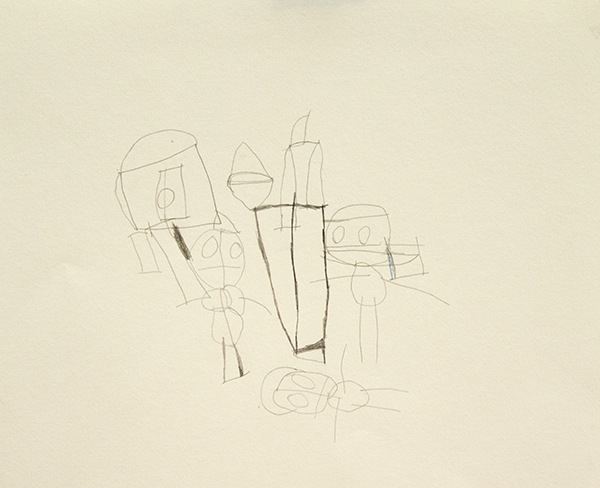
My Body, mixed media on canvas, 18" x 24", 2015

Jed Clampett, glazed ceramic, 10" x 7" x 4"

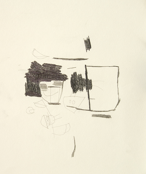
Untitled, acrylic, 18" x 24", 2015

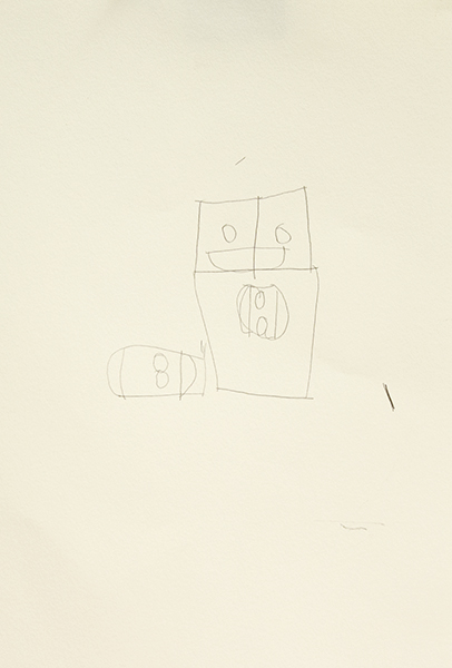
Untitled, graphite on paper, 12" x 17"

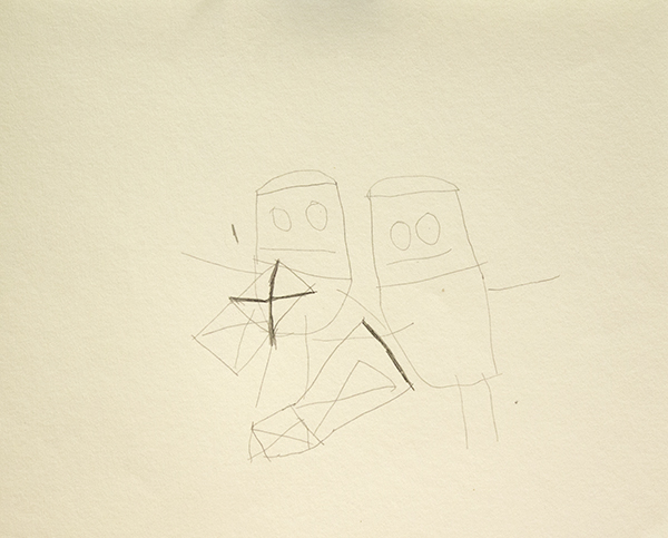
Untitled, mixed media on canvas, 24" x 18"

The process of evaluating any artwork includes some interpretation of how it functions - mechanisms such as the way gestural brushstrokes communicate movement by indexing the physical action of their application, or the way that arrangements of representational imagery can imply relationships between elements that generate narrative.

The mechanism by which Billy White’s paintings elicit emotion is sharply specific, yet escapes analysis, remaining a wonderful mystery. A loose, fearless application of paint renders forms with a striking physicality and sense of humor. There’s an uncanny affinity with the work of figurative painters Todd Bienvenu and Katherine Bradford (who both have an aesthetic undoubtedly informed by the work of self-taught artists). The impact of White’s work cuts through a vivid alternate world that operates on White’s terms - a highly original set of priorities, passing over image and rendering to achieve an expression of mood and vitality, as though excavating the underlying stories that were already present; impatient mark-making and barely legible imagery find time and space for redolent storytelling and detail. While he typically focuses on painting and drawing, White occasionally creates small ceramic sculptures that are rich in character and evocative of Allison Schulnik’s warped clay figures - slumped postures, elongated, rubbery appendages, intermingling glazes, and sunken, cartoonish expressions.

White’s work is largely influenced by his avid interest in pop culture, often depicting actual and imagined events in the lives of various celebrities or fictional characters, from Dr Dre to Hulk Hogan to Superman. NIAD provides some insight into White’s process: “He might start off painting Bill Cosby, but quickly change his mind by lunch. When that happens, he simply works right on top and doesn’t erase what came before. The new work becomes an extension of the old. By the end of the day this could happen several times and what’s often left is a latticework of figures and stories with interchangeable meanings.”


Billy White (b. 1962) has exhibited previously in Rollergate at the Seattle Art Fair, Telling It Slant organized by Courtney Eldridge at the Richmond Art Center, Undercover Geniuses organized by Jan Moore at the Petaluma Art Center, ArtPad San Francisco at the Phoenix Hotel, and extensively at NIAD Art Center, where he has maintained a studio practice since 1994. He has an upcoming solo exhibition at San Francisco’s Jack Fischer Gallery later this year.


Julian Martin


Untitled (motorbike), pastel on paper, 15" x 11", 2014

Untitled (White on Cream), pastel on paper, 15" x 11 1/4", 2010

Untitled (Orange Shape and Khaki), pastel on paper, 15" x 11 1/4", 2010

Untitled (parrot), pastel on paper, 15" x 11", 2014

Like other progressive art studio artists at the Outsider Art Fair, Julian Martin works from found imagery culled from magazines (often art publications). Whereas Helen Rae pushes found imagery to greater levels of complexity and reality, and Marlon Mullen and Andrew Hostick retell images in their own vocabularies, Martin pares the image down to a series of perfectly resolved moments in which a series of forms (each powerful and resolved in their own right), is described with an abundance of velvety pastel marks applied deliberately and seamlessly with a deft touch. Martin achieves a ubiquitous softness - soft colors, shapes, surfaces, and materials, yet always precise and controlled in application, saturating the surface while maintaining the boundaries of each form with conviction.

Initially, Martin’s work seems aesthetically akin to the work of many young artists currently revisiting concepts of early abstraction with suggestions of the figure, such as Brooklyn-based painters Austin Eddy and Tatiana Berg. However, where these artists revisit and re-imagine the ideas of artists like Picasso and Dubuffet, who were themselves appropriating the aesthetics of outsiders, Martin is the real thing. Not in that he is a “real outsider” (at this point Martin is quite well established professionally, certainly as much an insider as any artist living and working in Melbourne), but rather that his works, in sum, lack any tone of irony or nostalgia; the strength of resolution that each of Julian Martin’s drawings finds is achieved through a minimalist’s sensibility, preoccupied with the absolute rather than a historical context, more comparable to Malevich, Gottlieb, or Mondrian than Cubism or Art Brut.

The proposition underlying Martin's work seems to be that a found image may, inevitably or inherently, possess a more perfect resolution that can be exposed through a measured and thoughtful process of reduction. Unlike Mondrian, the absolute is not found in total abandonment of the original, but in the poetic and specific distillation of the identity and expression of the image.

Martin has attended Arts Project Australia in Melbourne since 1988 and has exhibited extensively at various venues in Melbourne since 1990. He has also shown previously at Fleisher/Ollman (Philadelphia), several Outsider Art Fairs (NYC), Museum of Everything (London), MADMusée (Belgium), Phyllis Kind Gallery (NYC), Jack Fischer Gallery (San Francisco), among others. Martin is represented by Fleisher/Ollman and Arts Project Australia.


The Effortless Humor of Michael Pellew

Michael Pellew, Untitled, 2016, Mixed Media on Paper, 11"x17"

Michael Pellew, Michael and Latoya Texting on the Beach, 2015, Acrylic on Canvas, 12"x9"

Michael Pellew, British Platter, 2015, Mixed Media on Paper, 14"x17"

One of the fantastic surprises at the Outsider Art Fair this year was our experience with the work of Michael Pellew. Pellew’s work is unassuming, and in the context of the fair particularly blends in - a style defined by repetition, drawing within a simple system, and the use of unconventional materials (markers). We were more familiar with his series of small original drawings marketed as greeting cards, which typically feature a grouping of four or five figures (available at Opening Ceremony in Manhattan and LA). In a larger scale, the voice only available in snippets in smaller works unfolds to become an astonishing comedic performance.

The repetition and economy of visual language in his work is necessary to the humor - each figure articulated in an identical manner, with just a few distinctive features describing its specific identity. The supreme ease with which each character enters the scene via this agile visual vernacular accounts for the works’ pace and timing. There's an exciting cleverness in the way the simple archetype of the figure takes on the identity of countless celebrities, analogous to a skilled impressionist mimicking pop culture icons in rapid succession. Pellew seems to be compiling an ongoing, shifting catalog of celebrities; those with apparent relationships or categorizations are sporadically interrupted with unexpected pairings (Princess Diana and Lemmy Kilmister) or fictional personas (Lauryn Hill M.D. from Long Island College Hospital, The Phanton Lord). Viewers with an extensive knowledge of pop culture are highly rewarded by the ability to recognize the abundance and subtlety of his references.

Michael Pellew, Untitled, 2015, Mixed Media on Paper, 22"x30"

Humor is an important element in many works that don't necessarily make us laugh, but truly funny art like Pellew’s (beyond the occasional clever moment or inside joke), is very uncommon. Crystallizing the elusive and ephemeral quality of comedy into a permanent art object is extremely difficult to achieve. Usually the most overtly funny approach is to employ an explicit punchline that rests on an impressive technical or procedural spectacle; artists that exemplify this approach are those like Wayne White or Eric Yahnker. 

Eric Yahnker, Beegeesus, 2005, 13 x 10 x 10 in."Bible whited-out except that which sequentially spells Bee Gees" image via www.ericyahnker.com

Eric Yahnker, Beegeesus, 2005, 13 x 10 x 10 in.

"Bible whited-out except that which sequentially spells Bee Gees" image via www.ericyahnker.com

Pellew’s humor, however, is more nuanced, so in the absence of a punchline, his approach relies on absolute fluency rather than overt technical prowess. The quintessential example of this brand of humor is Raymond Pettibon; works that appear effortless afford the artist a more casual voice, equipped to cultivate a more dynamic interaction between the work and viewer. When it's less obvious that there's a joke present, the viewer tunes into a more acute examination of tone and timing in search of the artist's intention. 
 

Raymond Pettibon, image via www.raypettibon.com

Raymond Pettibon, image via www.raypettibon.com

Whereas Pettibon uses this approach to insert sardonic or satirical moments of levity into his generally grim oeuvre, Pellew instead engages this sort of humor with a lighter and even silly sensibility; he creates an abundantly bright and positive space that is captivating. The conceptual foundation of his work becomes about treading the line between earnestly identifying as an artist, or slyly engaging in play-acting the role of an artist. Walton Ford has described using play-acting (as a scientific illustrator) in a similar way as an entry point into comedy. In Pellew’s case, the performance is broader, and in its execution more engrossing - guiding you through his alternate world, you're always uncertain if he’s serious, even as he crosses well over into the realm of absurdity.

Michael Pellew, Michael Jackson and Bubbles, 2014, Acrylic on Canvas, 14"x11"

In the affable universe he realizes, there’s virtuosity in the way moments of comedic surprise cut sharply through. The lingering experience of these pieces isn’t static, but a dreamlike memory of an event unfolding; line-ups of celebrities…everyone had a pepsi…they were all hanging out around a limousine eating McDonalds…and then Marilyn Manson is offering his famous burger and fries. It’s an alternate reality composed of familiar characters and Pellew is leading us along, introducing each of them, all in his voice - but really it's the viewer’s voice. You are left walking away amused, incredibly satisfied, but not entirely sure what has just happened. 

Pellew has been working at LAND Gallery’s studio for over ten years and participated in numerous exhibitions in New York, including group shows at Christian Berst Art Brut and the MOMA. His work has been acquired by many reputable collectors, including Spike Lee, Sufjan Stevens, Citi Bank, JCrew and PAPER Magazine.

Michael Pellew, Making a Band (detail)

Mary Ann James

Heaven, graphite and watercolor on paper, 2015

Train, graphite, micron, and watercolor on paper, 2015

Camping, graphite, micron, and watercolor on paper, 2015

Untitled,  graphite and watercolor on paper, 2015

Mary Ann refers to all of her works as her “creations”. Like a story teller, she’s inspired by a combination of personal experiences in her daily life and concepts that she values, such as motherhood and heaven. Consequently, her works have a narrative feel - depictions of people and places that may be part of a story.

Mary Ann’s process, however, is not guided by narrative, but rather by an ambition to create. As a result of this, her subjects aren’t rendered as two-dimensional images, but intended to exist in their own right, in a two-dimensional world. In effect, her imaginative nature inevitably imbues the world she creates with a narrative life, but this distinction in her creative practice is important. Because she's creating rather than depicting, a figure, for example, is drawn in its entirety before clothing is drawn onto it - often a layer of flesh tones is painted before a subsequent layer of paint is added for the color of their clothing. If she includes shoes or gloves for a figure, she draws them around the foot or around the hand, rather than over it. Figures standing in front of a train are placed below the train, rather than in front of it, because both the train and people are created separately. Mary Ann has a highly original way of translating her perception of reference images onto paper, often distorting the scale of objects and editing out details that don’t fit her vision. 

In the world she creates, scale is an expressive choice; each form is given whatever space it needs to exist and relate to the world it occupies. Ultimately in her work, she creates people and things to stage a still, timeless moment that’s simple, complete, and good.

Mary Ann James maintains a studio practice at The Canvas, a progressive art studio in Juneau, Alaska.

Grace Coenraad

Grace Coenraad, Untitled, micron, sharpie, graphite, and india ink on paper, 2015, 16" x 16"

Grace Coenraad, Untitled, micron, sharpie, and india ink on paper, 2015, 22" x 22"

When I first painted a number of canvases grey all over (about eight years ago), I did so because I did not know what to paint, or what there might be to paint: so wretched a start could lead to nothing meaningful. As time went on, however, I observed differences of quality among the grey surfaces – and also that these betrayed nothing of the destructive motivation that lay behind them. The pictures began to teach me. By generalizing a personal dilemma, they resolved it.
           Gerhard Richter, From a letter to Edy de Wilde, 23 February 1975


Coenraad’s dark, minimalist works are the product of a measured and slow process, executed with extreme diligence. Using 08 black microns, traditional pen and ink nibs, and occassionally graphite, she densely hatches careful lines, which slowly collect on the surface over many hours of work. This method is a clear path leading to an absolute resolution - the surface being obscured by black. The magic of these pieces (although they’re inextricable from the story of the steadfast execution of this simple method) lies in content that’s fantastically nuanced and complex. The black square is a subtle, jagged field comprised of various sheens and tones - certain patches are tinted by an initial application of bright watercolor (often pink or blue) that has bled through the subsequent, inevitable layer of black. The marks made using microns are incised, and those created with india ink and nib lift the paper slightly away from the surface, resulting in a textured surface reminiscent of Richard Serra’s black oil stick drawings. And much like the reductive, sublime paintings of Richter or Clyfford Still, Coenraad demonstrates that the honest act of mark-making isn’t reduced when it’s stripped of intentions or illusion. Conversely, it only becomes more revealing and mysterious. 

After his first museum exhibition of entirely black drawings in 2011, Richard Serra was described by critic Roberta Smith as hermetic, abstract, difficult, and austere, an assessment that he accepted, describing it as “a virtue.” Explaining that art has to be difficult, Serra said that drawing independent of the flamboyance of color interaction, mark-making on its own, in black on white, proves to necessitate invention, thereby providing a “subtext” for how an artist thinks. For him, allover black works were a move to escape that convention of drawing as a “form to ground problem” to create works concerning “interval and space” rather than image.*  

Coenraad didn’t stumble upon this principle inadvertently like Richter; for her, it’s a process that reflects a way of being. It is, as Serra articulates, an extension of the thought process and more. To a degree that’s rarely seen for non-performative artists, Coenraad is an artist for whom the boundary between life and art is blurred. Every task is executed with the same resolute sensibility, engaging life with a singular and sophisticated method in pursuit of perfection. Every bite of food is carefully selected and examined before being eaten (ingredients of an undesirable color rejected), every mundane task is afforded great consideration. For years she has worked part-time at a document destruction facility, where no one has been able to compel her to obliterate more than one document at a time. At home, blackening crossword puzzle squares for hours with ballpoint pen or sharpie is part of her daily ritual.  

In the studio, Grace is fully immersed in her practice - working with her face close to the surface, she becomes absent from anything exterior of the drawing process. Occasionally she will stop and look around the room for a moment like a deep sea diver rising briefly to the surface, before submerging again. Grace doesn’t discuss her work, not because she can’t, but because there seems to be nothing necessary to say once a piece is finished. 

Between her larger, long-term works, Coenraad sometimes creates small graphite sketches,  thoughtful experiments that serve as a point of entry into her mysterious thought process. The placement of faces demonstrate the dynamics of orientation in her drawings. The coexistence of elements in combination with turning the paper many times while working isn’t incidental to the process, but essential to it.

Coenraad is a Juneau-based artist who maintains a studio practice at The Canvas in Juneau, Alaska. Her work will be included in an upcoming group exhibition curated by Disparate Minds writers Tim Ortiz and Andreana Donahue at The Canvas' exhibition space in December.

William Scott


San Francisco-based artist William Scott is a believer in a better world; his works are the celebratory announcement of the wholesome future. His complex oeuvre not only imagines a parallel universe, but Scott leads by example with a joyous conviction in articulating his vision of a utopian future San Francisco, “Praise Frisco”. Scott’s paintings, drawings, and sculptures are executed in a manner consistent with this gospel of idealism and excellence, shining with a pristine vibrance. 

In a Frieze review of Scott’s solo exhibition "Good Person" at White Columns, Katie Kitamura asserts:

Scott’s work is wrapped up in the idea of what it means to be a citizen, to be interpellated within the social order. That is probably most memorably captured in an untitled series of sci-fi infused works ...These are populated with a lovely switch and change of language - ‘citi-fi’ and ‘inner limits’ and ‘whole some citizen’ - and a series of wide-eyed future citizens of the world, about to depart on airport shuttles into space.
In the most direct way, Scott communicates the way in which being part of any social order relates to pop cultural paranoia and conspiracy theories. But he also captures the deeper suspicion that we are sometimes possessed by forces beyond our comprehension.


William Scott attends Creative Growth’s studio in Oakland. Scott is widely collected and has work in the permanent collections of the MOMA and The Studio Museum in Harlem, New York. 
He has exhibited recently in Groupings at Park Life Gallery (San Francisco) and previously at the Outsider Art Fair (NYC), Hayward Gallery (London), Gavin Brown’s enterprise, Yerba Buena Center for the Arts (San Francisco), the Armory Show (NYC), Palais de Tokyo (Paris), NADA (Art Basel, Miami), and White Columns. From White Columns’ "Good Person" exhibition statement:

For many years William Scott has been working on an ongoing urban planning project that would see San Francisco – in Scott’s terminology – “cancelled”, only to be re-imagined, rebuilt, and rechristened as a new city named ‘Praise Frisco.’ Scott’s urban project, which was the subject of his...White Room exhibition at White Columns, is rooted in a desire to see his own socially marginalized neighborhood of Bay View / Hunter’s Point “torn down” and then subsequently renewed according to his carefully detailed plans. Scott’s ambitious, optimistic, and deeply humane project engages explicitly with San Francisco’s recent past, present realities, and potential future. (more)

John Hartman

assorted letter openers

Three Geese on Stands, Pine and Cyprus

owl sculpture, mahogany

Material in the raw is nothing much. Only worked material has quality, and pieces of worked material are made to show their quality by men, or put together to so that together they show a quality which singly they had not. “Good material” is a myth. English walnut is not good material. Most of the tree is leaf-mold and firewood. It is only because of workmanlike felling and converting and drying and selection and machining and setting out and cutting and fitting and assembly and finishing - particularly finishing - that a very small proportion of the tree comes to be thought of as good material.
    - David Pye, The Nature and Art of Workmanship

John Hartman skillfully works within the tangible, tactile boundaries of a small-scale process and commitment to good workmanship. Within this intimate context, he engages wood without conceptual boundaries, exploring utility, mimesis, and sculptural invention freely. Through the tradition of woodworking, Hartman is able to realize a wide range of possessable objects that evoke a sense of elegance and great integrity.

Hartman is a Manhattan-based artist who has been working in Pure Vision’s studio since 2013. From Pure Vision: 

Hartman’s “main passion is woodcarving. John was introduced to the craft at the age of eleven, in wood shop at The Rudolph Steiner School. He began by crafting a cherrywood flour scoop. Instantly drawn to the medium, he slowly started teaching himself how to make more complicated objects. Collecting rare woods from around the world such as ebony, zebra wood, Philippine mahogany and bloodwood, John now spends hours in the studio and at home carving, whittling, sanding and polishing each piece. Inspired by visits to his family’s seaside home on Fire Island, his subjects often reference birds and sea creatures.” (more)

Yasmin Arshad

Untitled, marker on paper, 22" x 30"

129999, marker on paper, 22" x 30"

Untitled, marker and acrylic on wood, 19.5" x 19.5"

Untitled, marker on paper, images courtesy Gateway Arts

Untitled, marker on paper, images courtesy Gateway Arts

Arshad’s distinctive works are characterized by series of numbers, phrases, and concepts of time that manifest in the form of visual and spacial poetry. An investigation of the overlap in the process of seeing and reading akin to Christopher Wool is present - where Wool employs the arrangement of words on a surface to disrupt the reading process systematically, Arshad’s visual and written languages instead merge more fluidly. Text forms, influenced by dynamics of color and scale, impose elusive and subjective variation in the reading experience.

Arshad’s work reflects an avid interest in ideas related to the passage of time. An invented symbol for eternity, 129999 (a single number indicating all months and years), often surfaces in her work; she also lists years chronologically beginning with the year 2000, organizing the numerical information into multi-colored grids. Over the course of 46 years, Roman Opalka painted horizontal rows of consecutive, ascending numbers (1 – ∞), an ongoing series that ultimately spanned 233 uniformly sized canvases. In “Roman Opalka’s Numerical Destiny” for Hyperallergic Robert C. Morgan writes:

From the day his project began in Poland until his death in the south of France in 2011, Opalka combined clear conceptual thinking with painterly materials. His search for infinity through painting became a form of phenomenology, which, in retrospect, might be seen as parallel to the philosophy of Hegel. Through his attention to a paradoxically complex, reductive manner of painting, Opalka focused on infinite possibilities latent within his project.

Arshad’s rigorous, repetitive approach is similar to 0palka’s engagement with infinity, yet there are more prevalent breaches in her pattern-based system. Much like the process of weaving, Arshad’s drawings reflect an intrinsic structure that serves as a guide for intended visual results, yet there is room for distortion and a spontaneous response to the surface.

Arshad (b. 1975, Florence, Italy) has exhibited previously at Cooper Union (NYC), the Outsider Art Fair, The Museum of Everything (London), Phoenix Gallery (NYC), Berenberg Gallery (Boston), Trustman Gallery (Simmons College, Boston), Drive-By Projects (Watertown, MA), Creativity Explored (San Francisco), and at Gateway’s Gallery in Brookline, Massachusetts. Arshad lives in Cambridge, Massachusetts and has attended Gateway Arts’ studio since 1996.              

see more work by Arshad here


Luis Hernandez

Untitled, marker on vellum, 8.5" x 11" 2015

Untitled, marker on vellum, 8.5" x 11" 2015

Untitled, marker on vellum, 18" x 24" 2015


We were fortunate to meet Luis Hernandez at a turning point in his creative practice, as he was beginning this body of work, a series of marker drawings on vellum. Aesthetically, they’re exciting abstractions; energized and vibrant, each complex composition is perched between intuitive and systematic visual ideas. Hernandez's work effortlessly achieves what many contemporary artists currently investigating abstraction strive to, with the re-emergence of a Twombly-esque aesthetic.

Observing Hernandez in the studio, it's impossible not to feel a sense of wonder at the mysterious and dynamic nature of his prolific creative process. The contrast of expressive and systematic qualities in his work is mirrored in his disposition, which is that of an extremely earnest and affable man, with a great aspiration to speak directly and connect with the world beyond himself, but whose way of thinking and seeing is fantastically disparate from that of his neurotypical peers.  

Because of his aspiration to communicate clearly, he was slow to fully embrace his instinctive practice and still sometimes strives to create representational work. When he attempts to draw from life, however, he’s never satisfied. During these moments, as he discards page after page of a sketchbook, the singularity of his experience is most clear as the renderings even he finds most successful have no obvious visual relationship to their subject. Once, an observer sympathetic to his frustration tried to assist by providing a dotted line as a guide; he has since adopted the dotted line, applying it to his abstract forms as though he can achieve a magical quality of objectivity from its presence.

In this body of work, Hernandez has described his process of drawing as moving along or searching for a path. If it’s a path, then it’s one he follows with great vigilance, a quality that he values deeply. His vigilance is a matter of faith, an inherent knowledge of the world that he believes in with great conviction; this is sometimes expressed in terms of his Tlingit heritage (referencing conversations in dreams with his ancestors or communications with Eagle or Raven) and at other times in drawing comparisons between himself and his idol, the ever vigilant Walker, Texas Ranger.

Hernandez maintains a studio practice in Juneau, Alaska at The Canvas; work from his current series will be included in an upcoming group exhibition curated by Disparate Minds writers Tim Ortiz and Andreana Donahue, which will be on view at The Canvas’ exhibition space in December.

drawing in progress in the studio 


Larry Pearsall

Bad Bon Squared, Acrylic, 16" x 24" 2012

Letting You, Screenprint, 11" x 15" 2013

Mischief In The Ladies Room, Acrylic, 16" x 24.5" 2012

Loner, Acrylic, 18" x 24" 2012

Larry Pearsall

The visual quality of Larry Pearsall’s drawings makes them initially seem very rudimentary. However, they quickly begin to reward careful examination with a revealed nuance and sophistication. This cartoonish place is full of striking details - armpit stains, tile grout shifting color in different lights, a door slightly ajar in suspense, and a mirror reflects the far edge of a bathroom stall. It's in these details that the robust realization of Pearsall’s alternate world (Apple Bay) shines through his highly stylized and systematic way of describing it. This juxtaposition of the highly unreal and real places the unsettling narrative on a precarious line between humorously bizarre and disturbing. Pearsall creates art at one of ECF’s Los Angeles art centers and is represented by their affiliate DAC Gallery. DAC exhibits his work regularly and also has it available for purchase on Amazon.com.  More on Pearsall and Apple Bay from DAC Gallery:

“...Larry Pearsall's flat, cartoon-style paintings narrate the ongoing saga of a dark place called "Apple Bay". Inhabited by characters such as "The Overall Team Club" (a group of overall wearing pre-pubescent boys and girls), guardian animals (cats, possums, rats), a bald 100-year-old bearded pedophile named "Bon", and hundreds of others, Apple Bay is a place where abuse happens behind closed doors, and demons reside in deceptively innocuous settings. In this avowedly fictional narrative, "bad" members are depicted as such, and while their victims are clearly oppressed and visibly marked, they are often unaware of their abuse. Larry Pearsall has been developing the Apple Bay story for the past ten years. It has been translated in paintings, prints, and ceramics. Although Pearsall is soft-spoken, he is always eager to discuss the story of the town and its inhabitants, giving listeners an astounding amount of detail...” (more)

The Phone Call, Screenprint, 11" x 14.75" 2013

Terri Bowden


In her boldly marked drawings, Terri Bowden portrays the figures as if they are intense, strikingly present memories - fleshy and visceral in some aspects, but broadly summarized, distorted, and surreal in others. Faces are rendered with a realism and clarity that evokes vulnerability, re-contextualizing familiar icons of distant pop culture with a mysterious, untold narrative. Bowden’s work achieves the uncommon combination of dreaminess and gritty power reminiscent of Philip Guston. Recent exhibitions include Vis-à-vis curated by Michael Mahalchick at Andrew Edlin Gallery (New York) and stARTup Fair (San Francisco); her work will also be included in the upcoming exhibition Indigo Mind at StoreFrontLab (San Francisco).

Bowden works at Creative Growth's studio in Oakland, California; from Creative Growth:

"Terri’s whimsical and quirky sense of humor is delightfully evident in her artwork. Having befriended other albinos–who, like herself, are legally blind–Terri often uses albino animals and people as the subject of her drawings. Whether it’s reimagining Led Zeppelin’s Robert Plant, pop music icon Michael Jackson, or a nondescript winking punk rocker, Terri’s ability to capture the nuances of human expression exceeds far beyond the photos she uses as reference.  Her fixation on albinism extends to ceramics as well, with her pigmentless fruit, Hershey’s kisses, cookies, rabbits and ducks, all executed in the same whitish pink palette that appears in her drawings." (more)