Marlon Mullen’s second solo exhibition at JTT Gallery is an expansive collection of recent works by this San Francisco-based hero in the progressive art studio movement.
Read MoreMapping Fictions: Daniel Green
Daniel Green, Fifteen People, 2009, Mixed media on wood, 14.25 x 22.5 x 1.75 inches
Daniel Green, Little Mac vs Soda Poponski, 2015, mixed media on wood, 11.5 x 15 inches
Daniel Green, The Sun, 2015, mixed media on wood, 6 x 16.5 x 1 inch
Daniel Green, Business Delivery, 2011, Mixed media on wood, 13 x 29 x 1 inches
Daniel Green's process is slow and intimate; quietly hunched over his works in the bustling studio, he draws and writes at a measured pace. These detailed works are an uninhibited visual index of Green’s hand; when read carefully, they become jarring and curious, slowly leading the viewer to meaning amid the initial incoherence. Green’s text is poetic and complex - language and thought translated densely from memory in ink, sharpie, and colored pencil on robust panels of wood. Figures and their embellishments are drawn without a hierarchy in terms of space occupied on the surface; they are at times elaborate and at other times profoundly simple. The iconic figures’ facial expressions (Jesus, Abraham Lincoln, Tina Turner, video game characters, etc.) are generally flat with proportions stretching and distorting subject to Green’s intention.
Ultimately, these drawings compel the viewer to internalize and decipher Green’s ongoing, non-linear narrative. His drawings call to mind Deb Sokolow’s humorous, text-driven work, but are less diagrammatic and concerned with the viewer. In an interview with Bad at Sports’ Richard Holland, Sokolow elaborates on her process:
I’ve been reading Thomas Pynchon and Joseph Heller lately and thinking about how in their narratives, certain characters and organizations and locations are continuously mentioned in at least the full first half of the book (in Pynchon’s case, it’s hundreds of pages) without there being a full understanding or context given to these elements until much later in the story. And by that later point, everything seems to fall into place and with a feeling of epic-ness. It’s like that television drama everyone you know has watched, and they tell you snippets about it but you don’t really understand what it is they’re talking about, but by the time you finally watch it, everything about it feels familiar but also epic. (Bad At Sports)
Much like Sokolow, Green engages in making work that begins with the rigorous practice of archiving information culled from his surroundings and interests, which then develops into intriguing, fictitious digressions. Dates and times, tv schedules, athletes, historical figures, and various pop culture references flow through networks of association - “KURT RUSSEL GRAHAM RUSSEL RUSSEL CROWE RUSSEL HITCHCOCK AIR SUPPLY ALL OUT OF LOVE…” Although the listing within his work sometimes gives the impression of being intuitive streams of consciousness, most of it proves to be very structured and complex within Green’s system. Rather than expression or even communication, the priority seems to be the collection of information or organization of ideas; the physical encoding of incorporeal information as marks on a surface is a method for making it tangible, possessable, and manageable.
Daniel Green, Pure Russia, 2011, Mixed media on wood, 9 x 23 x 3.5 inches
Pure Russia (detail)
From the perspective that Green invents, there’s an endless number of time sequences that haven’t been considered before. A grid of days and times (as in Pure Russia) imagines time passing in increments of one day and several minutes, then returns to the beginning of the series, stepping forward one hour, and proceeding again just as before. It could be cryptic if you choose to imagine these times having a relationship to one another, or it could instead be an original rhythm whose tempo spans days, so that it can only be understood conceptually as an ordered structure mapped through time - the significance of the pattern superseding that of specific moments.
By blurring the distinction between the articulation of ideas through text and the development of mark-making, Green’s highly original objects become unexpectedly minimal and material, yet simultaneously personal and expressive.
Daniel Green’s work will be included in Mapping Fictions, an upcoming group exhibition opening July 9th at The Good Luck Gallery in LA, curated by Disparate Minds writers Andreana Donahue and Tim Ortiz. Green has exhibited previously in Days of Our Lives at Creativity Explored (2015), Create, a traveling exhibition curated by Lawrence Rinder and Matthew Higgs that originated at University of California Berkeley Art Museum and Pacific Film Archive (2013), Exhibition #4 at The Museum of Everything in London (2011), This Will Never Work at Southern Exposure in San Francisco, and Faces at Jack Fischer Gallery in San Francisco.
Mapping Fictions: Roger Swike
Untitled, ballpoint pen on paper, 12 x 9 inches
Untitled, ballpoint pen and crayon on paper, 12 x 9 inches
Untitled, ballpoint pen and crayon on paper, circa 2013 12 x 9 inches
Roger Swike's ten crayons
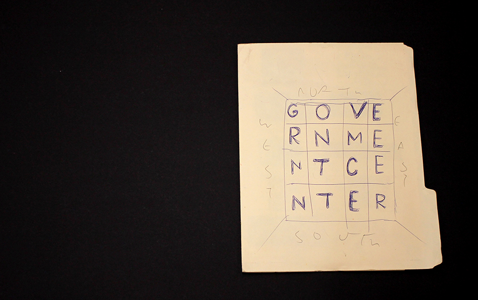
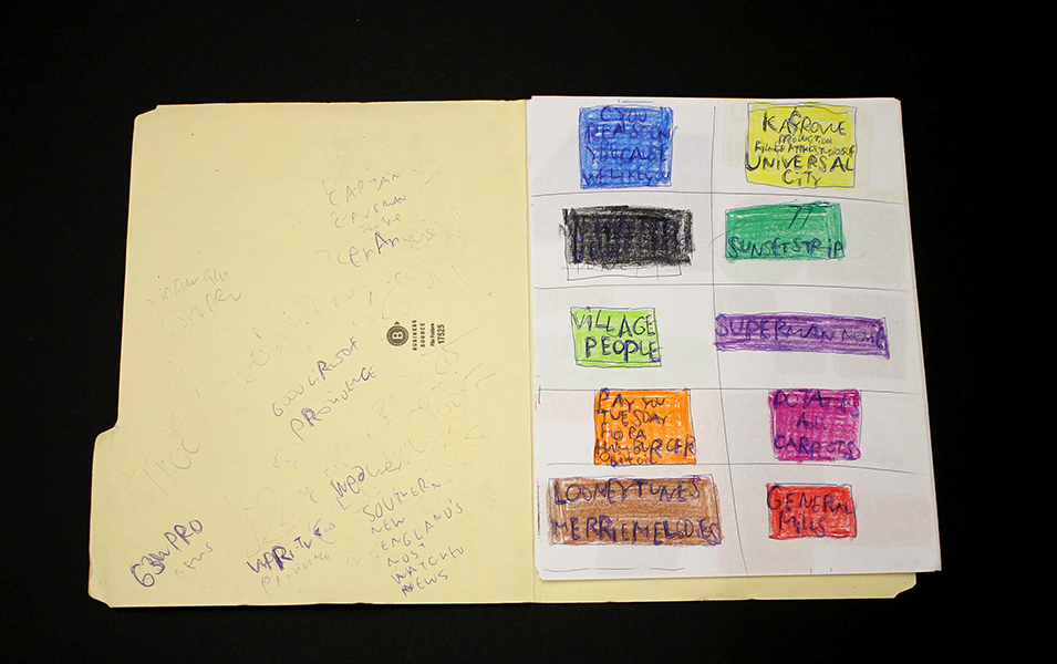
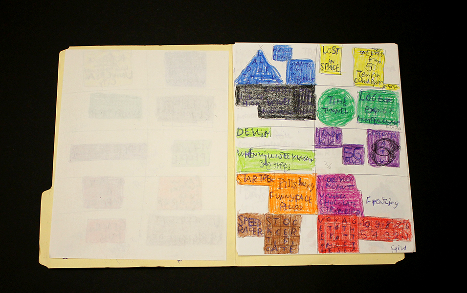
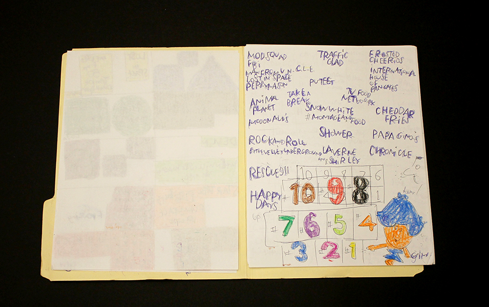
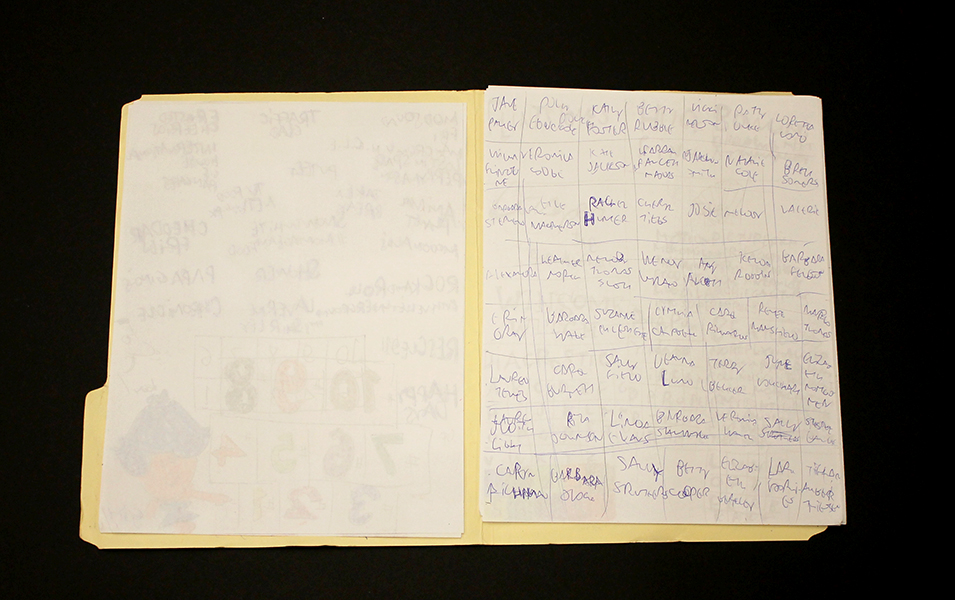
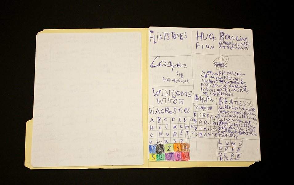
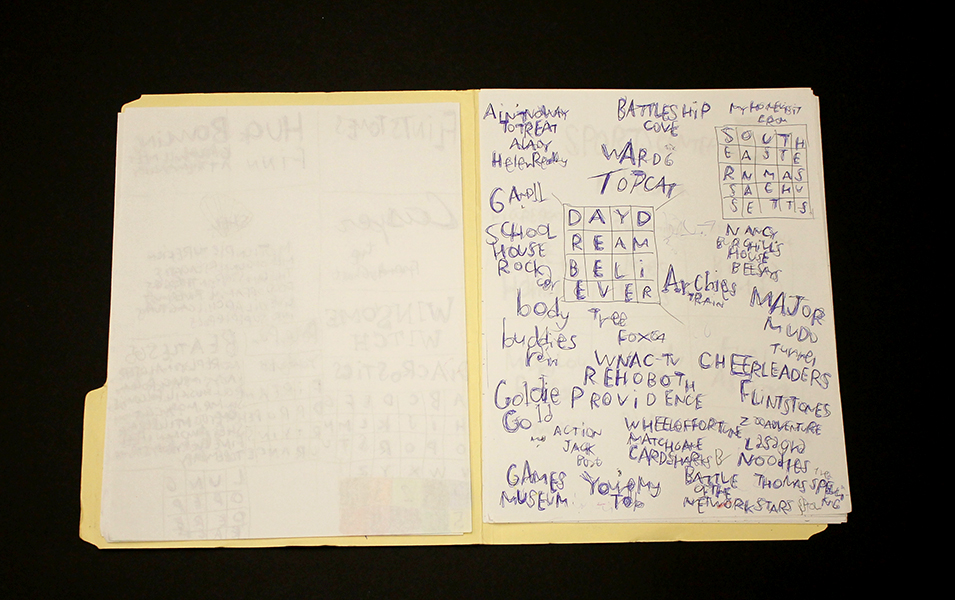
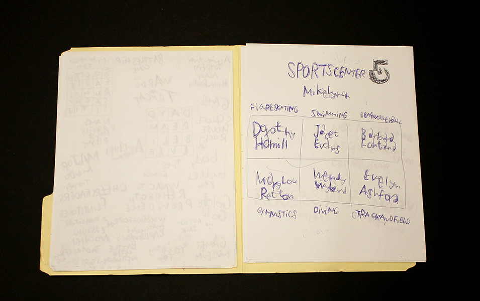
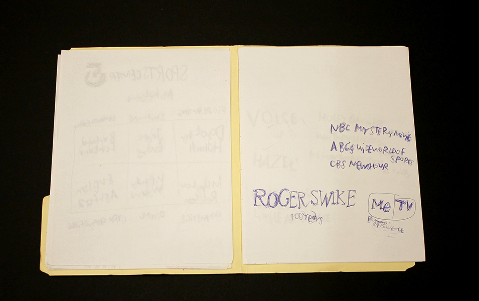
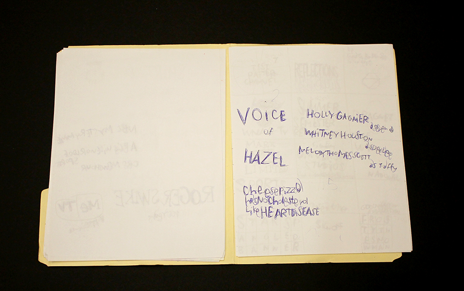
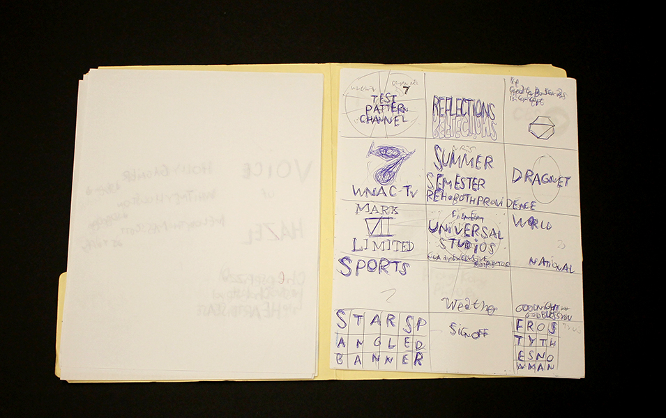
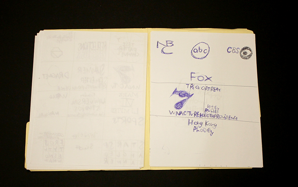
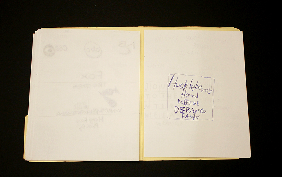
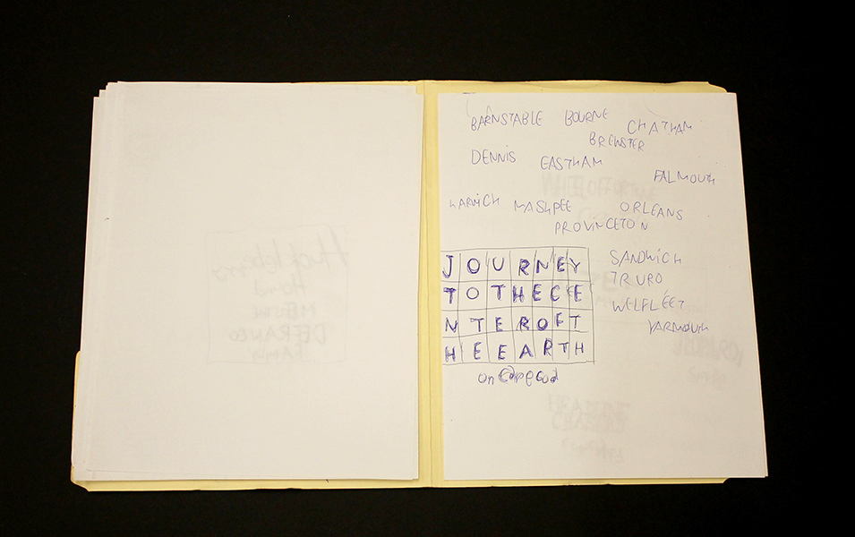
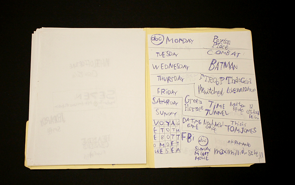
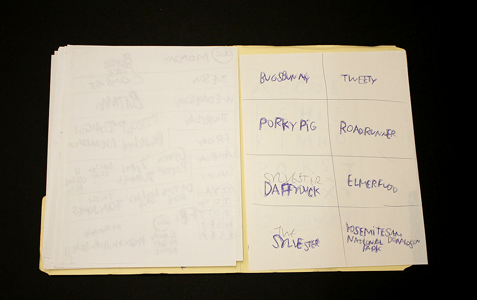
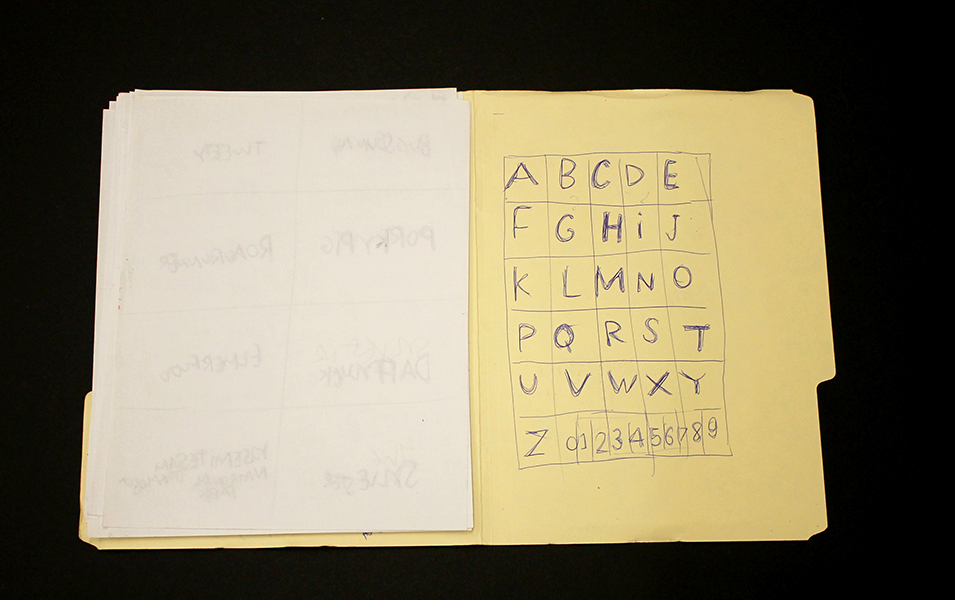
Roger Swike is an exceptionally prolific artist who works rapidly on many pieces simultaneously; much like Melvin Way, his drawing process channels an immediate and intuitive stream of information, yet is also executed with deliberation and great intention. Swike will often revisit drawings created at different times and deliberately organize them into various color-coded folders; the resulting works are an assertive, endearing proposition about what an art object can be. Within content that initially appears chaotic or arbitrary, familiar text referring to pop culture and the exterior world is pervasive. Black and blue ballpoint pens and ten crayons are utilized as though each tool has a symbolic role. Some ideas are organized neatly into grids, others are written in less regimented clusters or lists, primarily in multiple layers of ballpoint pen. Over time, curious relationships and subtle patterns emerge, such as references to the number 7 or numbers listed on their own counting down from ten (but when listed alongside the alphabet they ascend from 0 to 9).
Because Swike’s work is disciplined and systematic, the viewer is tempted to decipher the rigid system that defines it, but the true nature of the work seems to reside in the plasticity of its rules. A grid listing Loony Toons characters deviates from the pattern to include "YOSEMITE NATIONAL PARK SAM DONALDSON", numbers are written in black ballpoint pen without an overlapping of blue pen, words or phrases are redacted, yet the sequence and grid are still drawn using the ten selected colors…often it feels as though Swike isn't creating the system, but instead exploring it as a poet does language, both fluent and curious. Each time Swike's lexicon is revisited, it presents an opportunity to rethink its mysterious nature - possibly an archive, message, map, poem, or something else entirely.
Roger Swike’s work will be included in Mapping Fictions, a group exhibition curated by Disparate Minds writers Tim Ortiz and Andreana Donahue at the Good Luck Gallery in LA, July 9 - August 27. Swike (born in Boston, 1962) has shown previously at the Berenberg Gallery in Boston, Fuller Craft Museum, the Outsider Art Fair, Margaret Bodell Gallery, and Phoenix Gallery in New York. He has also been awarded a MENCAP award in London, England.
We first encountered Roger Swike’s work many years ago, as studio co-managers and facilitators in a progressive art studio in Nevada; we began visiting other studios while traveling (before the inception of Disparate Minds). Swike has maintained a studio practice at Gateway in Brookline, Massachusetts (the oldest progressive art studio in the US) since 1995. Despite this, his extensive body of work remains relatively unknown outside of the Boston area, possibly because the art world hasn’t quite been ready for work as contemporary and singular coming from a living, so-called outsider artist.
Knicoma Frederick
Knicoma Frederick, Untitled (Candle Army Eyes) from the Series 80 Bit, 2006, Acrylic on canvas, 24” x 18”
Knicoma Frederick, Glory News Article from the Series Information 1600, 2012, marker and pen on paper, 8 ½” x 11”
Knicoma Frederick, Untitled (Elaborately Painted Pedicure) from the Series 80 Bit, 2008, colored pencil on paper, 8 ½” x 11”
Knicoma Frederick, from the series Die Evil 82, 2013
Knicoma Frederick, Unitled (Couple Painting/Interior) from the Series 80 Bit, 2010, Acrylic on canvas, 36 x 24 inches
“The painting is not on a surface, but on a plane which is imagined. It moves in a mind. It is not there physically at all. It is an illusion, a piece of magic, so what you see is not what you see … I think that the idea of the pleasure of the eye is not merely limited, it isn’t even possible. Everything means something. Anything in love or in art, any mark you make has meaning and the only question is ‘what kind of meaning?” - Philip Guston
Prolific visionary Knicoma “Intent” Frederick has lived the intensely dedicated life of an artist for whom painting is more than painting - it’s a way to access something deeper than merely tangible or social ends. Frederick’s work engages the practice of image design and creation with a mystical or prophetic intent, relying on and striving to access and utilize the magic inherent in the process of painting.
Sometimes remarkably akin to the work of William Scott, Frederick’s work possesses an abundance of idealism, realized as utopian visions of the future - proclamations from Glory News, superhero first responders defeating armies of demons, or a “love and justice” rocket ship flying overhead. Where Scott has a steadfast tone of praise and celebration, however, Frederick’s narrative works also include darker, stranger, sometimes ominous themes that afford them a sense of gravity, conflict, and romance.
Knicoma Frederick, Untitled (Couple Painting/Beach Scene) from the Series 80 Bit, 2010, Acrylic on canvas, 36" x 24"
Works such as Untitled (Couple Painting/Beach Scene) live in a space characterized by a more cryptic sort of mysticism, in which painting becomes not only the method that Frederick employs, but also becomes incorporated into the content of the image - overtly, when paintings are included in the image, and less explicitly when “painting” as an archetype is present in the work via the presence of painting tropes (such as a dramatic seascape or elements of traditional still life). These tendencies also present themselves in the work of Los Angeles based painter John Seal.

In response to our inquiry about Frederick and the concept of paintings of paintings Seal remarked:
"The magic, really, is in the disconnect/misconnect. It is in the way the subject and its material delivery interface/intermesh with the viewer's life experiences--it is the surprise of finding anything in common, the surprise of seeing one's self, altered and new, reflected in the painting which in turn becomes new in the viewer's eyes. The magic is in this dual rebirth of viewer (subject) and painting (object). The magic is the painting's ability to make this dual rebirth visible. Painting paintings of paintings is, to me, a way to lead people into the mechanics of image, and to invite the viewer to examine their own relationship to looking: if a picture can be captured by a picture via the means (language) of painting, what can it do to the rest of the world?"
Knicoma Frederick harnesses these mechanics to not only compel the viewer to reflect on the capacity of painting, but to also assert the presence of his message in the world he envisions. The "dual rebirth" that painting facilitates is, for Frederick, a pathway into this realm that his work manifests, and painting is explicitly the magic by which this manifestation takes place.
In the course of discussing his WPIZ series of artist books, and a fictional video game called ArtFighter (which exists within WPIZ) Frederick articulates his manipulation of this mystical function of painting:
"People have heard of games like ‘Street Fighter’ and ‘Mortal Combat’ and ‘Tekken’ for PlayStation and XBox and all of those different types of game systems…But ‘Art Fighter…is fighting with artwork. You’re taking artwork and you’re fighting the situation with it. You’re taking a picture that represents what you want to have happen, done by the storyline in each book. You’re taking a picture, and you’re destroying the negative with it…I have an obligation to make the WPIZ so that the books are used for overcoming the evil that’s in the people’s way." (source)
Shortly before the establishment of the Creative Vision Factory (where Frederick maintains his studio practice), Director Michael Kalmbach encountered Frederick attempting to get permission at a drop-in mental health center to use the copy machine (unsuccessfully), presumably for the distribution of a handwritten series of newspapers (in the neighborhood of six hundred pages). Kalmbach cites this event as instrumental in the development of CVF (informing its goals, design, and function), not only due to the magnitude of this endeavor, demonstrating the need for and potential value of a studio of this kind, but also that the content of these newspapers provided important insight about both Frederick's personal experience and the mental health system in general.
Frederick’s works are conceptualized as series of books for which each work represents a specific page. Over the four years that he has been with CVF, he has published more than 25 artist books, each comprised of 125 - 150 works; prior to the publishing a book, the works can not be sold individually. Frederick has an extremely productive creative practice; Kalmbach estimates that he creates roughly 1000 works per year.
Knicoma Frederick is originally from Brooklyn, New York, but is currently based in Wilmington, Delaware. Recent exhibitions include All Different Colors and Outsiderism at Fleisher/Ollman in Philadelphia and previously at numerous venues in Wilmington, Delaware. He has work in the permanent collection of the Delaware Art Museum and is the recipient of an Emerging Individual Artist Fellowship from the Delaware Division of the Arts.