Dale Jackson at White Columns presents a significant selection from the Cincinnati-based artist’s extensive body of work for his first New York exhibition. Brimming with a disarming sincerity and candor, Jackson’s imaginative missives are a breath of fresh air...
Read MoreMapping Fictions at The Good Luck Gallery
We recently had the honor of guest curating an exhibition at The Good Luck Gallery, an important, new space in Los Angeles. Founded and directed by former Artillery publisher Paige Wery, The Good Luck Gallery is the only space in LA dedicated to showing the work of self-taught artists. Wery fosters the burgeoning careers of artists such as Helen Rae and Deveron Richard, who maintain studio practices in progressive art studios, as well as artists like Willard Hill, who fall into the Outsider, Visionary, or Vernacular categories. Mapping Fictions, curated by Andreana Donahue and Tim Ortiz, opened on July 9th and will be on view through August 27th.
Read MoreMapping Fictions: Daniel Green
Daniel Green, Fifteen People, 2009, Mixed media on wood, 14.25 x 22.5 x 1.75 inches
Daniel Green, Little Mac vs Soda Poponski, 2015, mixed media on wood, 11.5 x 15 inches
Daniel Green, The Sun, 2015, mixed media on wood, 6 x 16.5 x 1 inch
Daniel Green, Business Delivery, 2011, Mixed media on wood, 13 x 29 x 1 inches
Daniel Green's process is slow and intimate; quietly hunched over his works in the bustling studio, he draws and writes at a measured pace. These detailed works are an uninhibited visual index of Green’s hand; when read carefully, they become jarring and curious, slowly leading the viewer to meaning amid the initial incoherence. Green’s text is poetic and complex - language and thought translated densely from memory in ink, sharpie, and colored pencil on robust panels of wood. Figures and their embellishments are drawn without a hierarchy in terms of space occupied on the surface; they are at times elaborate and at other times profoundly simple. The iconic figures’ facial expressions (Jesus, Abraham Lincoln, Tina Turner, video game characters, etc.) are generally flat with proportions stretching and distorting subject to Green’s intention.
Ultimately, these drawings compel the viewer to internalize and decipher Green’s ongoing, non-linear narrative. His drawings call to mind Deb Sokolow’s humorous, text-driven work, but are less diagrammatic and concerned with the viewer. In an interview with Bad at Sports’ Richard Holland, Sokolow elaborates on her process:
I’ve been reading Thomas Pynchon and Joseph Heller lately and thinking about how in their narratives, certain characters and organizations and locations are continuously mentioned in at least the full first half of the book (in Pynchon’s case, it’s hundreds of pages) without there being a full understanding or context given to these elements until much later in the story. And by that later point, everything seems to fall into place and with a feeling of epic-ness. It’s like that television drama everyone you know has watched, and they tell you snippets about it but you don’t really understand what it is they’re talking about, but by the time you finally watch it, everything about it feels familiar but also epic. (Bad At Sports)
Much like Sokolow, Green engages in making work that begins with the rigorous practice of archiving information culled from his surroundings and interests, which then develops into intriguing, fictitious digressions. Dates and times, tv schedules, athletes, historical figures, and various pop culture references flow through networks of association - “KURT RUSSEL GRAHAM RUSSEL RUSSEL CROWE RUSSEL HITCHCOCK AIR SUPPLY ALL OUT OF LOVE…” Although the listing within his work sometimes gives the impression of being intuitive streams of consciousness, most of it proves to be very structured and complex within Green’s system. Rather than expression or even communication, the priority seems to be the collection of information or organization of ideas; the physical encoding of incorporeal information as marks on a surface is a method for making it tangible, possessable, and manageable.
Daniel Green, Pure Russia, 2011, Mixed media on wood, 9 x 23 x 3.5 inches
Pure Russia (detail)
From the perspective that Green invents, there’s an endless number of time sequences that haven’t been considered before. A grid of days and times (as in Pure Russia) imagines time passing in increments of one day and several minutes, then returns to the beginning of the series, stepping forward one hour, and proceeding again just as before. It could be cryptic if you choose to imagine these times having a relationship to one another, or it could instead be an original rhythm whose tempo spans days, so that it can only be understood conceptually as an ordered structure mapped through time - the significance of the pattern superseding that of specific moments.
By blurring the distinction between the articulation of ideas through text and the development of mark-making, Green’s highly original objects become unexpectedly minimal and material, yet simultaneously personal and expressive.
Daniel Green’s work will be included in Mapping Fictions, an upcoming group exhibition opening July 9th at The Good Luck Gallery in LA, curated by Disparate Minds writers Andreana Donahue and Tim Ortiz. Green has exhibited previously in Days of Our Lives at Creativity Explored (2015), Create, a traveling exhibition curated by Lawrence Rinder and Matthew Higgs that originated at University of California Berkeley Art Museum and Pacific Film Archive (2013), Exhibition #4 at The Museum of Everything in London (2011), This Will Never Work at Southern Exposure in San Francisco, and Faces at Jack Fischer Gallery in San Francisco.
Mapping Fictions: Roger Swike
Untitled, ballpoint pen on paper, 12 x 9 inches
Untitled, ballpoint pen and crayon on paper, 12 x 9 inches
Untitled, ballpoint pen and crayon on paper, circa 2013 12 x 9 inches
Roger Swike's ten crayons
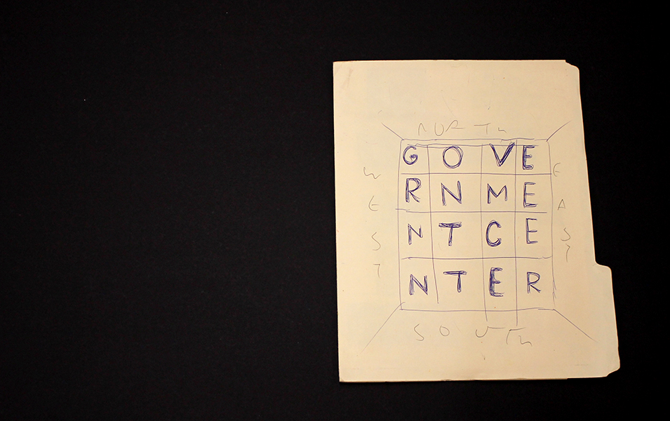
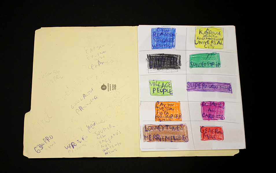
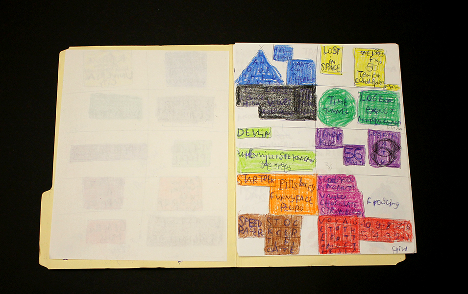
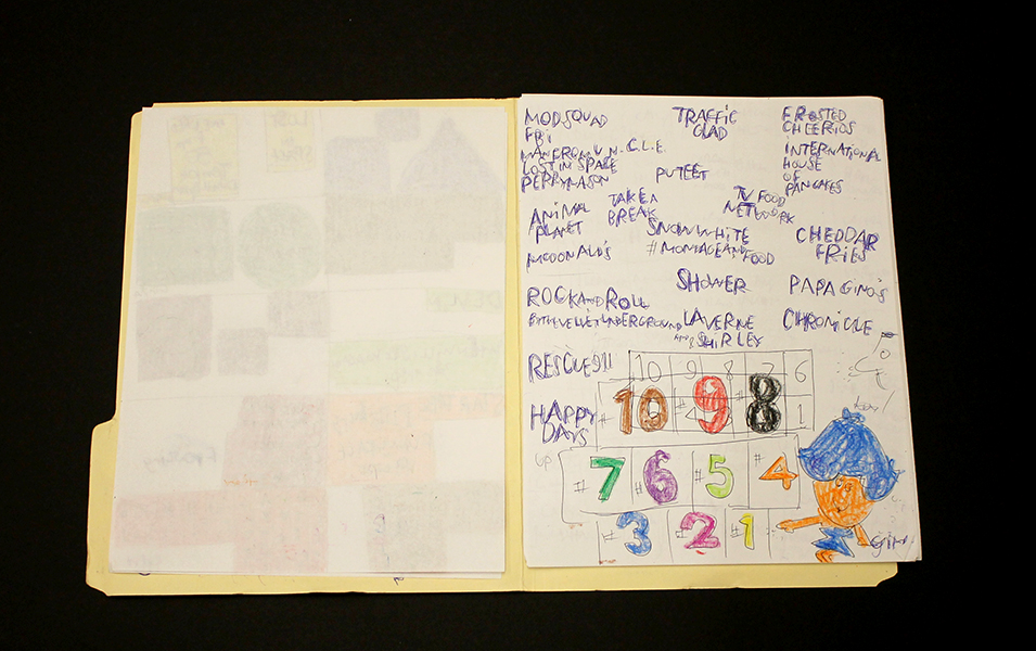
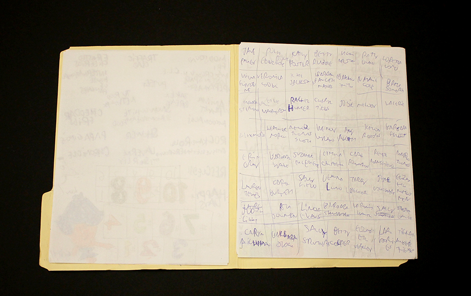
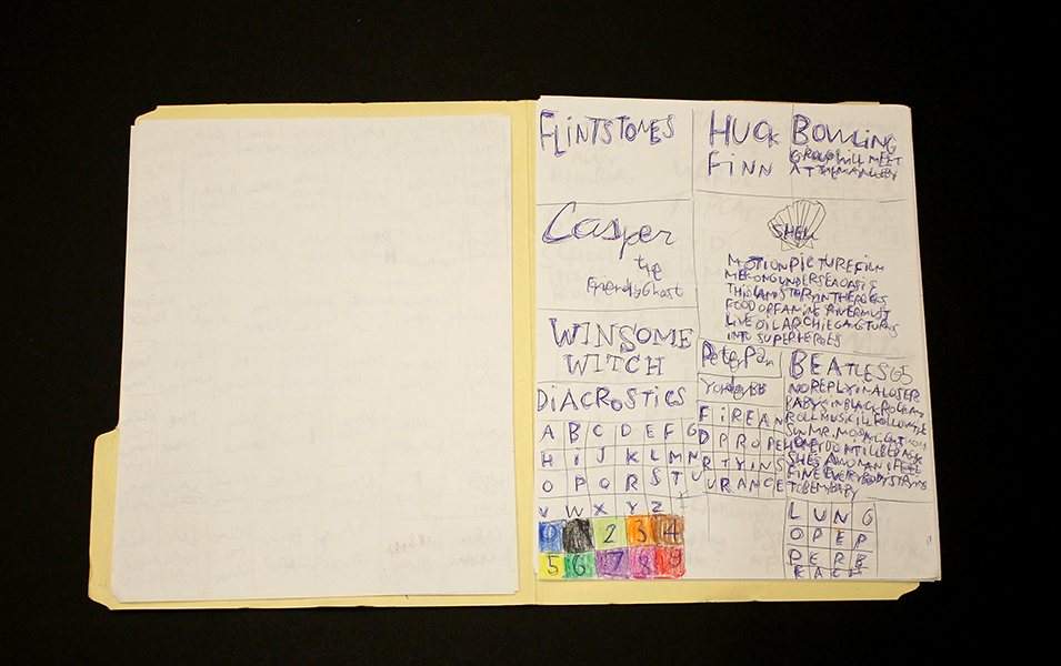
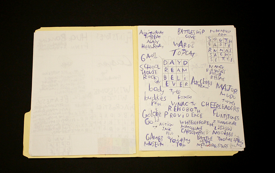
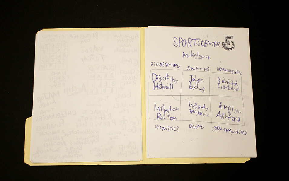
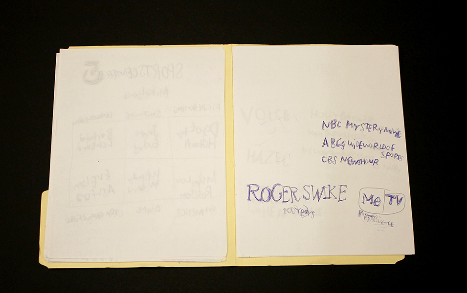
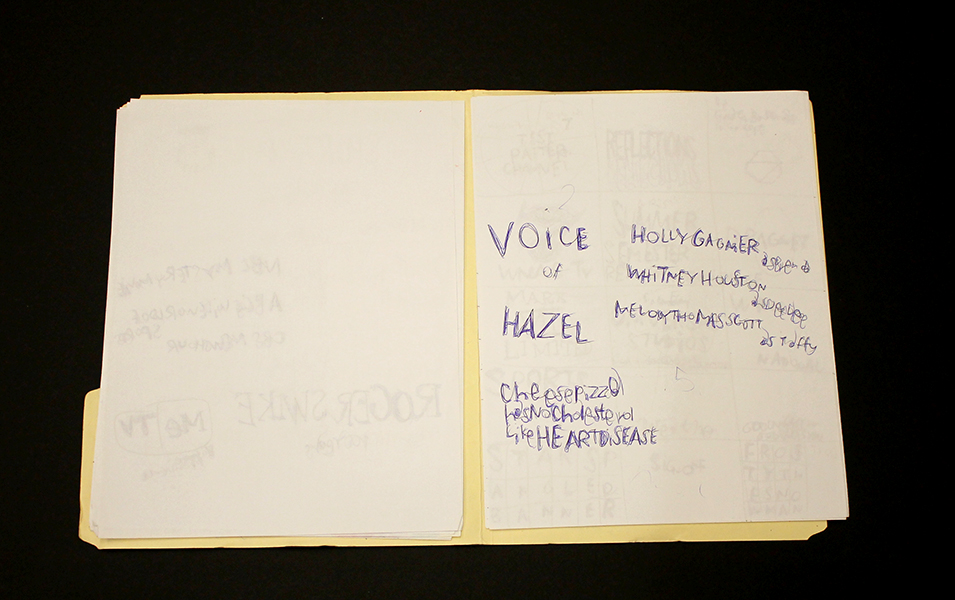
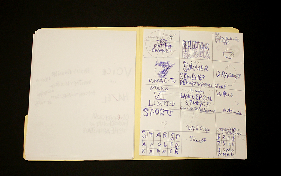
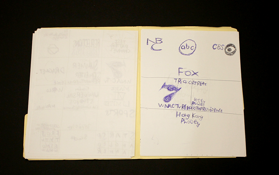
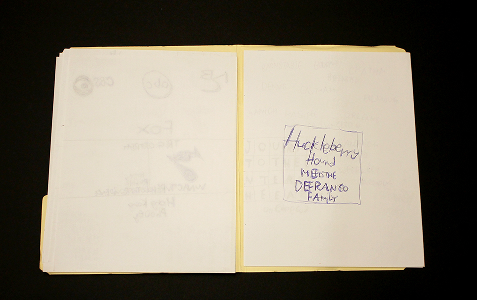
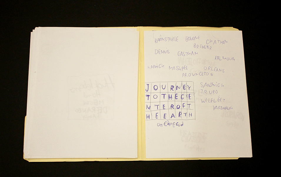
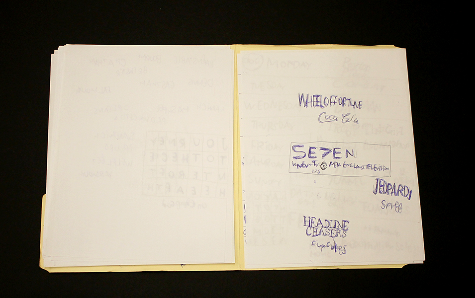
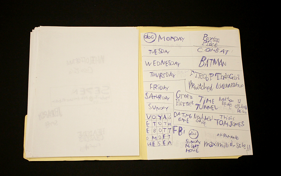
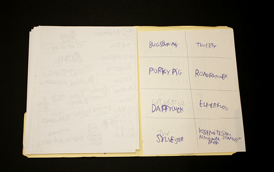
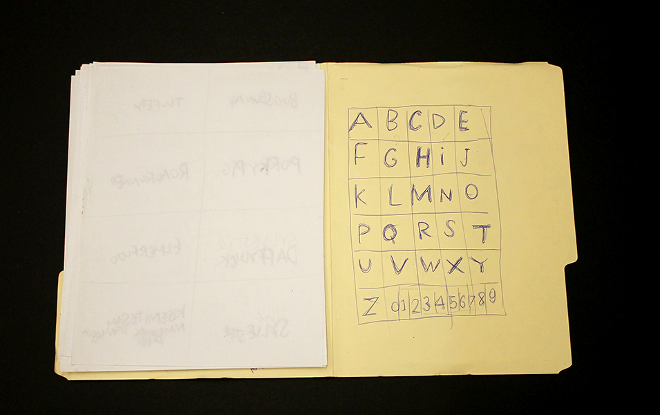
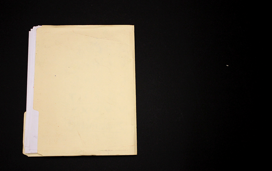
Roger Swike is an exceptionally prolific artist who works rapidly on many pieces simultaneously; much like Melvin Way, his drawing process channels an immediate and intuitive stream of information, yet is also executed with deliberation and great intention. Swike will often revisit drawings created at different times and deliberately organize them into various color-coded folders; the resulting works are an assertive, endearing proposition about what an art object can be. Within content that initially appears chaotic or arbitrary, familiar text referring to pop culture and the exterior world is pervasive. Black and blue ballpoint pens and ten crayons are utilized as though each tool has a symbolic role. Some ideas are organized neatly into grids, others are written in less regimented clusters or lists, primarily in multiple layers of ballpoint pen. Over time, curious relationships and subtle patterns emerge, such as references to the number 7 or numbers listed on their own counting down from ten (but when listed alongside the alphabet they ascend from 0 to 9).
Because Swike’s work is disciplined and systematic, the viewer is tempted to decipher the rigid system that defines it, but the true nature of the work seems to reside in the plasticity of its rules. A grid listing Loony Toons characters deviates from the pattern to include "YOSEMITE NATIONAL PARK SAM DONALDSON", numbers are written in black ballpoint pen without an overlapping of blue pen, words or phrases are redacted, yet the sequence and grid are still drawn using the ten selected colors…often it feels as though Swike isn't creating the system, but instead exploring it as a poet does language, both fluent and curious. Each time Swike's lexicon is revisited, it presents an opportunity to rethink its mysterious nature - possibly an archive, message, map, poem, or something else entirely.
Roger Swike’s work will be included in Mapping Fictions, a group exhibition curated by Disparate Minds writers Tim Ortiz and Andreana Donahue at the Good Luck Gallery in LA, July 9 - August 27. Swike (born in Boston, 1962) has shown previously at the Berenberg Gallery in Boston, Fuller Craft Museum, the Outsider Art Fair, Margaret Bodell Gallery, and Phoenix Gallery in New York. He has also been awarded a MENCAP award in London, England.
We first encountered Roger Swike’s work many years ago, as studio co-managers and facilitators in a progressive art studio in Nevada; we began visiting other studios while traveling (before the inception of Disparate Minds). Swike has maintained a studio practice at Gateway in Brookline, Massachusetts (the oldest progressive art studio in the US) since 1995. Despite this, his extensive body of work remains relatively unknown outside of the Boston area, possibly because the art world hasn’t quite been ready for work as contemporary and singular coming from a living, so-called outsider artist.
Yasmin Arshad
Untitled, marker on paper, 22" x 30"
129999, marker on paper, 22" x 30"
Untitled, marker and acrylic on wood, 19.5" x 19.5"
Untitled, marker on paper, images courtesy Gateway Arts
Arshad’s distinctive works are characterized by series of numbers, phrases, and concepts of time that manifest in the form of visual and spacial poetry. An investigation of the overlap in the process of seeing and reading akin to Christopher Wool is present - where Wool employs the arrangement of words on a surface to disrupt the reading process systematically, Arshad’s visual and written languages instead merge more fluidly. Text forms, influenced by dynamics of color and scale, impose elusive and subjective variation in the reading experience.
Arshad’s work reflects an avid interest in ideas related to the passage of time. An invented symbol for eternity, 129999 (a single number indicating all months and years), often surfaces in her work; she also lists years chronologically beginning with the year 2000, organizing the numerical information into multi-colored grids. Over the course of 46 years, Roman Opalka painted horizontal rows of consecutive, ascending numbers (1 – ∞), an ongoing series that ultimately spanned 233 uniformly sized canvases. In “Roman Opalka’s Numerical Destiny” for Hyperallergic Robert C. Morgan writes:
From the day his project began in Poland until his death in the south of France in 2011, Opalka combined clear conceptual thinking with painterly materials. His search for infinity through painting became a form of phenomenology, which, in retrospect, might be seen as parallel to the philosophy of Hegel. Through his attention to a paradoxically complex, reductive manner of painting, Opalka focused on infinite possibilities latent within his project.
Arshad’s rigorous, repetitive approach is similar to 0palka’s engagement with infinity, yet there are more prevalent breaches in her pattern-based system. Much like the process of weaving, Arshad’s drawings reflect an intrinsic structure that serves as a guide for intended visual results, yet there is room for distortion and a spontaneous response to the surface.
Arshad (b. 1975, Florence, Italy) has exhibited previously at Cooper Union (NYC), the Outsider Art Fair, The Museum of Everything (London), Phoenix Gallery (NYC), Berenberg Gallery (Boston), Trustman Gallery (Simmons College, Boston), Drive-By Projects (Watertown, MA), Creativity Explored (San Francisco), and at Gateway’s Gallery in Brookline, Massachusetts. Arshad lives in Cambridge, Massachusetts and has attended Gateway Arts’ studio since 1996.
see more work by Arshad here
Louis DeMarco
Fear Love
Cloud Chart
Halo Chart
Hank the Hawk
Louis DeMarco is a Chicago-based artist who has been making art at Project Onward since 2005. His works manifest bits and pieces of a robust alternate reality of his own invention, serving as the basis for creative endeavors of all kinds. The ideals of this other world seem to be characterized by clarity and definition, both aesthetically and conceptually. It’s a place without chaos but not without evil, and where the intangible becomes tangible, concrete, sortable, and clearly arranged. Each work provides new insight into this other place and as the endeavor proceeds, it’s a vehicle for the charismatic and poetic voice of its author.
“A natural comedian, DeMarco infuses humor into serious topics such as disappointment, anxiety, paranoia and relationship negotiations through his series of “Words to Live By” signs, executed in a brilliantly colored Simpsons-esque palatte. Originally a riff on Tom Hanks’ character’s terminal illness (a “brain cloud”) in the comedy classic Joe Versus the Volcano – charting and mapping continue in DeMarco’s popular Cloud Chart series, which catalogs “bad states”, followed later by a series of antidotes (“positive states”) in the Halo Chart series.
DeMarco is also an accomplished bass player for the rock band DHF Express, fronted by fellow Project Onward artist Adam Hines. DeMarco writes original lyrics and music and is developing several screenplays for musicals and comedies. He joined Project Onward in 2005 and currently lives in Chicago’s West Town neighborhood.” (more)
Sara Malpass
Untitled, ink on notebook paper, 8.5" x 11", 2014
Untitled Story, ink on notebook paper, 8.5" x 11", 2013
Untitled, mixed media on notebook paper, 8" x 10.5", 2014
This selection of lists are works by up and coming artist Sara Malpass, whose recent exhibition What Are Words For, was discussed in our overview of NIAD last year. Although Malpass’ fascination with words has informed the development of more traditional work (in the form of text-based paintings), her hand-written lists on notebook paper, whose reductive, pragmatic language serves as a striking and personal archive, continue to be central to her creative practice and oeuvre.
Malpass has exhibited work in the following selected exhibitions: Never Shout Never, organized by Jeffrey Cortland Jones (2015), What Are Words For (2014), Serenade: Lists, Poems and Missives (2013) and A Light That Never Goes Out: Continuing Traditions in Abstraction (2013), all at NIAD Art Center.
Roger Swike
This piece, from the collection of Disparate Minds writer Tim Ortiz, is a work by Roger Swike of Gateway Arts in Brookline, Massachusetts (the oldest progressive art studio we know of, founded over 40 years ago).
A collection of drawings created at different times and then deliberately assembled by Swike into a folder, it's an assertive, endearing proposition about what an art object can be. Each time Swike's lexicon is revisited, it presents an opportunity to rethink its nature - possibly an archive, message, map, poem, or something else entirely.
Within what initially appears chaotic, familiar text referring to the exterior world is everywhere. Black and blue ballpoint pens and ten colored pencils are used as though each tool has a symbolic role. Some ideas are organized neatly into grids, others are written, and everything written in multiple layers of ballpoint pen. Over time, subtle patterns emerge, such as references to the number 7 or numbers listed on their own counting down from ten (but when listed alongside the alphabet they ascend from 0 to 9).
Because the piece is disciplined and systematic, it's tempting to strive to understand a rigid system that defines it, but the true nature of the work seems to reside in the plasticity of its rules. A grid listing Loony Toons characters breaks pattern to include "YOSEMITE NATIONAL PARK SAM DONALDSON", numbers written in black pen without an overlapping of blue pen, yet the sequence and grid are still drawn using the ten selected colors…often it feels as though Swike isn't creating the system, but instead exploring it as a poet does language, both fluent and curious.
John Patrick McKenzie
John Patrick McKenzie has been working at Creativity Explored in San Francisco since 1989; we were able to meet him briefly during our tour of the Creativity Explored studio last year. He's has an exceptionally reserved and focused character, and didn't allow our visit to distract his attention away from a methodical and specific preparation of his work-space. McKenzie's works on paper are the perfect expression of a wonderfully inventive sense of humor that couldn't be expressed otherwise. His text, color choices, repetition, and occasional incoherence all contribute to a poetic charisma that is profoundly endearing. From Creativity Explored:
"Swirling, multiangled, and disorienting, the placement of his language comments on the contradictory, sometimes overwhelming, nature of media attention and celebrity. McKenzie’s original script and arrangement of text are tactile examples of his interpretation of the world, and can be both hilarious and poignant. " (more)
Jenny Cox
The decorative elements of Jenny Cox’s work explore the idea of embellishment as something reduced, authentic, and mysterious. Outlines, underlines, collections of dots, etc. access the romantic idea that meaning and value can be imbued in a work purely through the act of mark-making. Liza Lou, known for laboriously embellishing common objects with thousands of glass beads, has said “Everything has meaning. That's the philosophy of my work. Absolutely everything has meaning if you give it meaning.”
In Cox’s work, these decorative elements are not a spectacle, they are bare, intuitive marks giving meaning through this universal language of embellishment to each part of a complex network of text and forms, whose personal significance to Cox is beyond speculation.
Jenny Cox has been creating art at the Philadelphia progressive art studio Center for Creative Works since 2012.
Jeff Larabee
Marker on panel, 2015
Marker on Cardboard, 2015
Marker on panel, 2015
Over the course of working in and researching progressive art studios, we’ve encountered many artists who brilliantly incorporate text into their work: the narratives of Oscar Azmitia, rules and records of William Tyler, Daniel Green’s stream of consciousness lists, among many others. Text is usually employed by these artists in creative pursuits because it’s the paramount mode of expression and there’s often no separation between studio practice and daily life. This tendency may be the result of art-making as the most significant form of communication - a disposition which many artists lay claim to, but few truly experience in such a literal and profound way.
We’ve recently had the privilege of getting to know Jeff Larabee, a Juneau-based artist working at The Canvas, an integrated studio in Alaska. These grayscale, marker on panel and cardboard pieces (whose surfaces are wholly devoted to hand-written text), are selections from a recent series. The incredible aspect of Larabee's work is that it’s more fully about written language than the artists mentioned above, despite it being unavailable to him as a tool to communicate.
It’s important to understand that these works aren’t created through an intuitive or automatic process. Larabee always works from a reference - transcribing found newspapers, books, pages of printed text, and often his previous works. Larabee gathers newspapers and carries them with him; he fills in crossword and sudoku puzzles then blacks them out with ballpoint pen, examines articles and classified ads, then blacks them out as well. The process of studying and engaging with newspapers sometimes occupies the majority of his studio time. The romance of his work resides in a study of text akin to the investigation definitive of the work of Tom Sachs, who refers to his process as a form of Sympathetic Magic (the desire to imitate or recreate something whose true nature is unattainable). Sachs explains:
“...when someone like an Aborigine person in New Guinea will make a model of a refrigerator because they saw that missionaries had refrigerators and food was always coming out of them. They made these models of refrigerators, and they would pray to them and hope that food would come out. And they’d even make runways with the hope that airplanes would land on them and docks with the hope that ships would come visit them. In fact anthropologists did come to look at these makeshift docks, and runways, and fridges. So the Aboriginal people, in a way, created their own destiny using art.” (http://www.somamagazine.com/tom-sachs/)
In the same way that Tom Sachs uses intensive study and mimesis to access NASA’s Space Program, Larabee strives to access the written word. Larabee doesn’t experience written language as a literate person does, but experiences, values, and diligently engages with it in his creative practice and daily life. This body of work aspires to the concept of encoding and transmitting information in a purely magical sense, rendering visible to us what is unseen within the text - an aesthetic and conceptual investigation of letters and words, separate from a concrete concept of meaning.
Marker on panel, 2015
From a distance these drawings are alluring - stark, clean, and curious, with the promise of an elaborate message. Up close, they provide no message, but are surprisingly labored and nuanced, revealing ghosts of marks wiped away, shades of grey, and repeated, overlapping letters that build history and depth. In the absence of meaning, the accumulated hand-written forms are strikingly personal. Larabee, uninhibited and confident, ultimately leaves nothing between the viewer and his hand, as if the act of mark-making itself carries the power of the written word.
Although he’s rarely willing to discuss his work, Jeff (an avid Batman fan), has referred to these pieces as “letters to Gotham City.”

[CON]TEXT Exhibition at Visionaries + Voices
"From the rolling non-sequitur autobiographical text of Dale Jackson to the ordered classified objects of Cathrine Whited; from John Nusekabel’s editorial comments to the love stories of Barbara Riddle. [CON]TEXT will spin tales of fact and fiction leading the viewer to question what is language and what has evolved to a beautiful mark."
[CON]TEXT is a word-based art exhibition at Visionaries + Voices Northside Gallery. Stop by the gallery during Northside’s Second Saturday on March 14, 2015 from 6-9 pm. This exhibition can also be viewed during regular studio hours through April 17, 2015. (read more)
We are looking forward to seeing some images from this text based show. Visionaries + Voices is an excellent program in Cincinnati, we'll have a full overview coming soon.