Dale Jackson at White Columns presents a significant selection from the Cincinnati-based artist’s extensive body of work for his first New York exhibition. Brimming with a disarming sincerity and candor, Jackson’s imaginative missives are a breath of fresh air...
Read MoreSusan Te Kahurangi King: Drawings 1975 - 1989
Susan Te Kahurangi King’s current exhibition marks her second, highly anticipated solo show at Andrew Edlin, following the critically acclaimed debut of the New Zealand-based artist with the space in 2014, Drawings from Many Worlds. Known for her vibrant and frenetic biomorphic abstractions, Drawings 1975 - 1989 curated by Chris Byrne and Robert Heald features a lesser known series from her prolific and consistently impressive practice...
Read MoreCourttney Cooper
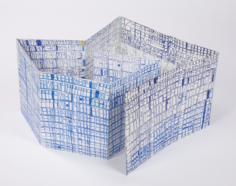
Cincinnati Map, 2010, ballpoint pen on collaged paper, 64" x 88"
Untitled, 2015, ballpoint pen on collaged paper, 52" x 80"
Cincinnati Map, 2009, ballpoint pen on collaged paper, 51" x 85"
Cincinnati Map, 2009 (detail)
Cincinnati Map, 2009 (detail)
images courtesy Western Exhibitions and Visionaries + Voices
Cooper’s oeuvre is a ongoing narrative featuring Cincinnati, imparted with adoration and idealism. Drawings that are tenaciously committed to archiving the city’s developing reality in bic ballpoint pen, Cooper documents the destruction of old buildings and construction of new ones, while modifying details to reflect the time of year (often after they've been hung in an exhibition space). But they are also richly populated with celebratory, idealistic imagery - flags flying on rooftops, hot air balloons traversing the sky above the river, “Do not be afraid, be a precious friend! Zmile, you’re in Zinzinnati Ohio USA 2011”.
Cooper’s works are often characterized as maps, which isn’t an entirely accurate categorization. Visionaries + Voices’ Krista Gregory points out:
I've come to learn that Courttney has been drawing "aerial views" of Cincinnati since he was a small child, first using an etch-a-sketch. His mark-making certainly reflects having this type of information/tool...I see the work that Courttney creates more in the vein of landscape, or townscape; as they are romantic in their visceral love for this place...I think that this work being categorized as ‘maps’ is misleading and couches them in something that is more related to Courttney's disability rather than to what it is that he is actually expressing and creating. They are not accurate. They are not drawn completely from memory. I've witnessed people hold on to wanting to think these things because it makes the work accessible or novel in some way. I sort of think that it is a reductive way to see them
The desire to see Cooper’s works as maps may be the consequence of trying to categorize autistic thinking - relegating autistic artists as spectacles of savant-ism. Courttney Cooper, however, is not comparable to Stephen Wiltshire, for example; his drawings are not an accurate configuration of streets as a road map indicates, nor are they a repetitious anonymous depiction of a city in an illustrative way. They're indeed informed by an intimate experience with his city - an astounding wealth of information accumulating across increasingly massive surfaces (created by gluing together scrap paper that Cooper gathers while working at Kroger). But this isn't the subject of the work, it's only the formal foundation that serves as a vehicle for Cooper’s voice. Cooper’s drawings are a complex and authentic network of specific places and structures; his streets are composed of details from memory or observation, cataloging expressions of particular perceptions in particular moments. The relationship of these moments to each other in space is approximated, as in memory - all of which culminates in a dizzying realm of overlapping information that becomes a living record, adorned generously with nostalgic, commemorative expressions of community and identity.
Zinzinnati Ohio USA: The Maps of Courttney Cooper curated by Matt Arient, is a selection of Cooper's drawings from 2005 - 2015, currently on view at Intuit through May 29th. Cooper is represented by Western Exhibitions in Chicago, where he has an upcoming solo exhibition November 12 - December 31, 2016. Cooper has maintained a studio practice at Visionaries + Voices in Cincinnati since 2004; he has exhibited extensively in the greater Cincinnati area and has work in the Cincinnati Art Museum collection. Selected exhibitions include the Wynn Newhouse Exhibition at Palitz Gallery, Syracuse University (as a 2015 Wynn Newhouse Award recipient), Cincinnati Everyday at the Cincinnati Art Museum, Maps + Legends: The Art of Robert Bolubasz and Courttney Cooper at Visonaries + Voices, Studio Visions at the Kentucky Museum of Art, Cincinnati USA: Before Meets After at PAC Gallery, and Indirect Observation at Western Exhibitions.
The Effortless Humor of Michael Pellew
Michael Pellew, Untitled, 2016, Mixed Media on Paper, 11"x17"
Michael Pellew, Michael and Latoya Texting on the Beach, 2015, Acrylic on Canvas, 12"x9"
Michael Pellew, British Platter, 2015, Mixed Media on Paper, 14"x17"
One of the fantastic surprises at the Outsider Art Fair this year was our experience with the work of Michael Pellew. Pellew’s work is unassuming, and in the context of the fair particularly blends in - a style defined by repetition, drawing within a simple system, and the use of unconventional materials (markers). We were more familiar with his series of small original drawings marketed as greeting cards, which typically feature a grouping of four or five figures (available at Opening Ceremony in Manhattan and LA). In a larger scale, the voice only available in snippets in smaller works unfolds to become an astonishing comedic performance.
The repetition and economy of visual language in his work is necessary to the humor - each figure articulated in an identical manner, with just a few distinctive features describing its specific identity. The supreme ease with which each character enters the scene via this agile visual vernacular accounts for the works’ pace and timing. There's an exciting cleverness in the way the simple archetype of the figure takes on the identity of countless celebrities, analogous to a skilled impressionist mimicking pop culture icons in rapid succession. Pellew seems to be compiling an ongoing, shifting catalog of celebrities; those with apparent relationships or categorizations are sporadically interrupted with unexpected pairings (Princess Diana and Lemmy Kilmister) or fictional personas (Lauryn Hill M.D. from Long Island College Hospital, The Phanton Lord). Viewers with an extensive knowledge of pop culture are highly rewarded by the ability to recognize the abundance and subtlety of his references.
Michael Pellew, Untitled, 2015, Mixed Media on Paper, 22"x30"
Humor is an important element in many works that don't necessarily make us laugh, but truly funny art like Pellew’s (beyond the occasional clever moment or inside joke), is very uncommon. Crystallizing the elusive and ephemeral quality of comedy into a permanent art object is extremely difficult to achieve. Usually the most overtly funny approach is to employ an explicit punchline that rests on an impressive technical or procedural spectacle; artists that exemplify this approach are those like Wayne White or Eric Yahnker.

Eric Yahnker, Beegeesus, 2005, 13 x 10 x 10 in.
"Bible whited-out except that which sequentially spells Bee Gees" image via www.ericyahnker.com
Pellew’s humor, however, is more nuanced, so in the absence of a punchline, his approach relies on absolute fluency rather than overt technical prowess. The quintessential example of this brand of humor is Raymond Pettibon; works that appear effortless afford the artist a more casual voice, equipped to cultivate a more dynamic interaction between the work and viewer. When it's less obvious that there's a joke present, the viewer tunes into a more acute examination of tone and timing in search of the artist's intention.

Raymond Pettibon, image via www.raypettibon.com
Whereas Pettibon uses this approach to insert sardonic or satirical moments of levity into his generally grim oeuvre, Pellew instead engages this sort of humor with a lighter and even silly sensibility; he creates an abundantly bright and positive space that is captivating. The conceptual foundation of his work becomes about treading the line between earnestly identifying as an artist, or slyly engaging in play-acting the role of an artist. Walton Ford has described using play-acting (as a scientific illustrator) in a similar way as an entry point into comedy. In Pellew’s case, the performance is broader, and in its execution more engrossing - guiding you through his alternate world, you're always uncertain if he’s serious, even as he crosses well over into the realm of absurdity.
Michael Pellew, Michael Jackson and Bubbles, 2014, Acrylic on Canvas, 14"x11"
In the affable universe he realizes, there’s virtuosity in the way moments of comedic surprise cut sharply through. The lingering experience of these pieces isn’t static, but a dreamlike memory of an event unfolding; line-ups of celebrities…everyone had a pepsi…they were all hanging out around a limousine eating McDonalds…and then Marilyn Manson is offering his famous burger and fries. It’s an alternate reality composed of familiar characters and Pellew is leading us along, introducing each of them, all in his voice - but really it's the viewer’s voice. You are left walking away amused, incredibly satisfied, but not entirely sure what has just happened.
Pellew has been working at LAND Gallery’s studio for over ten years and participated in numerous exhibitions in New York, including group shows at Christian Berst Art Brut and the MOMA. His work has been acquired by many reputable collectors, including Spike Lee, Sufjan Stevens, Citi Bank, JCrew and PAPER Magazine.
Michael Pellew, Making a Band (detail)
Marlon Mullen Update
Marlon Mullen, Untitled (P2403), acrylic on canvas, 36" x 36"
Marlon Mullen, Untitled, acrylic on canvas, 24" x 30"
Marlon Mullen, Untitled, acrylic on canvas, 30" x 30"
Marlon Mullen in the studio, images courtesy NIAD
Marlon Mullen (b. 1963 Rodeo, CA), who is now represented exclusively by JTT Gallery and Adams and Ollman, lives in Richmond California, where he maintains a studio practice at NIAD Art Center. Mullen’s process entails reducing found imagery, often in the form of art publications, to a point well beyond recognition. Mullen’s flat, simple abstractions are achieved with utter sincerity, devoid of stylistic embellishment, and without reverting to geometric or systematic deconstructions (calling to mind the work of Gary Hume or Monique Prieto). Each elegant, lushly painted composition feels like an original, unequivocal interpretation of its source (while maintaining mere fragments of the initial image), but ultimately asserting a new sense of resolution with power and charm.
Mullen has been exhibiting work for several years, but there has been a recent increase of interest in his oeuvre; after his inaugural show with JTT in New York, he went on to have a solo exhibition at Atlanta Contemporary; upcoming solo exhibitions are slated with Adams and Ollman in Portland, Oregon and Jack Fischer Gallery in San Francisco. JTT and Adams and Ollman will also be co-presenting a solo show of Mullen's work at the Outsider Art Fair in January.
In a March Artspace interview, on Finding Space in the Market for Underdogs, curator and White Columns Director Matthew Higgs asserted that Marlon Mullen is "an amazingly interesting painter...we did a solo with Mullen a few years ago...JTT saw his work with us and is doing a solo show with him now. I think that's a really amazing development, that Mullen's work, which was largely only seen in the context of the center where he worked, is now finding multiple audiences. Certainly, from our perspective at White Columns, the goal is to create an audience for these ideas - we're less concerned, or ultimately less interested, in creating a market for these ideas. But I accept entirely that sometimes a market will come."
Mullen's work was discussed more recently in a compelling article written by Brendan Greaves for Artnews, The Error of Margins: Vernacular Artists and the Mainstream Art World. Greaves investigates the current role of Mullen and comparable artists in the contemporary art market:
Though the art world may not yet have a satisfactory way of referring to artists like Mullen, who are variously described by such leaky terms as self-taught, outsider, and vernacular, it has, over the past few years, shown more interest in them and is gradually growing the existing market for their work. When this issue of ARTnews went to press, Christie’s was preparing a September sale of what it deems “outsider and folk art,” including work by such acknowledged masters as Chicago narrative artist Henry Darger, Tennessee stone carver William Edmondson, Swiss Art Brut exemplar Adolf Wölfli, and rural Idahoan James Castle, who made paper constructions and delicate drawings with soot and spit.
The anticipated sales prices of the vernacular works at the auction—ranging from $2,000 to $4,000 for small pieces by Clementine Hunter, a painter of life on the Louisiana plantation on which she lived, to $400,000 to $600,000 for a large double-sided Darger drawing—illustrate the highly variable nature of this still-developing market. As Cara Zimmerman, Christie’s newly hired specialist in the field, told me over the summer, “While some well-known artists like Darger and Edmondson have already achieved auction prices commensurate with post-war and contemporary artists, this is still a new venture for us.
Previous exhibitions include the Parking Lot Art Fair in San Francisco (2015), Welcome To My World at NIAD (2015), NADA Art Fair White Columns Booth in Miami (2014), Under Another Name, organized by Thomas J. Lax at the Studio Museum of Harlem (2014), Undercover Geniuses organized by Jan Moore at the Petaluma Arts Center (2013), Color and Form at Jack Fischer Gallery in San Francisco (2013), Marlon Mullen at White Columns in NYC (2012), After Shelley Duvall '72 at Maccarone in NYC (2011), and Create, curated by Matthew Higgs and Lawrence Rinder at the Berkeley Art Musueum (2011). Mullen is a 2015 recipient of the Wynn Newhouse Award and has work in the collections of The Studio Museum in Harlem, the Berkeley Art Museum, and MADMusée (Belgium). See more of Mullen's work here
John Hartman
assorted letter openers
Three Geese on Stands, Pine and Cyprus
owl sculpture, mahogany
Material in the raw is nothing much. Only worked material has quality, and pieces of worked material are made to show their quality by men, or put together to so that together they show a quality which singly they had not. “Good material” is a myth. English walnut is not good material. Most of the tree is leaf-mold and firewood. It is only because of workmanlike felling and converting and drying and selection and machining and setting out and cutting and fitting and assembly and finishing - particularly finishing - that a very small proportion of the tree comes to be thought of as good material.
- David Pye, The Nature and Art of Workmanship
John Hartman skillfully works within the tangible, tactile boundaries of a small-scale process and commitment to good workmanship. Within this intimate context, he engages wood without conceptual boundaries, exploring utility, mimesis, and sculptural invention freely. Through the tradition of woodworking, Hartman is able to realize a wide range of possessable objects that evoke a sense of elegance and great integrity.
Hartman is a Manhattan-based artist who has been working in Pure Vision’s studio since 2013. From Pure Vision:
Hartman’s “main passion is woodcarving. John was introduced to the craft at the age of eleven, in wood shop at The Rudolph Steiner School. He began by crafting a cherrywood flour scoop. Instantly drawn to the medium, he slowly started teaching himself how to make more complicated objects. Collecting rare woods from around the world such as ebony, zebra wood, Philippine mahogany and bloodwood, John now spends hours in the studio and at home carving, whittling, sanding and polishing each piece. Inspired by visits to his family’s seaside home on Fire Island, his subjects often reference birds and sea creatures.” (more)
Yasmin Arshad
Untitled, marker on paper, 22" x 30"
129999, marker on paper, 22" x 30"
Untitled, marker and acrylic on wood, 19.5" x 19.5"
Untitled, marker on paper, images courtesy Gateway Arts
Arshad’s distinctive works are characterized by series of numbers, phrases, and concepts of time that manifest in the form of visual and spacial poetry. An investigation of the overlap in the process of seeing and reading akin to Christopher Wool is present - where Wool employs the arrangement of words on a surface to disrupt the reading process systematically, Arshad’s visual and written languages instead merge more fluidly. Text forms, influenced by dynamics of color and scale, impose elusive and subjective variation in the reading experience.
Arshad’s work reflects an avid interest in ideas related to the passage of time. An invented symbol for eternity, 129999 (a single number indicating all months and years), often surfaces in her work; she also lists years chronologically beginning with the year 2000, organizing the numerical information into multi-colored grids. Over the course of 46 years, Roman Opalka painted horizontal rows of consecutive, ascending numbers (1 – ∞), an ongoing series that ultimately spanned 233 uniformly sized canvases. In “Roman Opalka’s Numerical Destiny” for Hyperallergic Robert C. Morgan writes:
From the day his project began in Poland until his death in the south of France in 2011, Opalka combined clear conceptual thinking with painterly materials. His search for infinity through painting became a form of phenomenology, which, in retrospect, might be seen as parallel to the philosophy of Hegel. Through his attention to a paradoxically complex, reductive manner of painting, Opalka focused on infinite possibilities latent within his project.
Arshad’s rigorous, repetitive approach is similar to 0palka’s engagement with infinity, yet there are more prevalent breaches in her pattern-based system. Much like the process of weaving, Arshad’s drawings reflect an intrinsic structure that serves as a guide for intended visual results, yet there is room for distortion and a spontaneous response to the surface.
Arshad (b. 1975, Florence, Italy) has exhibited previously at Cooper Union (NYC), the Outsider Art Fair, The Museum of Everything (London), Phoenix Gallery (NYC), Berenberg Gallery (Boston), Trustman Gallery (Simmons College, Boston), Drive-By Projects (Watertown, MA), Creativity Explored (San Francisco), and at Gateway’s Gallery in Brookline, Massachusetts. Arshad lives in Cambridge, Massachusetts and has attended Gateway Arts’ studio since 1996.
see more work by Arshad here
Visionaries and Voices
Established 2003, Cincinnati Ohio
The Visionaries and Voices Northside Studio Building in Cincinnati, featuring a mural of local legend Raymond Thundersky
Ohio has a high concentration of quality progressive art studios compared to other states - 12 in 11 different cities across the state. During our research trip, we were able to visit both Visionaries and Voices (V+V) studio locations in Cincinnati. V+V embodies all of the essential qualities of a progressive art studio, providing two fine art open studio spaces that are utilized by more than 140 Cincinnati-based artists experiencing developmental disabilities. The studios are staffed by trained artists who provide non-intrusive guidance and facilitation, and the Northside location includes a professional exhibition space.
We spoke with Tri-County Studio Coordinator, Megan Miller and the Northside Studio Coordinator Theo Bogen during our visits; both are dedicated to and passionate about the mission of V+V and committed to facilitating the studio process based on what each artist is compelled to make.
an artist's work space in the studio
V+V stands out because of its professional, egalitarian culture. The relationship of the staff to the artists in progressive art studios is often simplified in terms of teaching or facilitating. In practice, the latter is defined by hands-off assistance, allowing the artist to create freely, and the former is a more codependent or antiquated approach defined by teaching or instructing in a didactic sense. V+V not only demonstrates the more progressive approach, but also in a deeper way, shows that this bifurcation is just a piece of a more complex continuum. Artists at V+V work with not only a sense of ownership of their own practice and work, but also with ownership of the entire enterprise, the studio itself. They move freely throughout it, develop personalized workspaces with ongoing projects and materials, and enjoy a peer relationship with the assisting staff.
This culture may be explained by their unique history. The studio began as a work space for the late Raymond Thundersky (now a local legend), and slowly transitioned into a non-profit program over the years. The workspace was organized by a couple of social workers for Thundersky and a few other artists. The identity of the studio as a workspace provided wholey to a group of artists, as opposed to an art program functioning as a service provider, persists in the culture today, much to their benefit. Most prospective artists hear about the V+V by word of mouth and have an informal artist interview to determine if they’re a good fit for the studio. Ultimately, their admission is dependent primarily on whether they’re interested in working productively as an artist. To be productive, though, is not considered to be synonymous with being prolific, as many artists may be productively and creatively engaged without necessarily producing commercially viable or permanent works.
V+V's exhibition space
The V+V gallery usually hosts five exhibitions a year, and organizes exceptional group shows. They typically curate thoughtful exhibitions featuring 2 or 3 of their artists in a manner driven by those artists’ ideas. Sometimes artists function as curators as well. Furthermore, exhibition opportunities for artists’ work are sought out at galleries, museums, universities, and other venues on both a local and national level. In addition, a Teaching Artist Program (TAP) is offered as an option for artists that instead have an interest in pursuing visual art careers in teaching, speaking, and other leadership roles. TAP “supports those goals, while offering the community the opportunity to learn about art from a unique perspective. V+V artists who complete TAP courses bring lesson plans to classrooms, community centers, and partnering organizations all over greater Cincinnati. Each artist develops their own lesson plans customized to benefit students of all ages and abilities.”
a portion of the inventory stored at the Northside Studio.
Nicole Appel
Cars, Bikes, Car Parts, and Maine Coon Cats, colored pencil on paper, 19" x 24", 2014
Animal Eyes and Russian Boxes, colored pencil on paper, 19" x 24", 2014
Day of the Dead, colored pencil on paper, 19" x 24", 2014
Faberge Eggs and Communist Propaganda Posters, colored pencil on paper, 19" x 24", 2014
Nicole Appel working in the Pure Vision Arts studio in New York
By collecting richly detailed imagery into densely composed arrays, Appel’s drawings assert complex associations that range from the intuitive to the bizarre. The component imagery is intricately rendered and resolved, creating a noisy initial phenomenology that rewards examination with great generosity of nuance. As a creative endeavor, Appel's work traverses the paper as raw process, distorting proportions in order to remain true to earlier choices (with each element of the drawing determining its own edges) and creating untouched negative spaces valued for their potential to fit something else in.
from Pure Vision Arts in NYC:
"Nicole Appel was born in 1990 and was raised in Queens, NY where she still lives. At the age of three, Nicole was diagnosed with autism. She has always been passionate about making art and in 2012, began attending Pure Vision Arts.
Focused, and with a strong independent will, Nicole enjoys drawing and painting people and objects from her memory. With a particular interest in food, animals and pop culture icons, she has a vivid imagination and creates expressive, painterly images. Her stroke is bold and her use of color vibrant." (More)
Roger Swike
This piece, from the collection of Disparate Minds writer Tim Ortiz, is a work by Roger Swike of Gateway Arts in Brookline, Massachusetts (the oldest progressive art studio we know of, founded over 40 years ago).
A collection of drawings created at different times and then deliberately assembled by Swike into a folder, it's an assertive, endearing proposition about what an art object can be. Each time Swike's lexicon is revisited, it presents an opportunity to rethink its nature - possibly an archive, message, map, poem, or something else entirely.
Within what initially appears chaotic, familiar text referring to the exterior world is everywhere. Black and blue ballpoint pens and ten colored pencils are used as though each tool has a symbolic role. Some ideas are organized neatly into grids, others are written, and everything written in multiple layers of ballpoint pen. Over time, subtle patterns emerge, such as references to the number 7 or numbers listed on their own counting down from ten (but when listed alongside the alphabet they ascend from 0 to 9).
Because the piece is disciplined and systematic, it's tempting to strive to understand a rigid system that defines it, but the true nature of the work seems to reside in the plasticity of its rules. A grid listing Loony Toons characters breaks pattern to include "YOSEMITE NATIONAL PARK SAM DONALDSON", numbers written in black pen without an overlapping of blue pen, yet the sequence and grid are still drawn using the ten selected colors…often it feels as though Swike isn't creating the system, but instead exploring it as a poet does language, both fluent and curious.
John Patrick McKenzie
John Patrick McKenzie has been working at Creativity Explored in San Francisco since 1989; we were able to meet him briefly during our tour of the Creativity Explored studio last year. He's has an exceptionally reserved and focused character, and didn't allow our visit to distract his attention away from a methodical and specific preparation of his work-space. McKenzie's works on paper are the perfect expression of a wonderfully inventive sense of humor that couldn't be expressed otherwise. His text, color choices, repetition, and occasional incoherence all contribute to a poetic charisma that is profoundly endearing. From Creativity Explored:
"Swirling, multiangled, and disorienting, the placement of his language comments on the contradictory, sometimes overwhelming, nature of media attention and celebrity. McKenzie’s original script and arrangement of text are tactile examples of his interpretation of the world, and can be both hilarious and poignant. " (more)
Susan Brown
Her Mother, mixed media on cardboard, 2012
Parents at the Beach, mixed media on cardboard, 13.5″ x 15.5″, 2013
Breakfast Table, mixed media on cardboard, 12.5″ x 18.5″, 2013
Recalling the charm of Alex Katz and grit of Philip Guston, Brown is a distinctly New York painter. The paintings of her city, memories, and family are structured and complex, while also appearing effortless and intuitive - the result of a long and prolific career. The paragon of her practice is the extensive "Her Mother" series (see first image above), which includes hundreds of depictions of her mother, organized and described in grids. Brown works at Pure Vision Arts in New York, NY. From Pure Vision:
"Susan Brown was born in 1957 in Copiague, New York and for many years has lived in Sayville, New York. Diagnosed with autism as a young child, she began drawing spirals, women and cars at the age of five and was encouraged by her father, an engineer, her mother, a chemist, and her aunt, a sculptor. Brown first painted her characteristic grid like drawings on cardboard in the 1980’s while working as a dishwasher at Friendly’s where cardboard packing was readily available." (more)
Joe Zaldivar
"Mel's drive-in on Sunset Strip, West Hollywood."
"Lucas Oil Stadium in downtown Indianapolis, Indiana, home of the Indianapolis Colts, and was home to this year's Final Four and the NCAA national basketball championship."
"Street map of Ferguson, Missouri including north central St. Louis county and Lambert airport area."
"Detailed street map of South Gate and Lynwood and portions of Compton, Cudahy, Downey, Paramount and Watts."
From intricate maps to extensive interiors, Zaldivar's colored pencil and marker works on paper are a spectacle of diligent truth to their various subjects - street/public transit maps, LA area landmarks, disposable local business mailers, and pop culture references. Self-taught and prolific, he has been making art since early childhood; presently he's a studio artist at First Street Gallery Art Center (part of the Tierra del Sol Foundation).
Zaldivar recently exhibited work in Wunderkammer, an invitational group show at Pitzer College's Nichols Gallery and previously at First Street Gallery. He currently has work in Own It, a First Street Gallery benefit show at the Ginger Eliot Exhibition Center. He has also acquired several commissions from local businesses including Claremont’s Some Crust Bakery and Folk Music Center, Spaggi’s restaurant in Upland, Nate & Al’s Delicatessen in Beverly Hills, Western Rentals in Fontana, and Hamer Toyota in Mission Hills.
You can follow Zaldivar and see more of his works here.
"Hogwarts" by Janno Juguilon
"Master Builders" at Project Onward
Janno Juguilon is a relatively new artist at Project Onward in Chicago, showing a lot of promise. The adoration expressed in faithful details of Hogwarts (pictured above) is reminiscent of early foam core works by Tom Sachs (See Unité or Crawler), which Sachs describes as attempts to capture, through mimesis, the unattainable things he desires. Works by Juguilon and others who explore "the intersection of art and architecture" are included in Master Builders, on view now at Project Onward.