Dale Jackson at White Columns presents a significant selection from the Cincinnati-based artist’s extensive body of work for his first New York exhibition. Brimming with a disarming sincerity and candor, Jackson’s imaginative missives are a breath of fresh air...
Read MoreThe Eloquent Place: Harald Stoffers and Josef Hofer at Cavin-Morris Gallery
Harald Stoffers, Brief 163, 2010, Waterproof felt tip pen on cardboard, 39.375 x 27.5 inches
The Eloquent Place is a powerful exhibition featuring intimate works on paper by Harald Stoffers and Josef Hofer, currently on view at Cavin-Morris in NYC. In a compelling pairing of these artists Cavin-Morris proposes:
Both artists seek to establish a sense of internal and external Place by creating worlds that unfold within and around their own bodies. The act of drawing is a method of controlling survival; in Hofer's case figuratively, and in Stoffers’ case by emotionally charging the written words with visual intensity. For both the art becomes a conduit toward a way of balance and self-placement in the world.
The dialogue between the two bodies of work results in a rich commingling of concepts and earnest explorations of representation versus abstraction through drawing. The opposition of systematic processes with highly personal subject matter reveals a strong connection between the work of Stoffers and Hofer, while exposing a candid vulnerability.
Josef Hofer’s partially clothed and fully nude figures originated as self-portraits drawn from memory of his reflection in a small mirror (with a substantial, ornate wooden frame) placed on his bedroom floor. The priority of his images resides in the recollection and expression of sections of the body, connections of limbs and folding flesh - not reflecting a moment in time or visual representation of the figure, but rather a narrative of observation. He captures a series of moments spent noticing the body, which is then recalled as drawing. Abstract of the obfuscating influence of rendering, likeness, or proportions, Hofer’s marks are naked as they describe the truncated contours of the body he recalls.
An important element included in every portrait, is the frame around the perimeter of the drawing surface (always alternating in bands of orange and yellow colored pencil, outlined in robust graphite). Speculations surround the origin or purpose of this frame; it's generally understood as a depiction of the frame of Hofer’s mirror, although it’s included in every piece, not just the drawings featuring figures. Hofer doesn’t discuss or explain his work since he’s primarily non-verbal - ultimately the genesis and nature of this device remains unclear.
It is certain that, much like its presence in Martin Ramirez’s drawings, the frame is an integral element and not merely a decorative one; Hofer has included it consistently since 2003, though in various iterations. Created slowly and deliberately (as evidenced by the labored impressions of his blunt implement), the frame often becomes quite elaborate and is even more time intensive to develop than the current variation of figure within. Elisabeth Telsnig, who worked with Hofer (at the creative program he attends) in Ried, Austria from 1997 until recently, states, “He draws a figure again and again, looking for ‘the perfect figure’, ‘the perfect position’. Only, when he has the impression, he has found it, can he stop the series. He seems to like to to be under constraint.”
The drawing of the frames is formally opposite to that of the figures (using a straight edge) and bound by consistent rules across all of his works - always orthogonal (even when they evolve to deviate from the rectangle of the perimeter) and meeting at a diagonal, as a frame does.
It's important to notice the use of a straight edge by an artist whose figures are drawn in such a personal way, in which his hand is exposed. The use of a mechanical tool or process to contrast with (or justify) this exposed hand is almost universal throughout art history. From the explicit use of geometric and mathematical rules to restrict the influence of the artist’s voice in catholic iconography, to JMW Turner’s bits of architecture providing an armature for an ethereal expression of light and air, to Gerhard Richter’s squeegee obscuring his hand-painted marks. Chuck close’s grids, Gabriel Orozco’s checkered patterns, the frame itself, or the smooth white walls of a gallery space all strive to achieve the same end as a pencil guided along a straight edge - respite from the expressive responsibility of mark-making, submission to something sure, inert, and objective. In Hofer’s work these methodical choices build inward towards his figures, sometimes working their way around, completely enveloping them. The interactions of these opposing processes is a highly original visual and procedural poetry.
Josef Hofer, Untitled, 2007, pencil and colored pencil on paper, 17.32 x 23.62 inches
Josef Hofer, Untitled, 2014, Pencil and colored pencil on paper, 19.69 x 27.56 inches
Josef Hofer, Untitled, 2005, Graphite and colored pencil on paper, 17.32 x 23.62 inches
Josef Hofer, Untitled, 2005, (detail)
Harald Stoffers’ cascading rows of horizontal lines and text are hand-written letters, most often addressed to his mother. Deeply diligent and well-meaning, his notations describe in great detail ordinary daily events such as his choice of clothing, travel schedules, or activities, yet also embody a more romantic personal narrative and the endeavor of carefully poring over increasingly monumental letters that are rarely sent. This daily ritual of letter-writing has dominated his practice for over twenty years. They have increased in scale since Stoffers began working in the Hamburg studio at Galerie der Villa in 2001; previous to that he would freely give away very small notes to anyone around him.
Stoffers generously establishes a preliminary, wavering framework that mimics ruled paper, which is then loosely used as a guide for the placement of text. In a palette even more restricted than Hofer's, his erratic script primarily appears in black ink, with an occasional rogue excerpt in blue. Inconsistent in spacing behavior, the text expands, contracts, and sometimes much taller letters span several lines. Stoffers very often draws over every line repetitively, with some words receiving more emphasis than others; original text is often obscured by the subsequent layers of mark-making, ultimately rendering it illegible.
In Stoffers’ work, a similar contrast between the systematic and personal are engaged with in a different manner than Hofer’s corporeal vernacular. In his works, which resemble sheet music or unraveling textiles from a distance, the striations and the text itself provide his objective process, where his unsteady hand and his vision through language provide the contrasting expression. Where Hofer uses a system of structured marks to assert a rigid context for his figures, Stoffers appeals to a familiar methodology to assert himself dutifully, not inventing a system, but engaging in common, learned systems - penmanship, list making, and the organization of language.
The conversation between Stoffers and Hofer in The Eloquent Place compliments the dialogue between vision and process within each artist’s work. The association that relentless drawing, manipulating, or obscuring of text has to the content and intention of that text can be understood in terms of the relationship of Hofer’s systematic straight lines to his divulging recollections of the figure, and vice versa. The intellectual depth of these parallels isn’t in the specifics of their implications, but in the quiet emotional power of their coexistence in this installation. These bodies of work are typified by genuine intention, vulnerability, and a complete faith in the meaningful act of drawing to validate their messages through diligent labor as draftsmen.
Harald Stoffers and Josef Hofer will be on view at Cavin-Morris through October 8th.
Harald Stoffers, Brief 295, 2014, Ink on paper, 11.5 x 8 inches
Harald Stoffers, Brief 336, 2014, Waterproof felt tip pen on paper, 16.5 x 11.75 inches
Harald Stoffers, Brief 192, August 12th, 2011, Ink on paper, 19.75 x 19.75 inches
Harald Stoffers, Brief 192, August 12th, 2011 (detail), all images courtesy Cavin-Morris Gallery
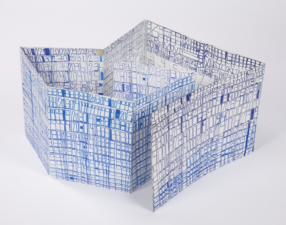
Courttney Cooper
Cincinnati Map, 2010, ballpoint pen on collaged paper, 64" x 88"
Untitled, 2015, ballpoint pen on collaged paper, 52" x 80"
Cincinnati Map, 2009, ballpoint pen on collaged paper, 51" x 85"
Cincinnati Map, 2009 (detail)
Cincinnati Map, 2009 (detail)
images courtesy Western Exhibitions and Visionaries + Voices
Cooper’s oeuvre is a ongoing narrative featuring Cincinnati, imparted with adoration and idealism. Drawings that are tenaciously committed to archiving the city’s developing reality in bic ballpoint pen, Cooper documents the destruction of old buildings and construction of new ones, while modifying details to reflect the time of year (often after they've been hung in an exhibition space). But they are also richly populated with celebratory, idealistic imagery - flags flying on rooftops, hot air balloons traversing the sky above the river, “Do not be afraid, be a precious friend! Zmile, you’re in Zinzinnati Ohio USA 2011”.
Cooper’s works are often characterized as maps, which isn’t an entirely accurate categorization. Visionaries + Voices’ Krista Gregory points out:
I've come to learn that Courttney has been drawing "aerial views" of Cincinnati since he was a small child, first using an etch-a-sketch. His mark-making certainly reflects having this type of information/tool...I see the work that Courttney creates more in the vein of landscape, or townscape; as they are romantic in their visceral love for this place...I think that this work being categorized as ‘maps’ is misleading and couches them in something that is more related to Courttney's disability rather than to what it is that he is actually expressing and creating. They are not accurate. They are not drawn completely from memory. I've witnessed people hold on to wanting to think these things because it makes the work accessible or novel in some way. I sort of think that it is a reductive way to see them
The desire to see Cooper’s works as maps may be the consequence of trying to categorize autistic thinking - relegating autistic artists as spectacles of savant-ism. Courttney Cooper, however, is not comparable to Stephen Wiltshire, for example; his drawings are not an accurate configuration of streets as a road map indicates, nor are they a repetitious anonymous depiction of a city in an illustrative way. They're indeed informed by an intimate experience with his city - an astounding wealth of information accumulating across increasingly massive surfaces (created by gluing together scrap paper that Cooper gathers while working at Kroger). But this isn't the subject of the work, it's only the formal foundation that serves as a vehicle for Cooper’s voice. Cooper’s drawings are a complex and authentic network of specific places and structures; his streets are composed of details from memory or observation, cataloging expressions of particular perceptions in particular moments. The relationship of these moments to each other in space is approximated, as in memory - all of which culminates in a dizzying realm of overlapping information that becomes a living record, adorned generously with nostalgic, commemorative expressions of community and identity.
Zinzinnati Ohio USA: The Maps of Courttney Cooper curated by Matt Arient, is a selection of Cooper's drawings from 2005 - 2015, currently on view at Intuit through May 29th. Cooper is represented by Western Exhibitions in Chicago, where he has an upcoming solo exhibition November 12 - December 31, 2016. Cooper has maintained a studio practice at Visionaries + Voices in Cincinnati since 2004; he has exhibited extensively in the greater Cincinnati area and has work in the Cincinnati Art Museum collection. Selected exhibitions include the Wynn Newhouse Exhibition at Palitz Gallery, Syracuse University (as a 2015 Wynn Newhouse Award recipient), Cincinnati Everyday at the Cincinnati Art Museum, Maps + Legends: The Art of Robert Bolubasz and Courttney Cooper at Visonaries + Voices, Studio Visions at the Kentucky Museum of Art, Cincinnati USA: Before Meets After at PAC Gallery, and Indirect Observation at Western Exhibitions.
Julian Martin
Untitled (motorbike), pastel on paper, 15" x 11", 2014
Untitled (White on Cream), pastel on paper, 15" x 11 1/4", 2010
Untitled (Orange Shape and Khaki), pastel on paper, 15" x 11 1/4", 2010
Untitled (parrot), pastel on paper, 15" x 11", 2014
Like other progressive art studio artists at the Outsider Art Fair, Julian Martin works from found imagery culled from magazines (often art publications). Whereas Helen Rae pushes found imagery to greater levels of complexity and reality, and Marlon Mullen and Andrew Hostick retell images in their own vocabularies, Martin pares the image down to a series of perfectly resolved moments in which a series of forms (each powerful and resolved in their own right), is described with an abundance of velvety pastel marks applied deliberately and seamlessly with a deft touch. Martin achieves a ubiquitous softness - soft colors, shapes, surfaces, and materials, yet always precise and controlled in application, saturating the surface while maintaining the boundaries of each form with conviction.
Initially, Martin’s work seems aesthetically akin to the work of many young artists currently revisiting concepts of early abstraction with suggestions of the figure, such as Brooklyn-based painters Austin Eddy and Tatiana Berg. However, where these artists revisit and re-imagine the ideas of artists like Picasso and Dubuffet, who were themselves appropriating the aesthetics of outsiders, Martin is the real thing. Not in that he is a “real outsider” (at this point Martin is quite well established professionally, certainly as much an insider as any artist living and working in Melbourne), but rather that his works, in sum, lack any tone of irony or nostalgia; the strength of resolution that each of Julian Martin’s drawings finds is achieved through a minimalist’s sensibility, preoccupied with the absolute rather than a historical context, more comparable to Malevich, Gottlieb, or Mondrian than Cubism or Art Brut.
The proposition underlying Martin's work seems to be that a found image may, inevitably or inherently, possess a more perfect resolution that can be exposed through a measured and thoughtful process of reduction. Unlike Mondrian, the absolute is not found in total abandonment of the original, but in the poetic and specific distillation of the identity and expression of the image.
Martin has attended Arts Project Australia in Melbourne since 1988 and has exhibited extensively at various venues in Melbourne since 1990. He has also shown previously at Fleisher/Ollman (Philadelphia), several Outsider Art Fairs (NYC), Museum of Everything (London), MADMusée (Belgium), Phyllis Kind Gallery (NYC), Jack Fischer Gallery (San Francisco), among others. Martin is represented by Fleisher/Ollman and Arts Project Australia.
Yasmin Arshad
Untitled, marker on paper, 22" x 30"
129999, marker on paper, 22" x 30"
Untitled, marker and acrylic on wood, 19.5" x 19.5"
Untitled, marker on paper, images courtesy Gateway Arts
Arshad’s distinctive works are characterized by series of numbers, phrases, and concepts of time that manifest in the form of visual and spacial poetry. An investigation of the overlap in the process of seeing and reading akin to Christopher Wool is present - where Wool employs the arrangement of words on a surface to disrupt the reading process systematically, Arshad’s visual and written languages instead merge more fluidly. Text forms, influenced by dynamics of color and scale, impose elusive and subjective variation in the reading experience.
Arshad’s work reflects an avid interest in ideas related to the passage of time. An invented symbol for eternity, 129999 (a single number indicating all months and years), often surfaces in her work; she also lists years chronologically beginning with the year 2000, organizing the numerical information into multi-colored grids. Over the course of 46 years, Roman Opalka painted horizontal rows of consecutive, ascending numbers (1 – ∞), an ongoing series that ultimately spanned 233 uniformly sized canvases. In “Roman Opalka’s Numerical Destiny” for Hyperallergic Robert C. Morgan writes:
From the day his project began in Poland until his death in the south of France in 2011, Opalka combined clear conceptual thinking with painterly materials. His search for infinity through painting became a form of phenomenology, which, in retrospect, might be seen as parallel to the philosophy of Hegel. Through his attention to a paradoxically complex, reductive manner of painting, Opalka focused on infinite possibilities latent within his project.
Arshad’s rigorous, repetitive approach is similar to 0palka’s engagement with infinity, yet there are more prevalent breaches in her pattern-based system. Much like the process of weaving, Arshad’s drawings reflect an intrinsic structure that serves as a guide for intended visual results, yet there is room for distortion and a spontaneous response to the surface.
Arshad (b. 1975, Florence, Italy) has exhibited previously at Cooper Union (NYC), the Outsider Art Fair, The Museum of Everything (London), Phoenix Gallery (NYC), Berenberg Gallery (Boston), Trustman Gallery (Simmons College, Boston), Drive-By Projects (Watertown, MA), Creativity Explored (San Francisco), and at Gateway’s Gallery in Brookline, Massachusetts. Arshad lives in Cambridge, Massachusetts and has attended Gateway Arts’ studio since 1996.
see more work by Arshad here
Luis Hernandez
Untitled, marker on vellum, 8.5" x 11" 2015
Untitled, marker on vellum, 8.5" x 11" 2015
Untitled, marker on vellum, 18" x 24" 2015
We were fortunate to meet Luis Hernandez at a turning point in his creative practice, as he was beginning this body of work, a series of marker drawings on vellum. Aesthetically, they’re exciting abstractions; energized and vibrant, each complex composition is perched between intuitive and systematic visual ideas. Hernandez's work effortlessly achieves what many contemporary artists currently investigating abstraction strive to, with the re-emergence of a Twombly-esque aesthetic.
Observing Hernandez in the studio, it's impossible not to feel a sense of wonder at the mysterious and dynamic nature of his prolific creative process. The contrast of expressive and systematic qualities in his work is mirrored in his disposition, which is that of an extremely earnest and affable man, with a great aspiration to speak directly and connect with the world beyond himself, but whose way of thinking and seeing is fantastically disparate from that of his neurotypical peers.
Because of his aspiration to communicate clearly, he was slow to fully embrace his instinctive practice and still sometimes strives to create representational work. When he attempts to draw from life, however, he’s never satisfied. During these moments, as he discards page after page of a sketchbook, the singularity of his experience is most clear as the renderings even he finds most successful have no obvious visual relationship to their subject. Once, an observer sympathetic to his frustration tried to assist by providing a dotted line as a guide; he has since adopted the dotted line, applying it to his abstract forms as though he can achieve a magical quality of objectivity from its presence.
In this body of work, Hernandez has described his process of drawing as moving along or searching for a path. If it’s a path, then it’s one he follows with great vigilance, a quality that he values deeply. His vigilance is a matter of faith, an inherent knowledge of the world that he believes in with great conviction; this is sometimes expressed in terms of his Tlingit heritage (referencing conversations in dreams with his ancestors or communications with Eagle or Raven) and at other times in drawing comparisons between himself and his idol, the ever vigilant Walker, Texas Ranger.
Hernandez maintains a studio practice in Juneau, Alaska at The Canvas; work from his current series will be included in an upcoming group exhibition curated by Disparate Minds writers Tim Ortiz and Andreana Donahue, which will be on view at The Canvas’ exhibition space in December.
drawing in progress in the studio
Terri Bowden
In her boldly marked drawings, Terri Bowden portrays the figures as if they are intense, strikingly present memories - fleshy and visceral in some aspects, but broadly summarized, distorted, and surreal in others. Faces are rendered with a realism and clarity that evokes vulnerability, re-contextualizing familiar icons of distant pop culture with a mysterious, untold narrative. Bowden’s work achieves the uncommon combination of dreaminess and gritty power reminiscent of Philip Guston. Recent exhibitions include Vis-à-vis curated by Michael Mahalchick at Andrew Edlin Gallery (New York) and stARTup Fair (San Francisco); her work will also be included in the upcoming exhibition Indigo Mind at StoreFrontLab (San Francisco).
Bowden works at Creative Growth's studio in Oakland, California; from Creative Growth:
"Terri’s whimsical and quirky sense of humor is delightfully evident in her artwork. Having befriended other albinos–who, like herself, are legally blind–Terri often uses albino animals and people as the subject of her drawings. Whether it’s reimagining Led Zeppelin’s Robert Plant, pop music icon Michael Jackson, or a nondescript winking punk rocker, Terri’s ability to capture the nuances of human expression exceeds far beyond the photos she uses as reference. Her fixation on albinism extends to ceramics as well, with her pigmentless fruit, Hershey’s kisses, cookies, rabbits and ducks, all executed in the same whitish pink palette that appears in her drawings." (more)
Harold Jeffries
Harold Jeffries, an artist at Center for the Arts (Little City) in Illinois (who was featured in the documentary Share My Kingdom) refers to these drawings as “blueprints for heaven.” As that phrase suggests, these works engage a complex creative space between the expression of narrative and a genuine concept of mystical utility. It is clear that for Jeffries these works are not merely drawings or paintings - they are acts part of a separate world, whose process includes finishing each work by drawing an elaborate phantom drawing for that unseen realm with his pen inches above the surface. Center for the Arts’ Frank Tumino elaborates:
"Harold Jeffries’ imagery and working methods are an outgrowth of his personal obsessions and inner world. Nearly every piece has as its basis a gridwork of lines, forming squares, rectangles, circles and other forms which resemble an isolated section of a vast blueprint outlining some lost Minoan palace. If asked, Jeffries will tell you that these are indeed blueprints. They are part of his lifelong obsession to create blueprinted plans for Heaven. This project has no beginning, middle or end. The portion of the plans that Jeffries draws at any one time simply reflects his thoughts at that moment, and do not advance the project along any conceivable timeline, a fitting solution for planning what is infinite and eternal.
The technique of layering, be it of forms, media, or concepts, is another hallmark of Jeffries’ art. Resulting in images which appear to be wholly abstract, Jeffries will sometimes layer additional media over his original blueprint drawings. He will alternate drawing media with washes of paint, obscuring the original blueprint in one spot, reemphasizing it in another, drawing new plans on top of it in yet another place. Sometimes all or part of the original drawing is overlaid with a tight mesh of faces and human forms. These are variously described by Jeffries as ghosts, or spirits, or voices. To him they are real, and they give the viewer an arresting glimpse of Jeffries waking life.
On occasion, Jeffries has taken his blueprints and worked them into 3-dimensional form. Harold is extremely interested in the use of construction materials. This fascination is evident in the decisions he makes to bring his ideas to reality of form. He prefers to reuse discarded materials like empty bottles. The act of building becomes a metaphor for Harold’s life and his sense of the world. He finds comfort in the idea that something both beautiful and useful is being created while the burden that would otherwise have been placed upon existing landfills is reduced." (More)
Sara Malpass
Untitled, ink on notebook paper, 8.5" x 11", 2014
Untitled Story, ink on notebook paper, 8.5" x 11", 2013
Untitled, mixed media on notebook paper, 8" x 10.5", 2014
This selection of lists are works by up and coming artist Sara Malpass, whose recent exhibition What Are Words For, was discussed in our overview of NIAD last year. Although Malpass’ fascination with words has informed the development of more traditional work (in the form of text-based paintings), her hand-written lists on notebook paper, whose reductive, pragmatic language serves as a striking and personal archive, continue to be central to her creative practice and oeuvre.
Malpass has exhibited work in the following selected exhibitions: Never Shout Never, organized by Jeffrey Cortland Jones (2015), What Are Words For (2014), Serenade: Lists, Poems and Missives (2013) and A Light That Never Goes Out: Continuing Traditions in Abstraction (2013), all at NIAD Art Center.
Roger Swike
This piece, from the collection of Disparate Minds writer Tim Ortiz, is a work by Roger Swike of Gateway Arts in Brookline, Massachusetts (the oldest progressive art studio we know of, founded over 40 years ago).
A collection of drawings created at different times and then deliberately assembled by Swike into a folder, it's an assertive, endearing proposition about what an art object can be. Each time Swike's lexicon is revisited, it presents an opportunity to rethink its nature - possibly an archive, message, map, poem, or something else entirely.
Within what initially appears chaotic, familiar text referring to the exterior world is everywhere. Black and blue ballpoint pens and ten colored pencils are used as though each tool has a symbolic role. Some ideas are organized neatly into grids, others are written, and everything written in multiple layers of ballpoint pen. Over time, subtle patterns emerge, such as references to the number 7 or numbers listed on their own counting down from ten (but when listed alongside the alphabet they ascend from 0 to 9).
Because the piece is disciplined and systematic, it's tempting to strive to understand a rigid system that defines it, but the true nature of the work seems to reside in the plasticity of its rules. A grid listing Loony Toons characters breaks pattern to include "YOSEMITE NATIONAL PARK SAM DONALDSON", numbers written in black pen without an overlapping of blue pen, yet the sequence and grid are still drawn using the ten selected colors…often it feels as though Swike isn't creating the system, but instead exploring it as a poet does language, both fluent and curious.
Edward Haswood
Edward Haswood, an artist who has been working at Hozhoni Artists in Flagstaff, Arizona since 2007, was able to meet with us to discuss his work during our studio visit last year. Storytelling, he explained, plays a crucial role in his work, citing his grandmother’s storytelling as an important influence. His dynamic body of work, which includes portraits and symbolic imagery, (as well as more complex narrative works) reference stories derived from merging mythologies of his native heritage (both Navajo and Hopi), his life experiences, and imagination.
Like many of his colleagues at Hozhoni, Haswood is doubly prone to being relegated into the “outsider” genre, as an artist who is both Native American and experiencing disabilities. Given this disposition, it's interesting that while Haswood's work bears little in common with either Outsider Art or traditional Native American art, it has an immediate aesthetic similarity (particularly in terms of color and design) to the work of contemporary Native American artists such as Wendy Red Star and John Nieto.
John Patrick McKenzie
John Patrick McKenzie has been working at Creativity Explored in San Francisco since 1989; we were able to meet him briefly during our tour of the Creativity Explored studio last year. He's has an exceptionally reserved and focused character, and didn't allow our visit to distract his attention away from a methodical and specific preparation of his work-space. McKenzie's works on paper are the perfect expression of a wonderfully inventive sense of humor that couldn't be expressed otherwise. His text, color choices, repetition, and occasional incoherence all contribute to a poetic charisma that is profoundly endearing. From Creativity Explored:
"Swirling, multiangled, and disorienting, the placement of his language comments on the contradictory, sometimes overwhelming, nature of media attention and celebrity. McKenzie’s original script and arrangement of text are tactile examples of his interpretation of the world, and can be both hilarious and poignant. " (more)
Jenny Cox
The decorative elements of Jenny Cox’s work explore the idea of embellishment as something reduced, authentic, and mysterious. Outlines, underlines, collections of dots, etc. access the romantic idea that meaning and value can be imbued in a work purely through the act of mark-making. Liza Lou, known for laboriously embellishing common objects with thousands of glass beads, has said “Everything has meaning. That's the philosophy of my work. Absolutely everything has meaning if you give it meaning.”
In Cox’s work, these decorative elements are not a spectacle, they are bare, intuitive marks giving meaning through this universal language of embellishment to each part of a complex network of text and forms, whose personal significance to Cox is beyond speculation.
Jenny Cox has been creating art at the Philadelphia progressive art studio Center for Creative Works since 2012.