Dale Jackson at White Columns presents a significant selection from the Cincinnati-based artist’s extensive body of work for his first New York exhibition. Brimming with a disarming sincerity and candor, Jackson’s imaginative missives are a breath of fresh air...
Read MoreThe Eloquent Place: Harald Stoffers and Josef Hofer at Cavin-Morris Gallery
Harald Stoffers, Brief 163, 2010, Waterproof felt tip pen on cardboard, 39.375 x 27.5 inches
The Eloquent Place is a powerful exhibition featuring intimate works on paper by Harald Stoffers and Josef Hofer, currently on view at Cavin-Morris in NYC. In a compelling pairing of these artists Cavin-Morris proposes:
Both artists seek to establish a sense of internal and external Place by creating worlds that unfold within and around their own bodies. The act of drawing is a method of controlling survival; in Hofer's case figuratively, and in Stoffers’ case by emotionally charging the written words with visual intensity. For both the art becomes a conduit toward a way of balance and self-placement in the world.
The dialogue between the two bodies of work results in a rich commingling of concepts and earnest explorations of representation versus abstraction through drawing. The opposition of systematic processes with highly personal subject matter reveals a strong connection between the work of Stoffers and Hofer, while exposing a candid vulnerability.
Josef Hofer’s partially clothed and fully nude figures originated as self-portraits drawn from memory of his reflection in a small mirror (with a substantial, ornate wooden frame) placed on his bedroom floor. The priority of his images resides in the recollection and expression of sections of the body, connections of limbs and folding flesh - not reflecting a moment in time or visual representation of the figure, but rather a narrative of observation. He captures a series of moments spent noticing the body, which is then recalled as drawing. Abstract of the obfuscating influence of rendering, likeness, or proportions, Hofer’s marks are naked as they describe the truncated contours of the body he recalls.
An important element included in every portrait, is the frame around the perimeter of the drawing surface (always alternating in bands of orange and yellow colored pencil, outlined in robust graphite). Speculations surround the origin or purpose of this frame; it's generally understood as a depiction of the frame of Hofer’s mirror, although it’s included in every piece, not just the drawings featuring figures. Hofer doesn’t discuss or explain his work since he’s primarily non-verbal - ultimately the genesis and nature of this device remains unclear.
It is certain that, much like its presence in Martin Ramirez’s drawings, the frame is an integral element and not merely a decorative one; Hofer has included it consistently since 2003, though in various iterations. Created slowly and deliberately (as evidenced by the labored impressions of his blunt implement), the frame often becomes quite elaborate and is even more time intensive to develop than the current variation of figure within. Elisabeth Telsnig, who worked with Hofer (at the creative program he attends) in Ried, Austria from 1997 until recently, states, “He draws a figure again and again, looking for ‘the perfect figure’, ‘the perfect position’. Only, when he has the impression, he has found it, can he stop the series. He seems to like to to be under constraint.”
The drawing of the frames is formally opposite to that of the figures (using a straight edge) and bound by consistent rules across all of his works - always orthogonal (even when they evolve to deviate from the rectangle of the perimeter) and meeting at a diagonal, as a frame does.
It's important to notice the use of a straight edge by an artist whose figures are drawn in such a personal way, in which his hand is exposed. The use of a mechanical tool or process to contrast with (or justify) this exposed hand is almost universal throughout art history. From the explicit use of geometric and mathematical rules to restrict the influence of the artist’s voice in catholic iconography, to JMW Turner’s bits of architecture providing an armature for an ethereal expression of light and air, to Gerhard Richter’s squeegee obscuring his hand-painted marks. Chuck close’s grids, Gabriel Orozco’s checkered patterns, the frame itself, or the smooth white walls of a gallery space all strive to achieve the same end as a pencil guided along a straight edge - respite from the expressive responsibility of mark-making, submission to something sure, inert, and objective. In Hofer’s work these methodical choices build inward towards his figures, sometimes working their way around, completely enveloping them. The interactions of these opposing processes is a highly original visual and procedural poetry.
Josef Hofer, Untitled, 2007, pencil and colored pencil on paper, 17.32 x 23.62 inches
Josef Hofer, Untitled, 2014, Pencil and colored pencil on paper, 19.69 x 27.56 inches
Josef Hofer, Untitled, 2005, Graphite and colored pencil on paper, 17.32 x 23.62 inches
Josef Hofer, Untitled, 2005, (detail)
Harald Stoffers’ cascading rows of horizontal lines and text are hand-written letters, most often addressed to his mother. Deeply diligent and well-meaning, his notations describe in great detail ordinary daily events such as his choice of clothing, travel schedules, or activities, yet also embody a more romantic personal narrative and the endeavor of carefully poring over increasingly monumental letters that are rarely sent. This daily ritual of letter-writing has dominated his practice for over twenty years. They have increased in scale since Stoffers began working in the Hamburg studio at Galerie der Villa in 2001; previous to that he would freely give away very small notes to anyone around him.
Stoffers generously establishes a preliminary, wavering framework that mimics ruled paper, which is then loosely used as a guide for the placement of text. In a palette even more restricted than Hofer's, his erratic script primarily appears in black ink, with an occasional rogue excerpt in blue. Inconsistent in spacing behavior, the text expands, contracts, and sometimes much taller letters span several lines. Stoffers very often draws over every line repetitively, with some words receiving more emphasis than others; original text is often obscured by the subsequent layers of mark-making, ultimately rendering it illegible.
In Stoffers’ work, a similar contrast between the systematic and personal are engaged with in a different manner than Hofer’s corporeal vernacular. In his works, which resemble sheet music or unraveling textiles from a distance, the striations and the text itself provide his objective process, where his unsteady hand and his vision through language provide the contrasting expression. Where Hofer uses a system of structured marks to assert a rigid context for his figures, Stoffers appeals to a familiar methodology to assert himself dutifully, not inventing a system, but engaging in common, learned systems - penmanship, list making, and the organization of language.
The conversation between Stoffers and Hofer in The Eloquent Place compliments the dialogue between vision and process within each artist’s work. The association that relentless drawing, manipulating, or obscuring of text has to the content and intention of that text can be understood in terms of the relationship of Hofer’s systematic straight lines to his divulging recollections of the figure, and vice versa. The intellectual depth of these parallels isn’t in the specifics of their implications, but in the quiet emotional power of their coexistence in this installation. These bodies of work are typified by genuine intention, vulnerability, and a complete faith in the meaningful act of drawing to validate their messages through diligent labor as draftsmen.
Harald Stoffers and Josef Hofer will be on view at Cavin-Morris through October 8th.
Harald Stoffers, Brief 295, 2014, Ink on paper, 11.5 x 8 inches
Harald Stoffers, Brief 336, 2014, Waterproof felt tip pen on paper, 16.5 x 11.75 inches
Harald Stoffers, Brief 192, August 12th, 2011, Ink on paper, 19.75 x 19.75 inches
Harald Stoffers, Brief 192, August 12th, 2011 (detail), all images courtesy Cavin-Morris Gallery
Mapping Fictions: Daniel Green
Daniel Green, Fifteen People, 2009, Mixed media on wood, 14.25 x 22.5 x 1.75 inches
Daniel Green, Little Mac vs Soda Poponski, 2015, mixed media on wood, 11.5 x 15 inches
Daniel Green, The Sun, 2015, mixed media on wood, 6 x 16.5 x 1 inch
Daniel Green, Business Delivery, 2011, Mixed media on wood, 13 x 29 x 1 inches
Daniel Green's process is slow and intimate; quietly hunched over his works in the bustling studio, he draws and writes at a measured pace. These detailed works are an uninhibited visual index of Green’s hand; when read carefully, they become jarring and curious, slowly leading the viewer to meaning amid the initial incoherence. Green’s text is poetic and complex - language and thought translated densely from memory in ink, sharpie, and colored pencil on robust panels of wood. Figures and their embellishments are drawn without a hierarchy in terms of space occupied on the surface; they are at times elaborate and at other times profoundly simple. The iconic figures’ facial expressions (Jesus, Abraham Lincoln, Tina Turner, video game characters, etc.) are generally flat with proportions stretching and distorting subject to Green’s intention.
Ultimately, these drawings compel the viewer to internalize and decipher Green’s ongoing, non-linear narrative. His drawings call to mind Deb Sokolow’s humorous, text-driven work, but are less diagrammatic and concerned with the viewer. In an interview with Bad at Sports’ Richard Holland, Sokolow elaborates on her process:
I’ve been reading Thomas Pynchon and Joseph Heller lately and thinking about how in their narratives, certain characters and organizations and locations are continuously mentioned in at least the full first half of the book (in Pynchon’s case, it’s hundreds of pages) without there being a full understanding or context given to these elements until much later in the story. And by that later point, everything seems to fall into place and with a feeling of epic-ness. It’s like that television drama everyone you know has watched, and they tell you snippets about it but you don’t really understand what it is they’re talking about, but by the time you finally watch it, everything about it feels familiar but also epic. (Bad At Sports)
Much like Sokolow, Green engages in making work that begins with the rigorous practice of archiving information culled from his surroundings and interests, which then develops into intriguing, fictitious digressions. Dates and times, tv schedules, athletes, historical figures, and various pop culture references flow through networks of association - “KURT RUSSEL GRAHAM RUSSEL RUSSEL CROWE RUSSEL HITCHCOCK AIR SUPPLY ALL OUT OF LOVE…” Although the listing within his work sometimes gives the impression of being intuitive streams of consciousness, most of it proves to be very structured and complex within Green’s system. Rather than expression or even communication, the priority seems to be the collection of information or organization of ideas; the physical encoding of incorporeal information as marks on a surface is a method for making it tangible, possessable, and manageable.
Daniel Green, Pure Russia, 2011, Mixed media on wood, 9 x 23 x 3.5 inches
Pure Russia (detail)
From the perspective that Green invents, there’s an endless number of time sequences that haven’t been considered before. A grid of days and times (as in Pure Russia) imagines time passing in increments of one day and several minutes, then returns to the beginning of the series, stepping forward one hour, and proceeding again just as before. It could be cryptic if you choose to imagine these times having a relationship to one another, or it could instead be an original rhythm whose tempo spans days, so that it can only be understood conceptually as an ordered structure mapped through time - the significance of the pattern superseding that of specific moments.
By blurring the distinction between the articulation of ideas through text and the development of mark-making, Green’s highly original objects become unexpectedly minimal and material, yet simultaneously personal and expressive.
Daniel Green’s work will be included in Mapping Fictions, an upcoming group exhibition opening July 9th at The Good Luck Gallery in LA, curated by Disparate Minds writers Andreana Donahue and Tim Ortiz. Green has exhibited previously in Days of Our Lives at Creativity Explored (2015), Create, a traveling exhibition curated by Lawrence Rinder and Matthew Higgs that originated at University of California Berkeley Art Museum and Pacific Film Archive (2013), Exhibition #4 at The Museum of Everything in London (2011), This Will Never Work at Southern Exposure in San Francisco, and Faces at Jack Fischer Gallery in San Francisco.
Yasmin Arshad
Untitled, marker on paper, 22" x 30"
129999, marker on paper, 22" x 30"
Untitled, marker and acrylic on wood, 19.5" x 19.5"
Untitled, marker on paper, images courtesy Gateway Arts
Arshad’s distinctive works are characterized by series of numbers, phrases, and concepts of time that manifest in the form of visual and spacial poetry. An investigation of the overlap in the process of seeing and reading akin to Christopher Wool is present - where Wool employs the arrangement of words on a surface to disrupt the reading process systematically, Arshad’s visual and written languages instead merge more fluidly. Text forms, influenced by dynamics of color and scale, impose elusive and subjective variation in the reading experience.
Arshad’s work reflects an avid interest in ideas related to the passage of time. An invented symbol for eternity, 129999 (a single number indicating all months and years), often surfaces in her work; she also lists years chronologically beginning with the year 2000, organizing the numerical information into multi-colored grids. Over the course of 46 years, Roman Opalka painted horizontal rows of consecutive, ascending numbers (1 – ∞), an ongoing series that ultimately spanned 233 uniformly sized canvases. In “Roman Opalka’s Numerical Destiny” for Hyperallergic Robert C. Morgan writes:
From the day his project began in Poland until his death in the south of France in 2011, Opalka combined clear conceptual thinking with painterly materials. His search for infinity through painting became a form of phenomenology, which, in retrospect, might be seen as parallel to the philosophy of Hegel. Through his attention to a paradoxically complex, reductive manner of painting, Opalka focused on infinite possibilities latent within his project.
Arshad’s rigorous, repetitive approach is similar to 0palka’s engagement with infinity, yet there are more prevalent breaches in her pattern-based system. Much like the process of weaving, Arshad’s drawings reflect an intrinsic structure that serves as a guide for intended visual results, yet there is room for distortion and a spontaneous response to the surface.
Arshad (b. 1975, Florence, Italy) has exhibited previously at Cooper Union (NYC), the Outsider Art Fair, The Museum of Everything (London), Phoenix Gallery (NYC), Berenberg Gallery (Boston), Trustman Gallery (Simmons College, Boston), Drive-By Projects (Watertown, MA), Creativity Explored (San Francisco), and at Gateway’s Gallery in Brookline, Massachusetts. Arshad lives in Cambridge, Massachusetts and has attended Gateway Arts’ studio since 1996.
see more work by Arshad here
Louis DeMarco
Fear Love
Cloud Chart
Halo Chart
Hank the Hawk
Louis DeMarco is a Chicago-based artist who has been making art at Project Onward since 2005. His works manifest bits and pieces of a robust alternate reality of his own invention, serving as the basis for creative endeavors of all kinds. The ideals of this other world seem to be characterized by clarity and definition, both aesthetically and conceptually. It’s a place without chaos but not without evil, and where the intangible becomes tangible, concrete, sortable, and clearly arranged. Each work provides new insight into this other place and as the endeavor proceeds, it’s a vehicle for the charismatic and poetic voice of its author.
“A natural comedian, DeMarco infuses humor into serious topics such as disappointment, anxiety, paranoia and relationship negotiations through his series of “Words to Live By” signs, executed in a brilliantly colored Simpsons-esque palatte. Originally a riff on Tom Hanks’ character’s terminal illness (a “brain cloud”) in the comedy classic Joe Versus the Volcano – charting and mapping continue in DeMarco’s popular Cloud Chart series, which catalogs “bad states”, followed later by a series of antidotes (“positive states”) in the Halo Chart series.
DeMarco is also an accomplished bass player for the rock band DHF Express, fronted by fellow Project Onward artist Adam Hines. DeMarco writes original lyrics and music and is developing several screenplays for musicals and comedies. He joined Project Onward in 2005 and currently lives in Chicago’s West Town neighborhood.” (more)
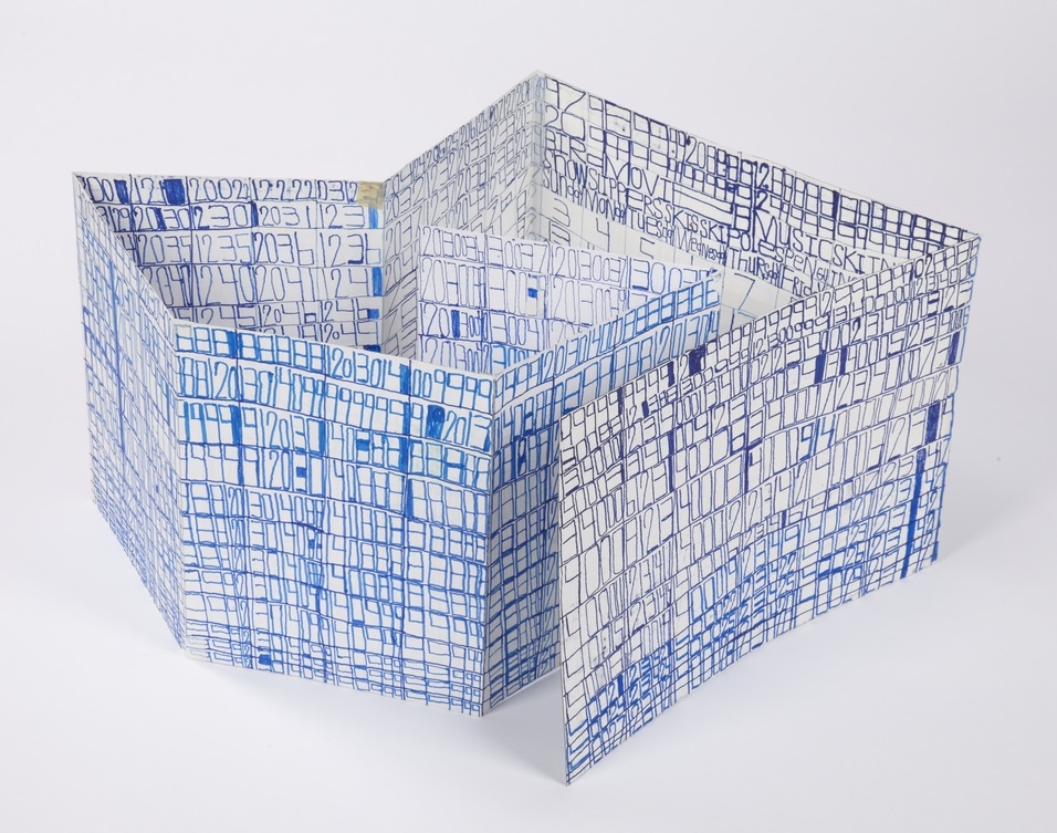
Roger Swike
This piece, from the collection of Disparate Minds writer Tim Ortiz, is a work by Roger Swike of Gateway Arts in Brookline, Massachusetts (the oldest progressive art studio we know of, founded over 40 years ago).
A collection of drawings created at different times and then deliberately assembled by Swike into a folder, it's an assertive, endearing proposition about what an art object can be. Each time Swike's lexicon is revisited, it presents an opportunity to rethink its nature - possibly an archive, message, map, poem, or something else entirely.
Within what initially appears chaotic, familiar text referring to the exterior world is everywhere. Black and blue ballpoint pens and ten colored pencils are used as though each tool has a symbolic role. Some ideas are organized neatly into grids, others are written, and everything written in multiple layers of ballpoint pen. Over time, subtle patterns emerge, such as references to the number 7 or numbers listed on their own counting down from ten (but when listed alongside the alphabet they ascend from 0 to 9).
Because the piece is disciplined and systematic, it's tempting to strive to understand a rigid system that defines it, but the true nature of the work seems to reside in the plasticity of its rules. A grid listing Loony Toons characters breaks pattern to include "YOSEMITE NATIONAL PARK SAM DONALDSON", numbers written in black pen without an overlapping of blue pen, yet the sequence and grid are still drawn using the ten selected colors…often it feels as though Swike isn't creating the system, but instead exploring it as a poet does language, both fluent and curious.