Masters and Emerging Artists at the Outsider Art Fair

Art Project Australia’s Julian Martin at Fleisher/Ollman

At the 24th annual Outsider Art Fair in New York, it was clear that there has been a profound shift. Superficially, the aesthetics are far from the folk art antique shop feel of the past, having assimilated to a presentation more typical of the mainstream - a change generally attributed to one of field’s most successful champions and current fair organizer, Andrew Edlin. On a deeper level, the definition of “outsider” is flexed to a degree that's able to contain a broad spectrum of idiosyncratic works - from the visionary scarecrows of the late Memphis-based artist Hawkins Bolden, to Marlon Mullen’s lush abstractions, to an installation of 3D printed sculptures designed by 65 unconnected collaborators (presented as the work of a manufacturing company, Babel curated by Leah Gordon). Abandoning category without losing identity, the context of this forum has evolved rapidly over the past few years.

In a review of the fair for Design Observer, John Foster recalls that at the inception of the genre, early outsider art dealer Sidney Janis introduced the concept that “serious art could be made by everyday people”, a notion that's difficult to sympathize with today (if artists aren't “everyday people” then what are they?). This train of thought still seems to have some novelty for some 74 years later, as illustrated by Barbara Hoffman’s odd New York Post headline “The artists at this amazing fair are prisoners, janitors, and mental patients”. Ultimately, Edlin has allowed the fair to begin to merge seamlessly with the mainstream by expanding to include a flexible set of principles rather than depending on this particular kind of romantic narrative structure. It’s no longer necessary that the artists work in isolation or live obscure, misunderstood lives.

Rather, it’s a space for excellent creative endeavors that are genuine and created for their own sake, or for a context not ordinarily included in the art world. The most essential principle underlying this movement is that the institution of the market isn’t what engenders great work. In a climate where Laura Poitras (a filmmaker and journalist with no prior fine art experience) has a significant exhibition opening today at the Whitney, the particular terms and intent with which the OAF brings divergent, highly original perspectives to the art world maintains a distinct and important purpose. 

The beauty of this more elastic definition is its efficacy both presently and retroactively, indicating that this isn’t so much a shift in paradigm as a greater understanding of why these works have been so compelling all along.

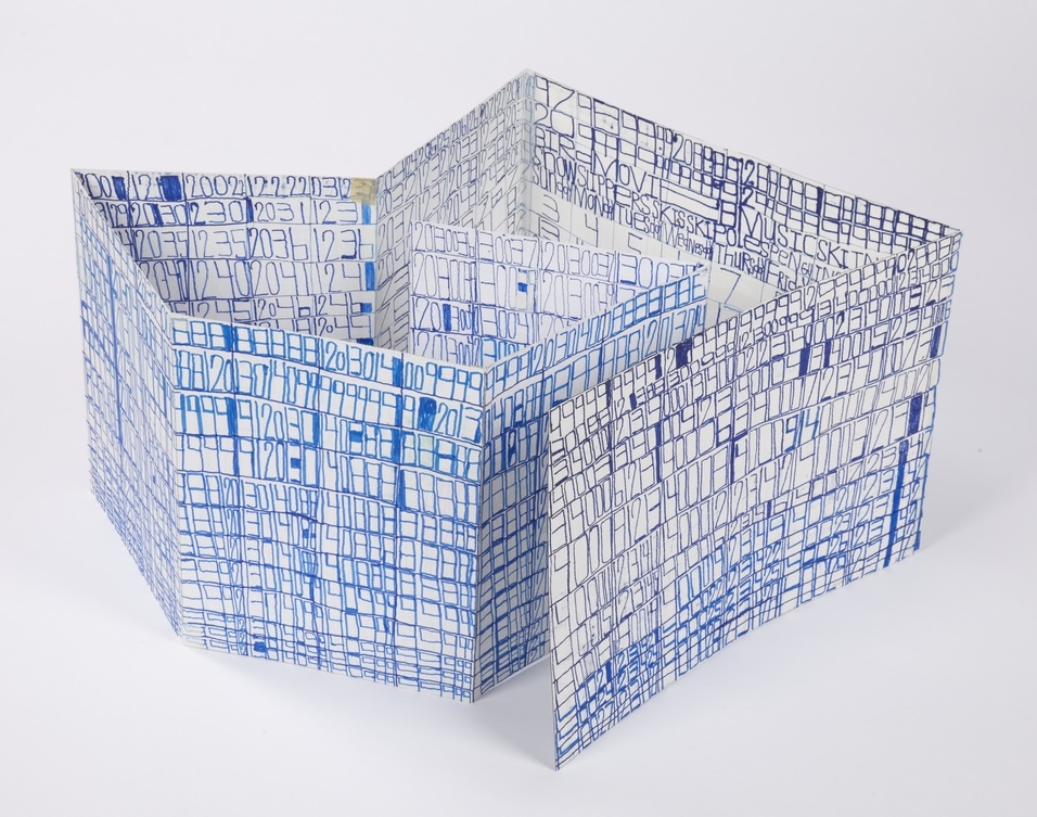
Hawkins Bolden at Shrine

As usual, titans of the self-taught canon were featured extensively throughout the fair: Henry Darger, Joseph Yoakum, Adolf Wolfli, Jesse Howard, Bill Traylor, Thornton Dial, Minnie Evans, Martin Ramirez, Gayleen Aiken, Frank Jones, Royal Robertson, and James Castle, etc. These masters (the ones who have inspired so many to work in this field) continue to be represented by fantastic works, not due to a traditional romantic narrative, but because of genuine, sophisticated, and highly original visions, as evidenced by their conceptual harmony with work by contemporary “outsiders”.

The fair's strongest and most relevant exhibitions, however, were contemporary works by artists who maintain studio practices at progressive art studios - a dynamic collection of installations that were, in sum, a tour de force eliminating any question about their importance to this emerging sub-market, and potential to sustain, develop, and gain momentum.

Marlon Mullen at JTT/Adams and Ollman

Marlon Mullen, NEWS (P0329), acrylic on canvas, 24" x 36"

The fair’s most important moment, and starkest example of the flexed "outsider" categorization, was the joint exhibition of NIAD’s Marlon Mullen by New York’s JTT Gallery and Portland’s Adams and Ollman - a solo exhibition of reductive acrylic paintings, with content explicitly referencing the contemporary mainstream. The narrative justification for its inclusion would be the assumption that these abstractions are defined by an unusual way of thinking and seeing, as opposed to a neurotypical artist’s contrived deconstruction of found imagery. Whether Mullen is engaging in abstraction in the traditional sense, creating representationally from his own perspective, or whether there is no meaningful difference between representation and abstraction in his experience is impossible to determine. Ultimately, their genesis becomes irrelevant because the elusive power of the imagery is an amalgamation of the inherently expressive nature of the work's formal elements, which isn’t dependent on a mutually understood way of seeing. The real triumph and importance of Mullen’s work lies in the revelation that their mysterious conceptual origin only causes their success to be more fascinating, and that they’re pushed to a degree of technical sophistication that’s unmistakably impactful. His paintings are paradoxically thoughtful and casual, as awkward as they are bold, as messy as they are delicate. These pieces embody a deeply genuine and intuitive quality that coexists with a strength defined by specificity and fine tuning.

Helen Rae at The Good Luck Gallery

Helen Rae, July 1, 2015, colored pencil and graphite on paper, 24" x 18"

The fair’s most generous moment was The Good Luck Gallery’s installation of stunning Helen Rae drawings - surfaces saturated with vigorous mark-making culminate in robust, stylized worlds rendered in graphite and colored pencil. Rae’s counter-intuitive re-imagining of the boundaries between abstraction and representation are thrillingly confounding. Strong graphic or patterned passages have an inexplicable sense of depth and form, which transition into fields scattered with spare details, achieving an almost photographic quality - all of which emerges from a surface that (when examined closely) possesses a roughly inscribed physicality. The continuous stream of excellent new drawings replacing sold work served as a testament to the promise of this prolific septuagenarian as an emerging phenomenon to watch. 

Andrew Hostick at Morgan Lehman

Photos do little to capture the true nature of Andrew Hostick's drawings at Morgan Lehman Gallery. Not evident above is the experience of approaching this simple red, blue, and brown figure eight to discover that it’s surrounded by an opaque, shimmering field of marks in white colored pencil, worked hard into the mat board surface. The mystery of choosing to color a white surface white, is in its own way explained and not compounded by its eventual effect: fantastic moments of wonder in a distinct and familiar space. The curious effect of this subtlety achieved in such a laborious manner lays a foundation for the elusive mood that runs throughout all of Hostick’s works. He seems to search for, and with great success, achieve abstractions that aren’t just poignant in a general sense, but evoke a beautifully bleak, arid quality that seems to romantically belong to Ohio. 

Andrew Hostick, Leon Polk Smith: A Constellation with Works on Paper, graphite/colored pencil on mat board,


Kenya Hanley, Family Matters, 2015, Mixed Media on Paper, 17" x 14", image courtesy Land Gallery

Other highlights included the velvety pastel abstractions of Art Project Australia’s Julian Martin at Philadelphia’s Fleisher/Ollman, humorous, pop-culture driven drawings by Kenya Hanley and Michael Pellew at LAND Gallery, Harald Stoffers at Cavin Morris Gallery, Joe Minter and Lonnie Holley at James Fuentes, Evelyn Reyes, Daniel Green, and Camille Halvoet at Creativity Explored, Terri Bowden, Susan Janow, and William Scott at Creative Growth, Walter Mika and Victor Critescu at Pure Vision, and an impressive quantity of work by artists at Japanese studios. Although only 4 progressive art studios exhibited independently at this year’s fair, their respective artists were prominently featured in a quarter of the exhibitions, including those of the most prominent dealers.

Henry Darger and Judith Scott at Andrew Edlin

Susan Janow, Untitled, colored pencil and micron on paper

Harald Stoffers, Brief 164, March 10th, 2012, ink on paper, 39.25" x 27.5", image courtesy Cavin Morris Gallery

Lonnie Holley at James Fuentes, NY

One of the most important insights from this year's Outsider Art Fair is that the progressive art studio can no longer strive to position itself as a neutral, invisible player between self-taught artists and an outsider art gallery. Undeniably, progressive art studios are poised to be a truly important movement, but, reflecting on this changing landscape it’s important that they critically evaluate their role in presenting work to the market. Despite their prevalence at the fair, gallerists had no reservations about expressing that they’ve been forced to stop representing artists they believe in due to studios' failures, ranging from unethical behavior (such as gifting works to program board members) to providing intrusive facilitation to simply being disorganized. The process of translation from outsider to the mainstream fine art market is delicate, and is something outsider art dealers are just now learning to do effectively; they’ve been an asset to studios because of their willingness to represent unique artists without ties to the broader art community. As the distinction continues to break down between outsider and insider, however, studios can only continue to be relevant if they’re able to proactively take on the responsibilities of translation and promotion typically provided by gallerists (including handling and documenting artwork properly). 

The future of this process is pioneered right now by career paths that resemble the ones profiled above: NIAD, JTT, Adams and Ollman, and Marlon Mullen; Visionaries + Voices, Andrew Hostick, and Morgan Lehman; First Street, Helen Rae, and Good Luck Gallery; and Creative Growth, William Scott, and White Columns.  Progressive art studios must believe in and champion each of their great artists with respect for their individual vision, with a focus on developing careers that extend beyond their program of origin.  

Mark Hogencamp, Untitled (IMG_2616), Digital C-print, 27" x 36", 2014

In the traditional narrative of outsider art, the career of an artist such as Mark Hogencamp would have ended with the initial discovery of Marwencol. Ideally in the past, he would have been deceased before the work was found and his fixed oeuvre would be intrinsically associated with the story of a strange man working in isolation and obscurity (much like Darger and Ramirez). Mark Hogancamp, however, is no longer obscure or working in isolation. His new work at this year's fair, scenes created using full-sized mannequins, are a clear and exciting new development in his creative process. Hogancamp’s work is not at all diminished by the open involvement of his facilitator and gallery director Eddie Mullins, who we spoke with at One Mile Gallery’s booth. In our conversation with Mullins, his relationship with Hogencamp was remarkably familiar. Marwencol is a project absolutely devised and driven by Hogencamp, but Mullins has no inhibitions about explaining that the use of mannequins began after he provided some for Mark. Mullins plays an instrumental role in how Hogencamp’s vision is ultimately seen as art, but his assistance isn’t mistaken for collaboration (much like the relationships sound engineers and producers have with musicians). In this way, the transparency of this relationship sets an important example for studios to follow.  

Recognizing the true nature of the facilitated creative process, including that provided by artist staff in the studio, must be fully open to criticism in order to progress; it’s simply too personal, dynamic, and delicate to be left out of the discussion. The next wave of great artists will come out of progressive art studios that are not only assisting artists to initiate a creative practice, but also provide innovative and ambitious new facilitation methods to further develop dynamic bodies of work.

Grace Coenraad

Grace Coenraad, Untitled, micron, sharpie, graphite, and india ink on paper, 2015, 16" x 16"

Grace Coenraad, Untitled, micron, sharpie, and india ink on paper, 2015, 22" x 22"

When I first painted a number of canvases grey all over (about eight years ago), I did so because I did not know what to paint, or what there might be to paint: so wretched a start could lead to nothing meaningful. As time went on, however, I observed differences of quality among the grey surfaces – and also that these betrayed nothing of the destructive motivation that lay behind them. The pictures began to teach me. By generalizing a personal dilemma, they resolved it.
           Gerhard Richter, From a letter to Edy de Wilde, 23 February 1975


Coenraad’s dark, minimalist works are the product of a measured and slow process, executed with extreme diligence. Using 08 black microns, traditional pen and ink nibs, and occassionally graphite, she densely hatches careful lines, which slowly collect on the surface over many hours of work. This method is a clear path leading to an absolute resolution - the surface being obscured by black. The magic of these pieces (although they’re inextricable from the story of the steadfast execution of this simple method) lies in content that’s fantastically nuanced and complex. The black square is a subtle, jagged field comprised of various sheens and tones - certain patches are tinted by an initial application of bright watercolor (often pink or blue) that has bled through the subsequent, inevitable layer of black. The marks made using microns are incised, and those created with india ink and nib lift the paper slightly away from the surface, resulting in a textured surface reminiscent of Richard Serra’s black oil stick drawings. And much like the reductive, sublime paintings of Richter or Clyfford Still, Coenraad demonstrates that the honest act of mark-making isn’t reduced when it’s stripped of intentions or illusion. Conversely, it only becomes more revealing and mysterious. 

After his first museum exhibition of entirely black drawings in 2011, Richard Serra was described by critic Roberta Smith as hermetic, abstract, difficult, and austere, an assessment that he accepted, describing it as “a virtue.” Explaining that art has to be difficult, Serra said that drawing independent of the flamboyance of color interaction, mark-making on its own, in black on white, proves to necessitate invention, thereby providing a “subtext” for how an artist thinks. For him, allover black works were a move to escape that convention of drawing as a “form to ground problem” to create works concerning “interval and space” rather than image.*  

Coenraad didn’t stumble upon this principle inadvertently like Richter; for her, it’s a process that reflects a way of being. It is, as Serra articulates, an extension of the thought process and more. To a degree that’s rarely seen for non-performative artists, Coenraad is an artist for whom the boundary between life and art is blurred. Every task is executed with the same resolute sensibility, engaging life with a singular and sophisticated method in pursuit of perfection. Every bite of food is carefully selected and examined before being eaten (ingredients of an undesirable color rejected), every mundane task is afforded great consideration. For years she has worked part-time at a document destruction facility, where no one has been able to compel her to obliterate more than one document at a time. At home, blackening crossword puzzle squares for hours with ballpoint pen or sharpie is part of her daily ritual.  

In the studio, Grace is fully immersed in her practice - working with her face close to the surface, she becomes absent from anything exterior of the drawing process. Occasionally she will stop and look around the room for a moment like a deep sea diver rising briefly to the surface, before submerging again. Grace doesn’t discuss her work, not because she can’t, but because there seems to be nothing necessary to say once a piece is finished. 

Between her larger, long-term works, Coenraad sometimes creates small graphite sketches,  thoughtful experiments that serve as a point of entry into her mysterious thought process. The placement of faces demonstrate the dynamics of orientation in her drawings. The coexistence of elements in combination with turning the paper many times while working isn’t incidental to the process, but essential to it.

Coenraad is a Juneau-based artist who maintains a studio practice at The Canvas in Juneau, Alaska. Her work will be included in an upcoming group exhibition curated by Disparate Minds writers Tim Ortiz and Andreana Donahue at The Canvas' exhibition space in December.

Progressive Practices: The Basics

We’ve added a new section on the site for pieces of writing concerning the methodology of progressive art studios. We hope these will be a valuable resource to those involved in this work, as well as anyone interested in this emerging model for artist development. This piece, which discusses the basic, essential components of a progressive art studio, is the first of many. As always, your feedback is appreciated. 

installation view of Judith Scott - Bound and Unbound, a recent exhibition at the Brooklyn Art Museum

“...there was an extraordinary amount of very strong and wonderful work coming out of these three studios…These centers, all three of which had been founded by the same couple, Florence and Elias Katz in the 1970s and 80s based on the same principles…I started to become intrigued by the question of why was there so much wonderful work coming out of these three art centers and was there something they had in common, some kind of methodology that was bringing forth such wonderful art…the methodology which was proposed by Florence and Elias Katz...which had to do with giving adult artists with developmental disabilities an opportunity to work in communal studios at hours which reflected the common work hours, five days a week 9-5, that these centers be connected to the art world, that there be a gallery connected to the studio, that there be not teachers but facilitators who would assist the artists in making their work, and that there would be a sales element.
        It’s interesting that the first of these centers was created at
exactly the same moment of Roger Cardinal’s famous Outsider Art definition of
outsider artists being cut off from the world and these centers were radically
connected to the world...”

- Lawrence Rinder, Director of the Berkeley Art Museum and Pacific Film Archive, discussing the exhibition Create, which he co-curated with White Columns’ Matthew Higgs in 2011. You can view the full panel discussion “Insider Art: Recent Curatorial Approaches to Self-Taught Art” here 

The Create exhibition in 2011 was inspired by the observation that the three Bay Area Katz-founded progressive art studios (Creative Growth, Creativity Explored, and NIAD) have been consistently creating high quality works and using a similar methodology, but without having much contact with each other (or studios elsewhere in the country) since their establishment. Our own research has found that this phenomenon isn’t limited to the Bay Area; studios have emerged across the country since deinstitutionalization began in the 70s - programs where incredible, valid art is created and whose methods include the same basic points. Although many progressive art studios have referred to the Bay Area programs as a development model, most were created prior to any knowledge of them. 

The spontaneous, isolated development of progressive art studios throughout the world indicates something important and unique about what these programs are and what they mean. The insight to be gained is that a model of acceptance rather than assimilation is viable and incredibly valuable, if the culture is forward-thinking enough to accept it. 

Whereas an assimilation methodology depends on developing a way of working with a person experiencing developmental disabilities that successfully produces the prescribed result (using contrived means to alter a way of being or behavior, to fit given expectations), the acceptance methodology begins with a perceived potential and conforms expectations to meet that potential with an open-ended concept of success. The acceptance model appears spontaneously because the potential identified, the creative person, exists universally. Conversely, the desired outcomes of assimilation methods depend on esoteric “best practices” informed by idealized or archaic concepts of behavior, professionalism, or generally appropriate ways of being.

Marlon Mullen, an exhibition currently on view at Atlanta Contemporary

As Lawrence Rinder points out, for the acceptance methodology of a progressive art studio to emerge and excel, it must simply operate on a handful of fundamental principles:

A radical connection to the world

Rinder references a radical connection, in direct contrast with Roger Cardinal’s definition of Outsider Art which is dependent on artists creating in isolation. A progressive art studio is also radically connected to the world in contrast with traditional services for people with developmental disabilities. 

Offering integrated services has long been an ambition of service providers for this population. This is not only because of the proven efficacy of integration, as demonstrated by examples of integrated schools, but also for the sake of cultivating a more inclusive community. In adult life, (post-school) the concept of integration and inclusion is far more complex; everyday life can not be simply “mainstreamed” the way that a school is. Progressive art studios provide opportunities for powerful forms of integration and inclusion that aren’t possible in any other form of support. Successful fine artists such as Judith Scott, Dan Miller, and Marlon Mullen (all of whom have been supported by progressive art studios) are the first examples of people receiving supported employment services who are internationally competitive and influential in their field.

This radical connection depends on the involvement of those at every level of the program who are personally invested in the practice of art-making. The work of facilitators and management must be informed by their knowledge of and personal investment in art (in the context of contemporary international and local culture, as well as art history). Employing fine artists as facilitators and studio managers also allows a connection to develop on a more fundamental level, in the peer relationships between artists in the studio (abstract of being on the providing or receiving end of services). This, in conjunction with the exhibition of artwork, offers unprecedented visibility and presence in the community, culminating in the best possible conditions for the development of genuine professional and personal relationships with other artists who are not paid supports.  

Nicole Appel, Animal Eyes and Russian Boxes, colored pencil on paper, 19″ x 24″, 2014, Pure Vision Arts, NYC

Investment of time

Artists having access to the studio and utilizing it for periods similar to regular work hours is extremely important. This point is a matter of principle and a good vehicle for advocacy of the progressive art studio model as a whole. 

Often, those involved in making decisions by committee with or on behalf of a person with a developmental disability (including parents, case workers, service coordinators, counselors, and other members of the “support team” who are not artists) will oppose large investments of time in the art studio. This occurs for the same reasons that parents oppose children pursuing artistic careers, schools persistently cut art programs, or illustrators, designers, etc. must argue the details of invoices with clients. Creative work as a valuable professional discipline is stigmatized as frivolous throughout american culture, and pushing for higher investments of time is the front line on which these studios combat this stigma. Although it takes place in a congregated and specialized setting, the progressive art studio is much like a job coaching service for those pursuing serious careers as fine artists.

Schedules should range from 6-8 hours per day and 2-5 days per week depending on how developed the artist is, what other employment services or opportunities they’re engaged in, and how much time they want or need to spend working on art. Generally speaking, artists should be permitted to commit as much time as they want to art-making and should be encouraged to commit as much time as they’re able. 

Project Onward's studio space in Chicago

An open studio

The studio must be a space belonging to the artists that’s conducive to creative work, where artists gather to maintain studio practices (not unlike a group of like-minded individuals in any workplace). The concept of the artists owning the space is crucial; providing opportunities for people experiencing developmental disabilities to create art is far more common than actual studios are, and this idea is one of the key distinctions of an approach that’s truly progressive.

There’s an obvious, superficial transition that can be made from a traditional day habilitation program to a shared art studio space. Both are fairly open workspaces where individuals exert themselves productively; several existing studios were once day hab programs or still operate under the pretense of being so in the eyes of Medicaid. However, even if a day hab program shifts its focus completely to art-making and physically becomes an art studio, it’s not a progressive art studio until it achieves a complete conceptual shift of paradigm. The space must be one in which the artists are free to invent and strive to meet expectations of their own devising, not a space where they’re guided to meet the expectations of staff. Any intensive one-on-one, step-by-step directions, or didactic practices must be eliminated. The goal of a progressive art studio is not to provide therapy, education, or any influence of assimilation - it’s to validate an artist’s experience and foster the capacity to share that experience on their own terms. 

It’s not necessarily the case, however, that a progressive art studio completely lacks an educational element. For studios that don’t have a limited admission with portfolio review, there’s a large group of new artists working in the studio who benefit from significant initial guidance in order to discover art-making and learn to value it. Also, the studio may need to set boundaries regarding the use of shared materials and it’s important all people using the space conduct themselves in a professional manner respectful of a communal work environment. This should be achieved with guidance and assistance as needed. Ultimately, though, the core goal must always be total creative independence. 

installation view at DAC Gallery in LA

A gallery and sales element

The gallery and sales element of the progressive art studio provides at least two essential functions. Firstly, as discussed above, exhibitions of artwork are a powerful form of integration into the community that’s not available by any other means. Even in cases where the artists don’t share a physical work space with other artists who aren’t paid supports, their presence and visibility in the community through a gallery show fosters connections with other artists and the general public on the artist’s terms.

Secondly, the handling and display of the work in a fine art exhibition space allows the studio to set an important example in the community for valuing the ideas and experiences of those living with developmental disabilities. By handling and installing the work professionally and making a meaningful investment of space and time in the gallery, the program makes a profound statement about the value of the artist, their ideas, and voice. 

Conversely, handling the work in a manner divergent from accepted standards of a professional artist, ie. overcrowded salon style shows, improperly installed or framed work, or uncritical exhibition of unsuccessful/unresolved works, makes the opposite statement about the work and artists, effectively presenting the work as other and lesser. Allen Terrell, Director of the ECF art centers and affiliated DAC gallery (one of the most professional gallery spaces directly affiliated with a progressive art studio) is driven by a simple principle: don't do anything with the artists’ work that you wouldn't do with your own. 

Yasmin Arshad

Untitled, marker on paper, 22" x 30"

129999, marker on paper, 22" x 30"

Untitled, marker and acrylic on wood, 19.5" x 19.5"

Untitled, marker on paper, images courtesy Gateway Arts

Untitled, marker on paper, images courtesy Gateway Arts

Arshad’s distinctive works are characterized by series of numbers, phrases, and concepts of time that manifest in the form of visual and spacial poetry. An investigation of the overlap in the process of seeing and reading akin to Christopher Wool is present - where Wool employs the arrangement of words on a surface to disrupt the reading process systematically, Arshad’s visual and written languages instead merge more fluidly. Text forms, influenced by dynamics of color and scale, impose elusive and subjective variation in the reading experience.

Arshad’s work reflects an avid interest in ideas related to the passage of time. An invented symbol for eternity, 129999 (a single number indicating all months and years), often surfaces in her work; she also lists years chronologically beginning with the year 2000, organizing the numerical information into multi-colored grids. Over the course of 46 years, Roman Opalka painted horizontal rows of consecutive, ascending numbers (1 – ∞), an ongoing series that ultimately spanned 233 uniformly sized canvases. In “Roman Opalka’s Numerical Destiny” for Hyperallergic Robert C. Morgan writes:

From the day his project began in Poland until his death in the south of France in 2011, Opalka combined clear conceptual thinking with painterly materials. His search for infinity through painting became a form of phenomenology, which, in retrospect, might be seen as parallel to the philosophy of Hegel. Through his attention to a paradoxically complex, reductive manner of painting, Opalka focused on infinite possibilities latent within his project.

Arshad’s rigorous, repetitive approach is similar to 0palka’s engagement with infinity, yet there are more prevalent breaches in her pattern-based system. Much like the process of weaving, Arshad’s drawings reflect an intrinsic structure that serves as a guide for intended visual results, yet there is room for distortion and a spontaneous response to the surface.

Arshad (b. 1975, Florence, Italy) has exhibited previously at Cooper Union (NYC), the Outsider Art Fair, The Museum of Everything (London), Phoenix Gallery (NYC), Berenberg Gallery (Boston), Trustman Gallery (Simmons College, Boston), Drive-By Projects (Watertown, MA), Creativity Explored (San Francisco), and at Gateway’s Gallery in Brookline, Massachusetts. Arshad lives in Cambridge, Massachusetts and has attended Gateway Arts’ studio since 1996.              

see more work by Arshad here


Larry Pearsall

Bad Bon Squared, Acrylic, 16" x 24" 2012

Letting You, Screenprint, 11" x 15" 2013

Mischief In The Ladies Room, Acrylic, 16" x 24.5" 2012

Loner, Acrylic, 18" x 24" 2012

Larry Pearsall

The visual quality of Larry Pearsall’s drawings makes them initially seem very rudimentary. However, they quickly begin to reward careful examination with a revealed nuance and sophistication. This cartoonish place is full of striking details - armpit stains, tile grout shifting color in different lights, a door slightly ajar in suspense, and a mirror reflects the far edge of a bathroom stall. It's in these details that the robust realization of Pearsall’s alternate world (Apple Bay) shines through his highly stylized and systematic way of describing it. This juxtaposition of the highly unreal and real places the unsettling narrative on a precarious line between humorously bizarre and disturbing. Pearsall creates art at one of ECF’s Los Angeles art centers and is represented by their affiliate DAC Gallery. DAC exhibits his work regularly and also has it available for purchase on Amazon.com.  More on Pearsall and Apple Bay from DAC Gallery:

“...Larry Pearsall's flat, cartoon-style paintings narrate the ongoing saga of a dark place called "Apple Bay". Inhabited by characters such as "The Overall Team Club" (a group of overall wearing pre-pubescent boys and girls), guardian animals (cats, possums, rats), a bald 100-year-old bearded pedophile named "Bon", and hundreds of others, Apple Bay is a place where abuse happens behind closed doors, and demons reside in deceptively innocuous settings. In this avowedly fictional narrative, "bad" members are depicted as such, and while their victims are clearly oppressed and visibly marked, they are often unaware of their abuse. Larry Pearsall has been developing the Apple Bay story for the past ten years. It has been translated in paintings, prints, and ceramics. Although Pearsall is soft-spoken, he is always eager to discuss the story of the town and its inhabitants, giving listeners an astounding amount of detail...” (more)

The Phone Call, Screenprint, 11" x 14.75" 2013

Terri Bowden


In her boldly marked drawings, Terri Bowden portrays the figures as if they are intense, strikingly present memories - fleshy and visceral in some aspects, but broadly summarized, distorted, and surreal in others. Faces are rendered with a realism and clarity that evokes vulnerability, re-contextualizing familiar icons of distant pop culture with a mysterious, untold narrative. Bowden’s work achieves the uncommon combination of dreaminess and gritty power reminiscent of Philip Guston. Recent exhibitions include Vis-à-vis curated by Michael Mahalchick at Andrew Edlin Gallery (New York) and stARTup Fair (San Francisco); her work will also be included in the upcoming exhibition Indigo Mind at StoreFrontLab (San Francisco).

Bowden works at Creative Growth's studio in Oakland, California; from Creative Growth:

"Terri’s whimsical and quirky sense of humor is delightfully evident in her artwork. Having befriended other albinos–who, like herself, are legally blind–Terri often uses albino animals and people as the subject of her drawings. Whether it’s reimagining Led Zeppelin’s Robert Plant, pop music icon Michael Jackson, or a nondescript winking punk rocker, Terri’s ability to capture the nuances of human expression exceeds far beyond the photos she uses as reference.  Her fixation on albinism extends to ceramics as well, with her pigmentless fruit, Hershey’s kisses, cookies, rabbits and ducks, all executed in the same whitish pink palette that appears in her drawings." (more)

Harold Jeffries


Harold Jeffries, an artist at Center for the Arts (Little City) in Illinois (who was featured in the documentary Share My Kingdom) refers to these drawings as “blueprints for heaven.”  As that phrase suggests, these works engage a complex creative space between the expression of narrative and a genuine concept of mystical utility. It is clear that for Jeffries these works are not merely drawings or paintings - they are acts part of a separate world, whose process includes finishing each work by drawing an elaborate phantom drawing for that unseen realm with his pen inches above the surface. Center for the Arts’ Frank Tumino elaborates:

"Harold Jeffries’ imagery and working methods are an outgrowth of his personal obsessions and inner world.  Nearly every piece has as its basis a gridwork of lines, forming squares, rectangles, circles and other forms which resemble an isolated section of a vast blueprint outlining some lost Minoan palace.  If asked, Jeffries will tell you that these are indeed blueprints.  They are part of his lifelong obsession to create blueprinted plans for Heaven.  This project has no beginning, middle or end.  The portion of the plans that Jeffries draws at any one time simply reflects his thoughts at that moment, and do not advance the project along any conceivable timeline, a fitting solution for planning what is infinite and eternal.  
 

The technique of layering, be it of forms, media, or concepts, is another hallmark of Jeffries’ art.  Resulting in images which appear to be wholly abstract, Jeffries will sometimes layer additional media over his original blueprint drawings.  He will alternate drawing media with washes of paint, obscuring the original blueprint in one spot, reemphasizing it in another, drawing new plans on top of it in yet another place.  Sometimes all or part of the original drawing is overlaid with a tight mesh of faces and human forms.  These are variously described by Jeffries as ghosts, or spirits, or voices.  To him they are real, and they give the viewer an arresting glimpse of Jeffries waking life.


On occasion, Jeffries has taken his blueprints and worked them into 3-dimensional form.  Harold is extremely interested in the use of construction materials.  This fascination is evident in the decisions he makes to bring his ideas to reality of form.  He prefers to reuse discarded materials like empty bottles.  The act of building becomes a metaphor for Harold’s life and his sense of the world.  He finds comfort in the idea that something both beautiful and useful is being created while the burden that would otherwise have been placed upon existing landfills is reduced." (More)

Marlon Mullen

Untitled, acrylic on canvas, 14" x 14", 2015

Untitled, acrylic on canvas, 30" x 30", 2015

Untitled, acrylic on canvas, 24" x 36", 2015

Nancy Graves, acrylic on canvas, 36" x 24", 2014

Marlon Mullen, who is represented exclusively by JTT in New York City, lives in Richmond California, where he maintains a studio practice at NIAD Art Center. Mullen’s abstractions reduce found imagery, often in the form of art magazines, to a point well beyond recognition. Mullen’s work, characterized by flat, simple abstraction, is achieved with an unprecedented sense of honesty, devoid of stylistic embellishment and without reverting to geometric or other systematic deconstructions (calling to mind the work of Gary Hume and Monique Prieto). Each elegant, lushly painted composition feels like an original and unequivocal interpretation of its source (often maintaining only fragments of the initial image), but ultimately asserting a new sense of resolution with power and charm. (See More)

Mullen currently has a solo exhibition on view until November 7, 2015 at Atlanta Contemporary in Georgia. Recent selected exhibitions include the Parking Lot Art Fair, San Francisco (2015), Marlon Mullen at JTT in NYC (2015), NADA Art Fair White Columns Booth in Miami (2014), Under Another Name, organized by Thomas J. Lax at the Studio Museum of Harlem (2014),  Undercover Geniuses organized by Jan Moore at the Petaluma Arts Center (2013), Color and Form at Jack Fischer Gallery in San Francisco (2013), and Marlon Mullen at White Columns in NYC (2012). Mullen is a 2015 recipient of the Wynn Newhouse Award.

Mullen and his works at NIAD


Dan Michiels

Return of the Aliens, Mixed Media, 19" x 23" 2009 

HG Wells in a Different Time Barrier, Mixed Media, 20" x 30" 2010 

Return of the Worms, Mixed Media, 2009

all images copyright Creativity Explored

Michiels' works are difficult to categorize; they're not exactly images or patterns, and not merely symbols or clearly narrative in nature. They are collections of information - setting up and exploring systems to create intensely detailed works comprised of spaces and passages, each asserting a strong sense of significance and purpose without explanation. Their intricacy demands close viewing, but careful examination becomes a mind-bending exercise that's overwhelming and fascinating. Dan Michiels has been making art at Creativity Explored in San Francisco since 2008.  From Creativity Explored:

“Michiels' painstakingly creates meticulous renderings of the mind’s action only in reference to a ruler, paper, pencil, and an array of color, and how these elements organize themselves in two dimensions. This can be a liberally amorphous registration of shape and color, or a pulsating, rigorous grid structure carefully filled-in to create a tessellated all-over composition. “(more)

Roger Swike

This piece, from the collection of Disparate Minds writer Tim Ortiz, is a work by Roger Swike of Gateway Arts in Brookline, Massachusetts (the oldest progressive art studio we know of, founded over 40 years ago). 

A collection of drawings created at different times and then deliberately assembled by Swike into a folder, it's an assertive, endearing proposition about what an art object can be. Each time Swike's lexicon is revisited, it presents an opportunity to rethink its nature - possibly an archive, message, map, poem, or something else entirely.

Within what initially appears chaotic, familiar text referring to the exterior world is everywhere. Black and blue ballpoint pens and ten colored pencils are used as though each tool has a symbolic role. Some ideas are organized neatly into grids, others are written, and everything written in multiple layers of ballpoint pen. Over time, subtle patterns emerge, such as references to the number 7 or numbers listed on their own counting down from ten (but when listed alongside the alphabet they ascend from 0 to 9).

Because the piece is disciplined and systematic, it's tempting to strive to understand a rigid system that defines it, but the true nature of the work seems to reside in the plasticity of its rules. A grid listing Loony Toons characters breaks pattern to include "YOSEMITE NATIONAL PARK SAM DONALDSON", numbers written in black pen without an overlapping of blue pen, yet the sequence and grid are still drawn using the ten selected colors…often it feels as though Swike isn't creating the system, but instead exploring it as a poet does language, both fluent and curious.

Thomas Sedgwick

Thomas Segwick, in pen on paper, composes images that feel constructed as opposed to drawn, achieving a robust depiction of mass and form with simple outlines. Sedgwick is represented by DAC Gallery, the exhibition space for the progressive art studios operated by the Los Angeles Exceptional Children's Foundation. From DAC:

"Thomas Sedgwick's line drawings are rendered as abstract grids reminiscent of maps, essentially acting as blueprints for his eccentric imagination. At the heart of his images, he depicts the desire to build, plan and create a fantastic world..." (more)

Susan Brown

Her Mother, mixed media on cardboard, 2012

Parents at the Beach, mixed media on cardboard, 13.5″ x 15.5″, 2013

Breakfast Table, mixed media on cardboard, 12.5″ x 18.5″, 2013

Recalling the charm of Alex Katz and grit of Philip Guston, Brown is a distinctly New York painter. The paintings of her city, memories, and family are structured and complex, while also appearing effortless and intuitive - the result of a long and prolific career. The paragon of her practice is the extensive "Her Mother" series (see first image above),  which includes hundreds of depictions of her mother, organized and described in grids. Brown works at Pure Vision Arts in New York, NY. From Pure Vision:

"Susan Brown was born in 1957 in Copiague, New York and for many years has lived in Sayville, New York. Diagnosed with autism as a young child, she began drawing spirals, women and cars at the age of five and was encouraged by her father, an engineer, her mother, a chemist, and her aunt, a sculptor. Brown first painted her characteristic grid like drawings on cardboard in the 1980’s while working as a dishwasher at Friendly’s where cardboard packing was readily available." (more)