As a painter, thinker, and self-described “indigenous male earthling of the United States of America”, Wilmington-based artist Carl Bailey explores concepts with a sense of wonder.
Never driven by the consensus narrative, he is only concerned with primary sources -
artworks and their respective artists, their relationship to time and place, and discovering their universal humanity...
Dontavius Woody
We recently traveled to MAKE, a Baltimore progressive art studio; Dontavious Woody is one of the artists we were most interested in meeting, struck by his compelling works on paper that convey an enduring fondness for humanity.
Read MoreStorytellers: Sara Malpass
We first encountered Sara Malpass’ work at NIAD in her solo exhibition What Are Words For, and have included her work in our latest curatorial project Storytellers, currently on view at LAND in Brooklyn. Selections by Malpass are featured in this exhibition in order to highlight the important perspective she offers in the discussion of narrative...
Read MoreStorytellers at LAND
Storytellers is a selection of works by artists who reimagine and reinvent the essential practice of telling stories through visual art. Each work represents aspects of a complex personal narrative, glimpses into alternate realities created with diverse materials and processes...
Read MoreDale Jackson at White Columns
Dale Jackson at White Columns presents a significant selection from the Cincinnati-based artist’s extensive body of work for his first New York exhibition. Brimming with a disarming sincerity and candor, Jackson’s imaginative missives are a breath of fresh air...
Read MoreGateway Arts
Gateway Arts, in Brookline, Massachusetts (just outside of Boston) is one of the largest and, arguably, the oldest progressive art studio in the country, originally founded in 1973 (just prior to the 1974 creation of Creative Growth by Katz in Oakland). Whereas the Katz west coast programs closely resembled the model we consider most progressive for a fine arts program from their inception, Gateway grew into this model over time and continues to do so. Today Gateway is an exicting and important program, home studio to many great arstis including Roger Swike (who was included in “Mapping Fictions” at The Good Luck Gallery), Joe Howe (recently noticed by Matthew Higgs for a potential solo show at White Columns) Yasmine Arshad, Michael Oliveira and many, many, others. The studio currently provides workspace and facilitation to over 100 artists.
Gateway was initially founded in direct response to a deinstitutionalization initiative (then named “Gateway Crafts”) as a weaving and ceramics studio for 10 individuals. Over the past 43 years, the program has grown, evolved, and maintained an effort to stay in touch with progressive ideas. A detailed history of Gateway and their relationship to the emerging progressive art studio movement is detailed in the essay “Outsider Art: the Studio Art Movement and Gateway Arts” by Rae Edelson, who has been the program’s director since 1978.
Yasmin Arshad, Untitled, marker on paper, image courtesy Gateway Arts
Gateway’s rich history is evidenced in their exceptionally dynamic approach to every aspect of what they do - the populations they support, the kind of art created, and methods they implement to promote and sell artists’ work. Even as they participate in fine art exhibitions at high level galleries, craft continues to be an important part of their program in a way that may be somewhat subversive to traditional ideas of fine art. More effectively than any other progressive art studio in the country, Gateway sells handmade craft objects in their own retail store, while also supporting the professional fine art careers of several of their artists.
The studio (a space they have been using since 1980) is separated into several sections, each of which is lead by a staff facilitator; artists rotate among the various work spaces from day to day on a regular schedule. This approach is conducive to (or strongly encourages) artists to work in a wide range of media. This isn’t uncommon, many studios have workspaces for various uses, usually based on media (ceramics, printmaking, sculpture, etc.). Gateway has an exceptionally large number of spaces, providing a wider range of ideas, which have come into being over a long period of time and aren’t necessarily defined by media in the typical sense.
Gateway’s main studio includes workspaces for “Pottery”, “Folk art”, “Fabric”, “Paper, “Weaving”, and “Art Making”; in addition to the main studio, “Studio A” provides various creative supports and resources for those with psychiatric disabilities. Each area has a supervisor/facilitator who specializes in its respective media and each artist has a weekly schedule that determines which area they work in daily. A potential problem with this complex structure is that it could distract from an artist’s ability to develop a consistent, independent method of working within any one medium. An artist like Roger Swike, however, demonstrates that Gateway leaves room for artists with a well developed vision to operate independently from this structure when they’re prepared to do so. While Roger may sometimes dabble in other media if he chooses to, he’s free to engage with his own practice of working on paper, that he has developed over the course of his long career with Gateway.
Learning to understand the unlimited potential value of a work of art is an important aspect of being an artist, and an important concept for progressive art studios to endeavor to communicate to their artists. Intuitively, one might imagine that the creation of lower value craft objects in the same space as fine art may undermine the studio’s ability to communicate that concept (and uphold that principle). For many programs, the fine art standard is considered to be directly in conflict with craft for this exact reason. Craft in Gateway’s studio, however, is rooted in a tradition of understanding craft as art on a higher level. Artistic director, Steven De Fronzo explains that during Gateway’s formative years in the 80s, the creative community in the Boston area embraced craft as an alternative to an art world that felt inaccessible, or elitist. In this way, craft was akin to the outsiderism of the time.
The fine art vs craft conundrum has a complicated history in progressive art studios; at its most problematic, craft programs are designed and operated on the assumption that individuals with disabilities aren’t capable of making fine art. In these cases, the studios can become assembly workshops that produce crafty “handmade” objects. In their best form, however, providing resources in a progressive art studio to engage in craft diversifies the opportunities available to artists in a way that is essential. Programs that don’t have an admissions process based on a portfolio review inevitably have many artists who will find craft processes and creativity with functional ends as a more intuitive or appropriate path.
In practice, what's most essential is how the artist chooses one path over the other, and how the standard is maintained - creative projects of any kind are created with as much independence and creative freedom as possible. As the the art world progresses, new facilitators bring new ideas to Gateway - as the use of craft processes becomes more prevalent in contemporary art, the use of craft processes become available in their studio on those terms. Staff facilitators present concepts about art-making in terms of their own expertise; ultimately at any progressive art studio, the onus is on artists to staff as examples, not authorities, with artists making choices about their approach to art independently. The critical element is that this relationship is understood by the staff, and independence or divergence from the structure is encouraged when it begins to emerge.
Mapping Fictions: Roger Swike
Untitled, ballpoint pen on paper, 12 x 9 inches
Untitled, ballpoint pen and crayon on paper, 12 x 9 inches
Untitled, ballpoint pen and crayon on paper, circa 2013 12 x 9 inches
Roger Swike's ten crayons
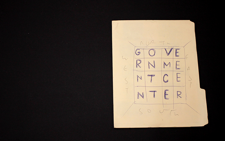
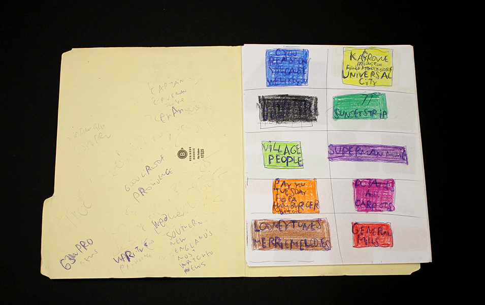
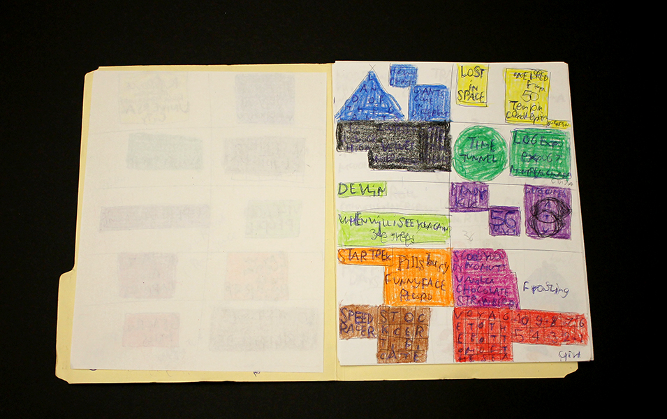
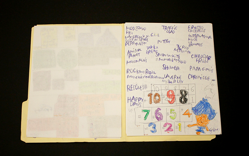
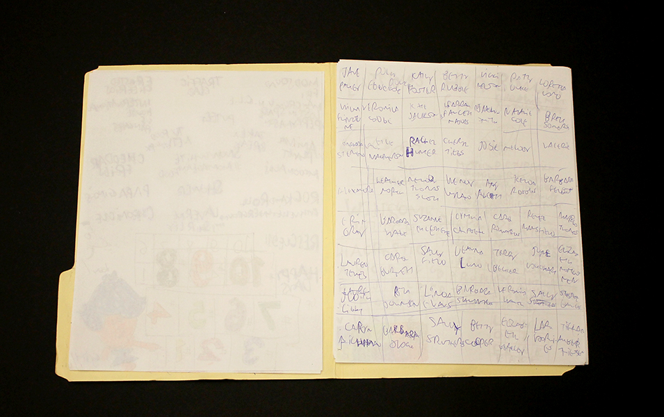
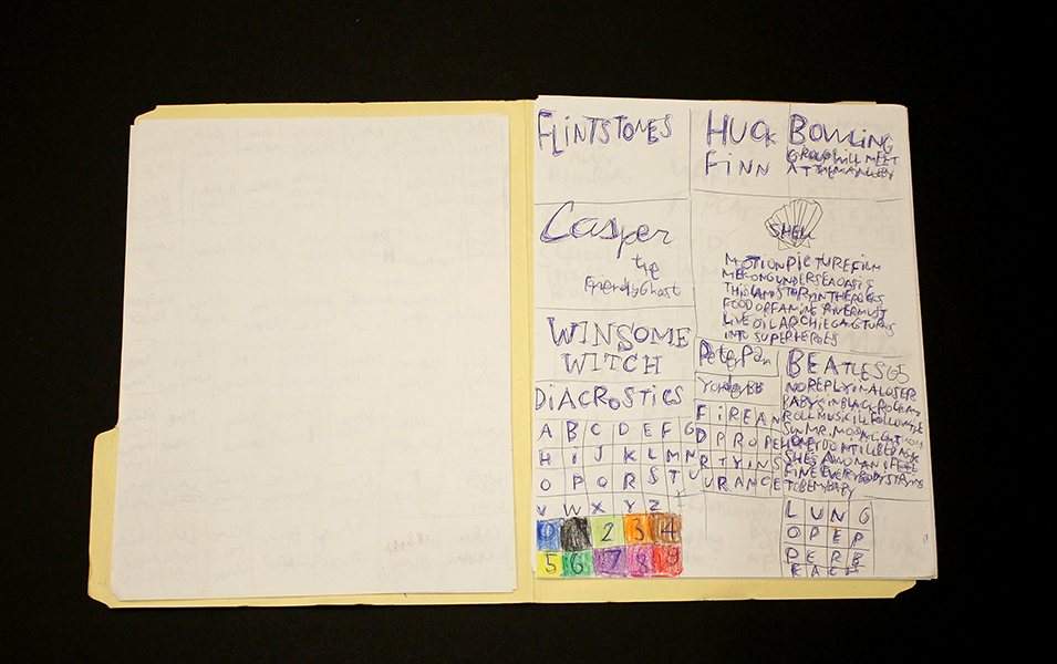
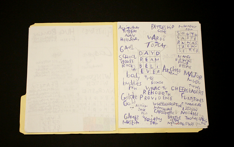
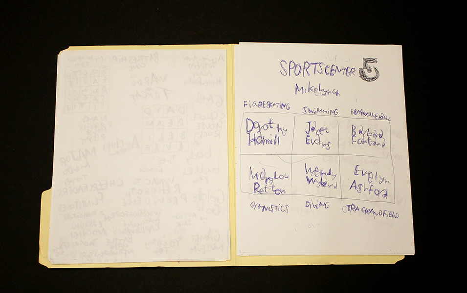
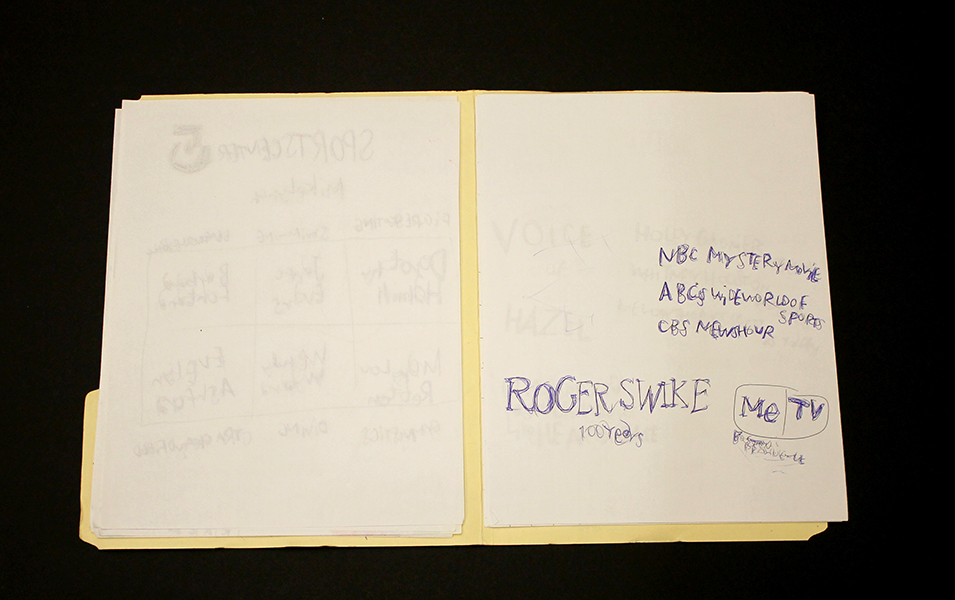
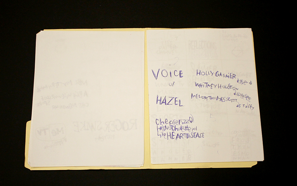
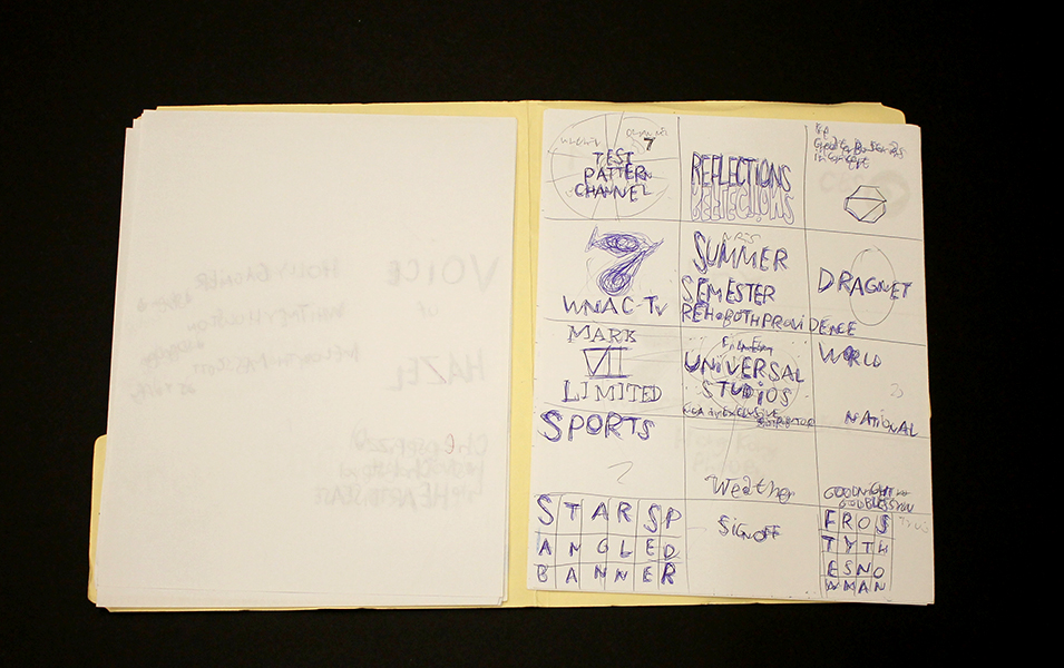
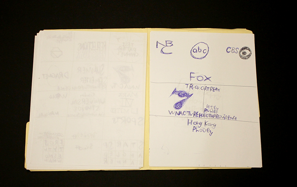
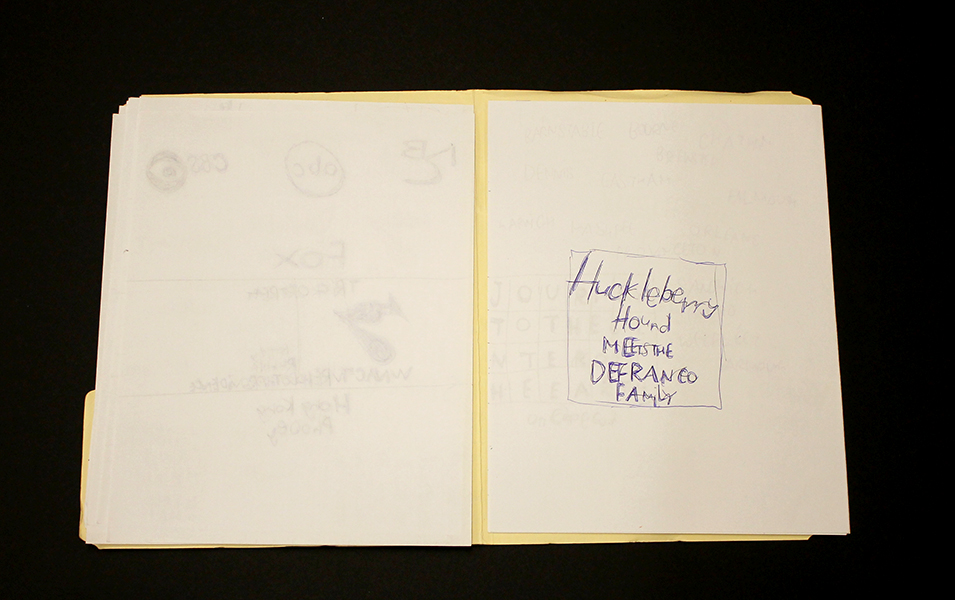
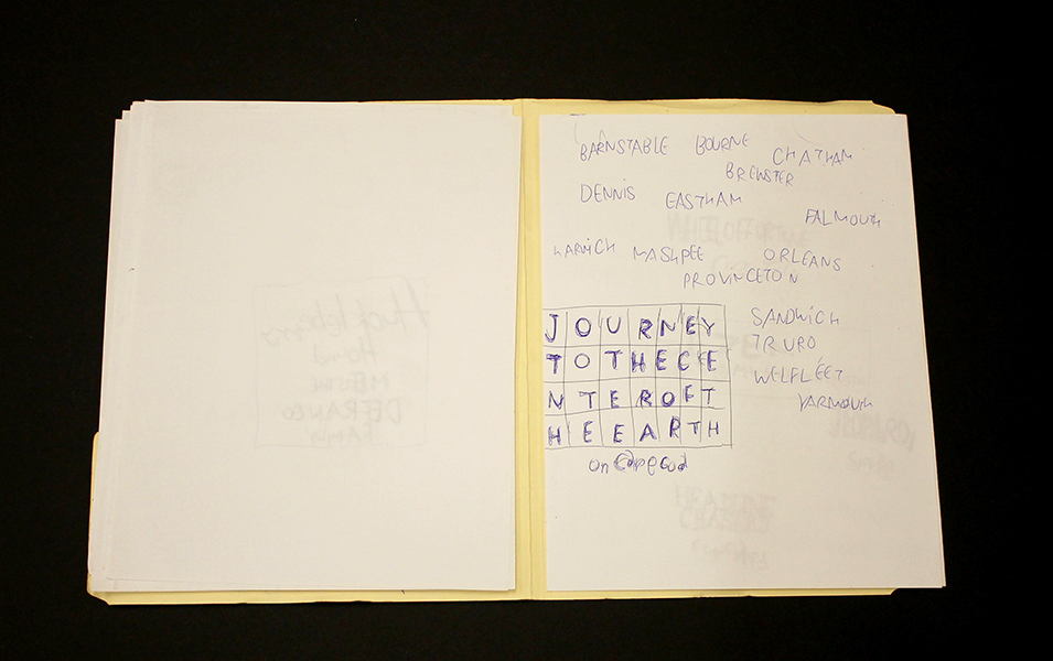
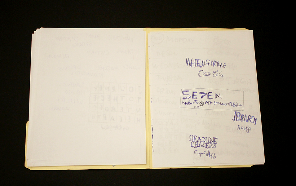
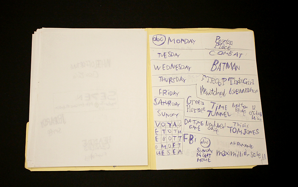
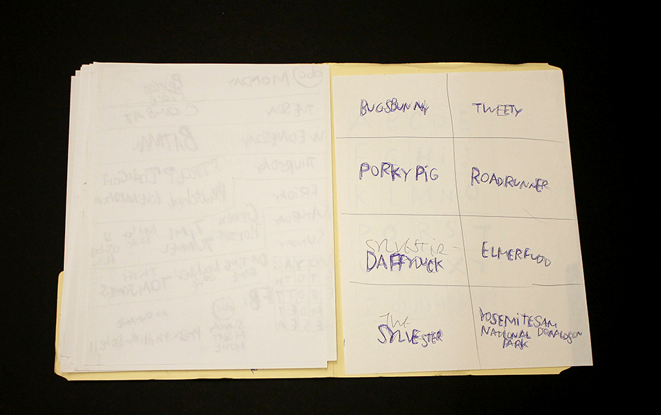
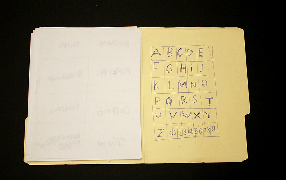
Roger Swike is an exceptionally prolific artist who works rapidly on many pieces simultaneously; much like Melvin Way, his drawing process channels an immediate and intuitive stream of information, yet is also executed with deliberation and great intention. Swike will often revisit drawings created at different times and deliberately organize them into various color-coded folders; the resulting works are an assertive, endearing proposition about what an art object can be. Within content that initially appears chaotic or arbitrary, familiar text referring to pop culture and the exterior world is pervasive. Black and blue ballpoint pens and ten crayons are utilized as though each tool has a symbolic role. Some ideas are organized neatly into grids, others are written in less regimented clusters or lists, primarily in multiple layers of ballpoint pen. Over time, curious relationships and subtle patterns emerge, such as references to the number 7 or numbers listed on their own counting down from ten (but when listed alongside the alphabet they ascend from 0 to 9).
Because Swike’s work is disciplined and systematic, the viewer is tempted to decipher the rigid system that defines it, but the true nature of the work seems to reside in the plasticity of its rules. A grid listing Loony Toons characters deviates from the pattern to include "YOSEMITE NATIONAL PARK SAM DONALDSON", numbers are written in black ballpoint pen without an overlapping of blue pen, words or phrases are redacted, yet the sequence and grid are still drawn using the ten selected colors…often it feels as though Swike isn't creating the system, but instead exploring it as a poet does language, both fluent and curious. Each time Swike's lexicon is revisited, it presents an opportunity to rethink its mysterious nature - possibly an archive, message, map, poem, or something else entirely.
Roger Swike’s work will be included in Mapping Fictions, a group exhibition curated by Disparate Minds writers Tim Ortiz and Andreana Donahue at the Good Luck Gallery in LA, July 9 - August 27. Swike (born in Boston, 1962) has shown previously at the Berenberg Gallery in Boston, Fuller Craft Museum, the Outsider Art Fair, Margaret Bodell Gallery, and Phoenix Gallery in New York. He has also been awarded a MENCAP award in London, England.
We first encountered Roger Swike’s work many years ago, as studio co-managers and facilitators in a progressive art studio in Nevada; we began visiting other studios while traveling (before the inception of Disparate Minds). Swike has maintained a studio practice at Gateway in Brookline, Massachusetts (the oldest progressive art studio in the US) since 1995. Despite this, his extensive body of work remains relatively unknown outside of the Boston area, possibly because the art world hasn’t quite been ready for work as contemporary and singular coming from a living, so-called outsider artist.
Courttney Cooper
Cincinnati Map, 2010, ballpoint pen on collaged paper, 64" x 88"
Untitled, 2015, ballpoint pen on collaged paper, 52" x 80"
Cincinnati Map, 2009, ballpoint pen on collaged paper, 51" x 85"
Cincinnati Map, 2009 (detail)
Cincinnati Map, 2009 (detail)
images courtesy Western Exhibitions and Visionaries + Voices
Cooper’s oeuvre is a ongoing narrative featuring Cincinnati, imparted with adoration and idealism. Drawings that are tenaciously committed to archiving the city’s developing reality in bic ballpoint pen, Cooper documents the destruction of old buildings and construction of new ones, while modifying details to reflect the time of year (often after they've been hung in an exhibition space). But they are also richly populated with celebratory, idealistic imagery - flags flying on rooftops, hot air balloons traversing the sky above the river, “Do not be afraid, be a precious friend! Zmile, you’re in Zinzinnati Ohio USA 2011”.
Cooper’s works are often characterized as maps, which isn’t an entirely accurate categorization. Visionaries + Voices’ Krista Gregory points out:
I've come to learn that Courttney has been drawing "aerial views" of Cincinnati since he was a small child, first using an etch-a-sketch. His mark-making certainly reflects having this type of information/tool...I see the work that Courttney creates more in the vein of landscape, or townscape; as they are romantic in their visceral love for this place...I think that this work being categorized as ‘maps’ is misleading and couches them in something that is more related to Courttney's disability rather than to what it is that he is actually expressing and creating. They are not accurate. They are not drawn completely from memory. I've witnessed people hold on to wanting to think these things because it makes the work accessible or novel in some way. I sort of think that it is a reductive way to see them
The desire to see Cooper’s works as maps may be the consequence of trying to categorize autistic thinking - relegating autistic artists as spectacles of savant-ism. Courttney Cooper, however, is not comparable to Stephen Wiltshire, for example; his drawings are not an accurate configuration of streets as a road map indicates, nor are they a repetitious anonymous depiction of a city in an illustrative way. They're indeed informed by an intimate experience with his city - an astounding wealth of information accumulating across increasingly massive surfaces (created by gluing together scrap paper that Cooper gathers while working at Kroger). But this isn't the subject of the work, it's only the formal foundation that serves as a vehicle for Cooper’s voice. Cooper’s drawings are a complex and authentic network of specific places and structures; his streets are composed of details from memory or observation, cataloging expressions of particular perceptions in particular moments. The relationship of these moments to each other in space is approximated, as in memory - all of which culminates in a dizzying realm of overlapping information that becomes a living record, adorned generously with nostalgic, commemorative expressions of community and identity.
Zinzinnati Ohio USA: The Maps of Courttney Cooper curated by Matt Arient, is a selection of Cooper's drawings from 2005 - 2015, currently on view at Intuit through May 29th. Cooper is represented by Western Exhibitions in Chicago, where he has an upcoming solo exhibition November 12 - December 31, 2016. Cooper has maintained a studio practice at Visionaries + Voices in Cincinnati since 2004; he has exhibited extensively in the greater Cincinnati area and has work in the Cincinnati Art Museum collection. Selected exhibitions include the Wynn Newhouse Exhibition at Palitz Gallery, Syracuse University (as a 2015 Wynn Newhouse Award recipient), Cincinnati Everyday at the Cincinnati Art Museum, Maps + Legends: The Art of Robert Bolubasz and Courttney Cooper at Visonaries + Voices, Studio Visions at the Kentucky Museum of Art, Cincinnati USA: Before Meets After at PAC Gallery, and Indirect Observation at Western Exhibitions.
By Sam Pennybacker
With nothing more than a ballpoint pen and paper, Visionaries and Voices artist Courttney Cooper creates large and highly detailed aerial 3-D drawings of the city that would impress even the most skilled cartographer. Starting with roads, and eventually moving on to individual buildings, Cooper relies on his memory and intimate knowledge of the city to capture neighborhoods and landmarks, past and present, in his art.
Cooper has been part of Visionaries and Voices since the organization’s inception in 2004 and he visits the Northside studio four days a week when he’s not working his full-time job at Kroger.
http://www.ucjournalism.org/archives/1633
Insights from Ari Ne'eman

Recently Disparate Minds had the opportunity to have an encouraging and insightful conversation with Ari Ne’eman about progressive art studios, the incredible work they do, their future, and their relationship to the disability rights movement. Ari is a hero of the movement, particularly as a champion of autism rights and autistic self advocacy; he’s the co-founder and current president of the Autism Self Advocacy Network (ASAN) and was appointed by President Barack Obama to chair the National Council on Disability’s Policy & Program Evaluation Committee in 2009 (Ne’eman is the first autistic person to ever serve on the council).
As we’ve traveled around the country speaking with directors of progressive art studios, a common concern, almost everywhere, has been how these programs can continue as regulations regarding medicaid services change - that phasing out the practice of providing medicaid funded services in a “congregated” or “sheltered” setting could threaten their existence. Strangely, progressive art studios seem to find themselves at odds with the broader disability rights movement as a direct result of this. As we’ve researched to understand this issue, we’ve found that representatives of the disability rights movement generally just aren't aware that progressive art studios exist or familiar with their impact or importance. Other than a general awareness of the VSA (a network of providers affiliated with the Kennedy Center offering some art related services to children with disabilities), Ari also had no prior knowledge of progressive art studios, had never heard of Creative Growth or Judith Scott, and didn’t know that at the center of our culture, the art world, there’s an incredible shift occurring in the way that developmental disability is currently understood.
During our visit with Creativity Explored director Amy Taub, responding to a question about developing practices to accommodate future regulations (such as an integrated or community based model that works) said “this is what works”. Studios like Creativity Explored have, for decades, provided day programs supporting artists to have independence, agency, and place in our culture to a degree beyond the the most idealistic dreams of any other form of service provider. Championing the voices and ideas of people with disabilities in national and international forums, in public works and large-scale commercial endeavors. And yet, Taub also conceded poignantly that progressive art studios are an incredibly small fraction of medicaid providers for day or employment services.
Through exhibitions, artists like Marlon Mullen achieve a profound connection to a broader community.
Furthermore, it’s not only studios that aren’t well known or understood among disability service providers, but art itself. The achievements of artists like Judith scott, Dan Miller, Courttney Cooper, Marlon Mullen, Julian Martin, and Helen Rae feel monumental; it’s easy to forget how small and obscure the art world really is to the majority of the population. The reality is that most people wouldn't know who Larry Gagosian or Jeff Koons are, nevermind Matthew Higgs or Andrew Edlin, even as their influence touches so many aspects of our culture. The social impact of contemporary art isn’t married to public knowledge of its agents; the average IKEA customer has likely never heard the name Donald Judd. The impact that progressive art studios have made and can make, is enormous and unprecedented in history for people with disabilities, even as the most successful examples of artists from progressive art studios remain mostly unknown.
We believe that even though progressive art studios are currently a relatively small fraction of services provided, the work they pursue is essential. We decided to reach out to Ari Ne’eman and discuss this specifically in response to his own comments on the relationship of the disability rights movement to social and cultural change. In this video Ari responds to a question about the lack of social and cultural victories made by the disability rights movement, conceding that the movement has focused on making valuable legal and policy advancements by “soft selling” the cultural and social impact that’s aspired for. He states, “We haven’t excelled at turning out large numbers of people, we haven’t excelled at winning social and cultural victories” and that the movement is “not well-geared towards winning hearts and minds”; as a result of this and the movement being insular in nature, Ne’eman says, “We don't see the broader cultural conversations about disabilities that we see in the context of other identities.”
Winning hearts and minds while creating broad cultural conversation is exactly what progressive art studios are doing, better than any other model for support. We conveyed to Ari the feeling expressed to us by many progressive art studios that “congregating” or “facility-based” programs are unfairly regarded to be necessarily less progressive than integrated community-based supports, arguing that although progressive art studios aren’t integrated spaces in a traditional sense, they affect integration and inclusion in their respective communities and cultures through exhibitions, which ultimately provide a categorically more authentic presence for the voices and ideas of artists with disabilities than simply being physically present does.
We also argue that even though integration is possible and is being pursued by several studios, it may not be without a cost to the studio’s effective functioning, as well as their social impact. Currently, we argued, these studios are emerging in the contemporary art conversation as a new model for artists’ careers and development, and it’s important that this movement belongs to artists with disabilities and their respective studios. Even ignoring the practical disadvantages of transitioning to a system in which artists with disabilities rent studio space to work alongside neurotypical artists (with facilitators visiting to work with them as job coaches), this is a change that would undermine these artists’ ability to make a case for their place in history not only as artists who are successful despite disability and receiving services, but as artists for whom being disabled and receiving services is an integral part of their identity, their lives, and their creative practice. These artists’ disability and dispositions as recipients of services should be understood as a legitimate cause to congregate as artists, because it should be understood as a legitimate way of being.
The studio at the Center For Creative Works in Philadelphia PA is a rich creative community
Ari’s response to this was encouraging and compelling. He expressed that integrating progressive art studios wouldn't have to mean eliminating the studio itself, or even depriving it of its identity as a space for artists with disabilities, it just needs to also be open to artists without disabilities who aren’t paid supports. Ari explained that this isn’t just about the social impact of integration, but also how integration affects the delivery of services. This is something easy to forget, as our focus has been on the handful of studios who are the most progressive and successful in the world, where delivery of services isn’t a concern. Looking more broadly, that there are a great many programs who provide art, even in an open studio setting that aren’t as effective as they should be - who are not as organized, progressive, or person-directed as they should be. It’s undeniable that the quality of services provided by staff would, as a whole, be better if staff were also working with neurotypical artists. In this sense, it’s impossible to deny that if all service providers providing day programs were required to be open and appealing to neurotypical artists using their space alongside artists with disabilities, they would be forced to use more progressive practices. It’s significant that this idea only makes any sense for art studio programs - they’re the only kind of day program that would be appealing to neurotypical artists if they become open to them.
Ari explained that there has been a focus on integrating and improving residential and employment services more than day services, and he committed to us that he’ll keep progressive art studios in mind as attention shifts to day services. In response to our description of the progressive art studio model, Ne’eman emphasized a few key points that will be important going forward:
- Focus on benefit to the individual served
Although the social and cultural impact of progressive art studios and their artists is important, it should never be prioritized over benefit to the individual. This means facilitating and supporting career management in a way that always prioritizes the artist’s wants and needs above all other concerns, including social impact, or benefit to the program or its staff. This means not exhibiting or selling an artist's work if they don't want it exhibited or sold, even if that exhibition would provide valuable exposure for the program as a whole. This also means being very careful about collaborative projects, which are often regarded as a good way to connect with the community, but which could also present a high risk for exploitation.
- Severability of services
The relationship of the program to the artist needs to be such that the artist is able to continue their life and career even if they chose to use another provider. This is a concern that stems from problems identified in residential services in which service providers are also landlords, so ending or changing services means moving out of their home.
For progressive art studios this has important implications in two dynamics of the model. One is ownership of the artists’ works - both physical inventory and as intellectual property. Agreements have to be very clear from the start about how this is managed in the event that an artist chooses to stop being a part of the studio or move to a different studio. The other dynamic is the marriage of habilitation/care services and art facilitation/career management services. Having artists work with artists in the studio is essential, so the dual role of artist staff as facilitators and direct care or habilitation staff is an ideal arrangement. The principle of severability of services would seem to also require that the artist should be able to continue to use the studio even if they prefer to use a different provider for rehabilitation services, or if they chose to discontinue their habilitation or care services. The latter is arguably more essential, and certainly more feasible, as it would simply require that the artist pay for their use of the studio by some other means, as neurotypical artists using the studio would in an integrated arrangement.
Eliminating scheduling of regular hours
One of the essential aspects of a progressive art studio described by Lawrence Rinder in discussion of the Create exhibition was that the artists work in the studio during “hours which reflect the common work hours, five days a week 9-5”. However, artists shouldn’t be in agreement with the studio to attend at certain times as they would attend work or school, but may set goals to invest a particular amount of time and devise plans that use a schedule to meet that goal. In practice, this seems to boil down to a mere matter of language, but it’s based on an important principle; artists in progressive art studios aren’t paid an hourly rate, so they can’t obliged to attend particular hours. Attendance policies or schedules that have a compulsory feeling are left over from less progressive models - an artist's use of the studio should be understood as self-motivated.
The most encouraging insight from this conversation was that the future of progressive art studios may be not only to sustain as regulations change, but to broaden scope and expand as a new definition of what day programming is. If studios are understood not as part of an outmoded form of service, but as the examples of the ideal model for a still relevant and important one, then day programs in general can be redefined, no longer as places where people with disabilities are accommodated, but as spaces for creativity, in which a truly neurologically diverse group of creative people congregate to utilize tools, materials, and work space with guidance and support as needed - spaces that are for expression, entrepreneurship, and all manner of making, whose existence is a statement about the essential relationship of diversity to productivity as paragons of the most extreme expression of those principles.
Progressive Practices: Materials, Archives, and Inventory
“I am glad that I had the guts to make these things, and that people like them, because I want them to live for a long time after I am gone.” - Patrick Hackleman
A remarkable aspect of the progressive art studio history is their independent emergence across the world. Creative Growth in Oakland, California is widely regarded to be the first; they were among the first to be established (Gateway Arts in Brookline, MA was founded shortly before) and they were, by far, the first to break into the art market and support artists that are recognized nationally and internationally. However, the relationship of this first program to subsequent programs elsewhere doesn't strictly follow the typical narrative of a pioneering idea. Their legacy is significant; Franz and Elias Katz went on to establish Creativity Explored and NIAD, and many programs have looked to the bay area as they developed (utilizing the example of Creative Growth as a proof of what's possible with this model). However, versions comparable to the progressive art studio are widespread and usually come into being without any knowledge of Creative Growth or any other studio. It has been and continues to be a naturally occurring phenomenon.
Art-making is an intuitive and fantastically effective solution to many of the issues that various service providers for adults with developmental disabilities strive to resolve. As those of us who work within the field understand, the endeavor to provide the least restrictive environment isn’t a merely passive endeavor, It requires a proactive, thoughtful, and ambitious effort to provide not just a safe space, but also independence, validation, and opportunities to make valued contributions in the community. In a setting based on these aspirations, art-making is a perfect answer, and in some form it tends to be introduced at some point, but in most cases with woefully insufficient ambition or perspective.
Once art is introduced in settings comparable to day programs, a door opens and an important opportunity emerges. From that point on, the success of the program is dependent on how much the staff believe in the potential of the works created to be great, meaningful, and valuable - and how they express that belief. The degree of belief spans a vast spectrum, at one end the artist’s potential is overlooked entirely as they’re encouraged to waste time by following step-by-step instructions to create mediocre craft objects, and at the other end their potential is hindered only by the limitations that the art itself has to be great - a limit that has not yet been discovered by anyone ever. How a progressive art studio demonstrates respect for their artists and belief in their potential is first expressed in tangible terms - how the work is handled and presented (in not only exhibitions, but at all times). The standard of these practices sets the tone for every aspect of the studio’s functioning, permeating the culture of the organization and influencing how the artists perceive their own work and potential.
Because progressive art studios don’t necessarily emerge with the intention of becoming fine art organizations, and often exist within larger organizations for which fine art has not been a part of their history or culture, they tend to reside within a system that isn’t prepared to understand the process of maintaining an art practice. As a result, many basic concepts such as the nuanced quality of materials or the concept that a great piece can be ruined very easily, aren’t broadly understood. Advocating for respecting the work and believing in its potential must be a constant effort, on every level, from the working culture within the studio, to the relationship between the studio and both its parent organization and the community; every choice has to adhere to clear principles with great conviction.

The Canvas' Jeff Larabee working with a selection of archival markers and surfaces
High Quality Materials
The first expression of belief in and respect for our artists’ endeavors is the investment we make in the materials provided. High quality art materials are expensive and great art can be made using very inexpensive materials; Henry Darger and Joseph Yoakum created amazing bodies of work in this manner. However, their work has yellowed and faded over time, with restoration efforts already being utilized to preserve their original integrity. The principle that a studio should follow is to use the highest quality archival and lightfast materials feasible for each artist; this must be a highly individualized facilitation process. New, very prolific artists, or artists who haven’t yet matured in their practice may work with student grade materials, but it’s not unreasonable to provide a very expensive sheet of handmade paper to someone who routinely spends months dedicated to completing a single drawing.
A program should strive to develop a budget capable of maintaining a baseline for quality of materials that, at a minimum, accounts for archival integrity while also allowing room for larger investments in artists who demonstrate promise. As often as possible, these investments and the precious nature of materials should be communicated to the artists. Learning to be attentive to the distinctions in quality and craftsmanship of tools and materials is an important aspect of being a visual artist; developing reverence for a beautiful surface or rich pigments can be an important step in an artist's development.
Great Photo Documentation and an Archival System
For a progressive art studio to create a clear and complete archive of works is an ongoing difficult and time consuming task; even medium or small sized programs easily produce hundreds of individual works each month. No other kind of art organization has such a labor-intensive professional archiving process as the progressive art studio; art schools produce a lot of work without storing or documenting it and galleries, museums, and private collections preserve and document large quantities of works, but they aren't created in house. Therefore, developing a great system to achieve this inevitably requires a bit of thought and innovation. Much like great materials, an archival system can be a huge investment (including proper lighting and camera equipment), but the benefits are equally huge.
The best and most thorough studio archive project we’ve encountered is NIAD’s inventory, which is available to view online in the form of a Tumblr blog - a great resource for what an inventory should ultimately look like. At first glance, it gives you an impression of the program overall, listing works by all artists, with the most recent work at the top. What makes it really powerful, though, is its searchability. You can search a specific artist's name to access their complete body of work, as well as search by medium or year.

Marlon Mullen's work in NIAD's online archive
There are many ways to achieve a similar system offline. The key is that each work have a distinct identity - a unique accession number that’s included in the filename of the digital image and physically written inconspicuously on the back of the work. These numbers can then be used to store Information about the work, including artist name, title, medium, size, framed or unframed, and whether it’s currently part of the inventory or sold previously in a simple searchable document (database or spreadsheet) separate from the images. This can be great resource for the program to track its own progress, to be aware of and critical about its trends.
An archive such as this makes the difference between being perceived and dismissed as a space for recreation or therapy, and being recognized and revered as a powerful and productive cultural institution. It’s also an extremely beneficial resource for gallerists, collectors, curators, and the press, providing convenient access to an impressive collection of incredible bodies of work.
As important as these pragmatic benefits are, though, is the statement and attitude implicit in developing an impressive archive is more important; the work is either treated as if it’s worth documenting, or as though it is not.
A Clean, Ordered Storage Space and Clean, Careful Handling Practices
Many years ago I worked with a young woman who was caught up in a network of behavior modification obsessed service providers carefully executing “proven” methods to move arbitrary behavioral metrics incrementally. Regretfully, I was never able to fully support her to escape this pseudo scientific culture she was immersed in, but I was able to have her attend our studio for a few days a week, where she was provided with beautiful sheets of pristine drawing paper, on which she made fantastic drawings that were subsequently stored away carefully. During this period of time I visited her home, a state owned “intensive care facility.” Standing in her living room, I was struck by what the the physical nature of the space asserted about the relationships existing within. There were small thrift store artworks hung weirdly high on the wall out of reach, thick glass brick windows, and a tv bolted to a quaint, wooden piece of furniture that was also bolted to the floor with a simple, but sturdy iron armature holding a sheet of 1.5” thick plexiglass in front of the screen, to protect it.
The contrast between the sensibility of this environment and the practice of giving her that valuable, delicate sheet of drawing paper, not only without protecting it from her, but with the presumption that when she was finished, it would be greatly more delicate and valuable than before, could not be more stark (and for home staff accompanying her to the studio, this notion was downright counterintuitive). This example is extreme, but defines a stigma that proves to be a significant barrier to any progressive art studio, especially those that exist as a part of a larger service provider. Day hab programs tend to be spaces defined by a preoccupation with safety, filled with reinforced or disposable versions of ordinary objects. Assembly workshop programs avoid jobs that entail the creation of delicate products or handling of delicate parts. In a setting that fashions itself to be a productive environment, the stereotype that those with disabilities are clumsy and careless is insidiously destructive. Progressive art studios’ designs and intentions aren’t just divergent from traditional programs for people with disabilities, but are actually opposed to and incompatible them; as much as they resemble day programs in form, they are, in almost every dynamic, the exact opposite.

The inventory at Grace Studio in Hardwick, Vermont. In addition to providing access to art to people with disabilities in their community, Grace owns the estate of the late Gayleen Aiken, who previously worked there. Grace received a grant specifically to provide their staff with professional training in handling and maintaining their collection.
A well-maintained and professionally handled inventory of works makes an important statement against this stigma. Progressive art studios need to learn how to handle, package, and store work with the utmost care, not only for obvious practical purposes, but for the sake of the principles that these practices stand for. The understanding that people with developmental disabilities can also create precious art objects worth treating with the highest standards of care is essential to the vision and message.
Like a great archival system, a robust, dependable inventory opens doors for progressive art studios and their artists. A well cared for body of work is an infinitely more compelling proposition to a gallerist than a handful of works carelessly piled onto shelves, stuffed into flat files, or hung arbitrarily on the studio walls. One of the most prevalent, troubling, and confusing phenomenons we discovered during studio visits across the country was artists who were invested in art-making for years having almost no inventory or documentation of work to show for it.
NEW VOICES
Throughout 2015, Disparate Minds writers Tim Ortiz and Andreana Donahue worked directly with The Canvas, a progressive art studio in Juneau, Alaska as Artists-In-Residence, guest facilitators, and curators of the group exhibition NEW VOICES.
Mike Godkin, Transportation: boat, plane, car, chalk pastel on vellum, 12" x 12", 2015
Jeff Larabee, Untitled, sharpie and marker on clayboard, 16" x 20", 2015
Mirov Menefee, Untitled, ceramic, dimensions variable, 2015
Mirov Menefee, Untitled, colored pencil, graphite, and micron on paper, 18" x 24", 2015
The Canvas is a relatively young studio and when we initially joined them was beginning to transition from a didactic approach to art-making to one of professional development. We were given the opportunity work directly with artists in the studio alongside facilitators to share ideas and knowledge about further developing the emerging creative culture and cultivating an environment conducive to the independent discovery of art-making - guiding artists to invent and maintain studio practices of their own devising. We focused on post hoc guidance through the introduction of criticism in one-on-one discussion and group critique, challenging artists to explore the potential investment of time and care available in each of their processes.
The result of this paradigm shift has been a wealth of inspired new ideas and creative voices. NEW VOICES represents a selection of current work in various media by this studio’s most promising and successful artists, including many that we’ve discussed in essays for Disparate Minds over the past year: the nuanced minimalism of Grace Coenraad, Luis Hernandez’s intuitive yet complex abstractions, the enigmatic text-based drawings of Jeff Larabee, and Susy Martin’s bold, layered symbolism. This exhibition establishes a dialogue between artists and artwork, accentuating similar investigations of visual language and innate tendencies - repetitive processes or subject matter choices, surface manipulation, emblematic mark-making, or heightened attention to detail.
Other highlights from the exhibition include:
Mark Davis, Untitled, colored pencil on paper, 19" x 24", 2015
Mark Davis’ first major work on paper - a complex, pattern-based drawing in colored pencil, created using an intuitive set of rules, built methodically from bottom to top; it’s a spectacle of fluorescent color and rich detail, paradoxically both a simple, flat pattern and organic rendering of form reminiscent of a woven textile.
Terral Kahklen, Untitled, graphite, micron, and marker on paper, 9" x 12", 2015
Exhibited alongside Jeff Larabee is his good friend and fellow explorer of text aesthetics, Terral Kahklen (TK). TK began coming to the studio late in the year, but immediately began making compelling work. He’s an example of an experience with profound intellectual disability that’s persistently misunderstood and unseen, a person whose way of being demonstrates that being disparate from the neurotypical (far from being a mere impairment in any linear sense), can become a disposition in which making connections between his inner and exterior world (social engagement in a fundamental sense) is a series of creative problems. In effect, his entire engagement with the neurotypical world becomes a creative and aesthetically thoughtful endeavor. Throughout his life, he has elected to be silent and communicate almost exclusively through minimal sign language, allowing himself to be understood on his own terms. For TK, creating elegant, minimalist drawings couldn’t be more natural. His process is exceptionally thoughtful, carefully considering each mark for long periods of time despite consistently choosing to repeat the forms T and K in an exclusively grayscale palette; each of his early works was a singular exploration, but quickly accumulated as a dynamic body of work reflecting a clear perspective.
Melanie Olsen, Twin Lakes, graphite on paper, 10" x 19", 2015
Melanie Olsen, Untitled, graphite on paper, 2015
Melanie Olsen is an eccentric artist who has spent her life surrounded by the majestic, monumental terrains of California and Alaska. In temperament, Melanie is a classic landscape painter, inspired by the beauty and romance of the sublime landscape, and strives to respond to it faithfully in her work. Her drawing process is a collection of brief, intensely focused moments in which she traces long, complicated contour lines, gritting her teeth and drawing almost blindly as her eyes intently follow the jagged mountain edges in her source imagery. In the interest of objectivity, she relies methodically on a range of different grades of graphite to control value in her shading, evaluating tones against a set of graphite swatches. Her works are a highly critical endeavor, not intended to be expressive or personal, but idealistic and true.
In addition to being a fantastic exhibition, NEW VOICES is an achievement of one of the most revolutionary and exciting aspects of progressive art studios: their power to support contemporary, genuine work for the benefit of both local and global art communities. In Juneau, Alaska, the local art community (with a few exceptions) produces and exhibits safe. accessible works - neo-impressionist landscapes typical of rural communities and kitschy illustrative works reflecting a narrow set of themes highly driven by the tastes of tourists, while the beautiful traditional arts of Native Alaskans often remain marginalized. In this cultural landscape, this exhibition is an unprecedented emergence of relevant and compelling contemporary concepts and studio processes.
Karen Wiley, Untitled, graphite and erasure marks on vellum, 12" x 12", 2015
NEW VOICES
Throughout 2015, Disparate Minds writers Tim Ortiz and Andreana Donahue worked directly with The Canvas, a progressive art studio in Juneau, Alaska as Artists-In-Residence, guest facilitators, and curators of the group exhibition NEW VOICES.
Read MoreGrace Coenraad
Grace Coenraad, Untitled, micron, sharpie, graphite, and india ink on paper, 2015, 16" x 16"
Grace Coenraad, Untitled, micron, sharpie, and india ink on paper, 2015, 22" x 22"
When I first painted a number of canvases grey all over (about eight years ago), I did so because I did not know what to paint, or what there might be to paint: so wretched a start could lead to nothing meaningful. As time went on, however, I observed differences of quality among the grey surfaces – and also that these betrayed nothing of the destructive motivation that lay behind them. The pictures began to teach me. By generalizing a personal dilemma, they resolved it.
Gerhard Richter, From a letter to Edy de Wilde, 23 February 1975
Coenraad’s dark, minimalist works are the product of a measured and slow process, executed with extreme diligence. Using 08 black microns, traditional pen and ink nibs, and occassionally graphite, she densely hatches careful lines, which slowly collect on the surface over many hours of work. This method is a clear path leading to an absolute resolution - the surface being obscured by black. The magic of these pieces (although they’re inextricable from the story of the steadfast execution of this simple method) lies in content that’s fantastically nuanced and complex. The black square is a subtle, jagged field comprised of various sheens and tones - certain patches are tinted by an initial application of bright watercolor (often pink or blue) that has bled through the subsequent, inevitable layer of black. The marks made using microns are incised, and those created with india ink and nib lift the paper slightly away from the surface, resulting in a textured surface reminiscent of Richard Serra’s black oil stick drawings. And much like the reductive, sublime paintings of Richter or Clyfford Still, Coenraad demonstrates that the honest act of mark-making isn’t reduced when it’s stripped of intentions or illusion. Conversely, it only becomes more revealing and mysterious.
After his first museum exhibition of entirely black drawings in 2011, Richard Serra was described by critic Roberta Smith as hermetic, abstract, difficult, and austere, an assessment that he accepted, describing it as “a virtue.” Explaining that art has to be difficult, Serra said that drawing independent of the flamboyance of color interaction, mark-making on its own, in black on white, proves to necessitate invention, thereby providing a “subtext” for how an artist thinks. For him, allover black works were a move to escape that convention of drawing as a “form to ground problem” to create works concerning “interval and space” rather than image.*
a breif view of Grace Coenraad working at The Canvas in Juneau
Coenraad didn’t stumble upon this principle inadvertently like Richter; for her, it’s a process that reflects a way of being. It is, as Serra articulates, an extension of the thought process and more. To a degree that’s rarely seen for non-performative artists, Coenraad is an artist for whom the boundary between life and art is blurred. Every task is executed with the same resolute sensibility, engaging life with a singular and sophisticated method in pursuit of perfection. Every bite of food is carefully selected and examined before being eaten (ingredients of an undesirable color rejected), every mundane task is afforded great consideration. For years she has worked part-time at a document destruction facility, where no one has been able to compel her to obliterate more than one document at a time. At home, blackening crossword puzzle squares for hours with ballpoint pen or sharpie is part of her daily ritual.
In the studio, Grace is fully immersed in her practice - working with her face close to the surface, she becomes absent from anything exterior of the drawing process. Occasionally she will stop and look around the room for a moment like a deep sea diver rising briefly to the surface, before submerging again. Grace doesn’t discuss her work, not because she can’t, but because there seems to be nothing necessary to say once a piece is finished.
Between her larger, long-term works, Coenraad sometimes creates small graphite sketches, thoughtful experiments that serve as a point of entry into her mysterious thought process. The placement of faces demonstrate the dynamics of orientation in her drawings. The coexistence of elements in combination with turning the paper many times while working isn’t incidental to the process, but essential to it.
Coenraad is a Juneau-based artist who maintains a studio practice at The Canvas in Juneau, Alaska. Her work will be included in an upcoming group exhibition curated by Disparate Minds writers Tim Ortiz and Andreana Donahue at The Canvas' exhibition space in December.
John Hartman
assorted letter openers
Three Geese on Stands, Pine and Cyprus
owl sculpture, mahogany
Material in the raw is nothing much. Only worked material has quality, and pieces of worked material are made to show their quality by men, or put together to so that together they show a quality which singly they had not. “Good material” is a myth. English walnut is not good material. Most of the tree is leaf-mold and firewood. It is only because of workmanlike felling and converting and drying and selection and machining and setting out and cutting and fitting and assembly and finishing - particularly finishing - that a very small proportion of the tree comes to be thought of as good material.
- David Pye, The Nature and Art of Workmanship
John Hartman skillfully works within the tangible, tactile boundaries of a small-scale process and commitment to good workmanship. Within this intimate context, he engages wood without conceptual boundaries, exploring utility, mimesis, and sculptural invention freely. Through the tradition of woodworking, Hartman is able to realize a wide range of possessable objects that evoke a sense of elegance and great integrity.
Hartman is a Manhattan-based artist who has been working in Pure Vision’s studio since 2013. From Pure Vision:
Hartman’s “main passion is woodcarving. John was introduced to the craft at the age of eleven, in wood shop at The Rudolph Steiner School. He began by crafting a cherrywood flour scoop. Instantly drawn to the medium, he slowly started teaching himself how to make more complicated objects. Collecting rare woods from around the world such as ebony, zebra wood, Philippine mahogany and bloodwood, John now spends hours in the studio and at home carving, whittling, sanding and polishing each piece. Inspired by visits to his family’s seaside home on Fire Island, his subjects often reference birds and sea creatures.” (more)
Larry Pearsall
Bad Bon Squared, Acrylic, 16" x 24" 2012
Letting You, Screenprint, 11" x 15" 2013
Mischief In The Ladies Room, Acrylic, 16" x 24.5" 2012
Loner, Acrylic, 18" x 24" 2012
Larry Pearsall
The visual quality of Larry Pearsall’s drawings makes them initially seem very rudimentary. However, they quickly begin to reward careful examination with a revealed nuance and sophistication. This cartoonish place is full of striking details - armpit stains, tile grout shifting color in different lights, a door slightly ajar in suspense, and a mirror reflects the far edge of a bathroom stall. It's in these details that the robust realization of Pearsall’s alternate world (Apple Bay) shines through his highly stylized and systematic way of describing it. This juxtaposition of the highly unreal and real places the unsettling narrative on a precarious line between humorously bizarre and disturbing. Pearsall creates art at one of ECF’s Los Angeles art centers and is represented by their affiliate DAC Gallery. DAC exhibits his work regularly and also has it available for purchase on Amazon.com. More on Pearsall and Apple Bay from DAC Gallery:
“...Larry Pearsall's flat, cartoon-style paintings narrate the ongoing saga of a dark place called "Apple Bay". Inhabited by characters such as "The Overall Team Club" (a group of overall wearing pre-pubescent boys and girls), guardian animals (cats, possums, rats), a bald 100-year-old bearded pedophile named "Bon", and hundreds of others, Apple Bay is a place where abuse happens behind closed doors, and demons reside in deceptively innocuous settings. In this avowedly fictional narrative, "bad" members are depicted as such, and while their victims are clearly oppressed and visibly marked, they are often unaware of their abuse. Larry Pearsall has been developing the Apple Bay story for the past ten years. It has been translated in paintings, prints, and ceramics. Although Pearsall is soft-spoken, he is always eager to discuss the story of the town and its inhabitants, giving listeners an astounding amount of detail...” (more)
The Phone Call, Screenprint, 11" x 14.75" 2013
Terri Bowden
In her boldly marked drawings, Terri Bowden portrays the figures as if they are intense, strikingly present memories - fleshy and visceral in some aspects, but broadly summarized, distorted, and surreal in others. Faces are rendered with a realism and clarity that evokes vulnerability, re-contextualizing familiar icons of distant pop culture with a mysterious, untold narrative. Bowden’s work achieves the uncommon combination of dreaminess and gritty power reminiscent of Philip Guston. Recent exhibitions include Vis-à-vis curated by Michael Mahalchick at Andrew Edlin Gallery (New York) and stARTup Fair (San Francisco); her work will also be included in the upcoming exhibition Indigo Mind at StoreFrontLab (San Francisco).
Bowden works at Creative Growth's studio in Oakland, California; from Creative Growth:
"Terri’s whimsical and quirky sense of humor is delightfully evident in her artwork. Having befriended other albinos–who, like herself, are legally blind–Terri often uses albino animals and people as the subject of her drawings. Whether it’s reimagining Led Zeppelin’s Robert Plant, pop music icon Michael Jackson, or a nondescript winking punk rocker, Terri’s ability to capture the nuances of human expression exceeds far beyond the photos she uses as reference. Her fixation on albinism extends to ceramics as well, with her pigmentless fruit, Hershey’s kisses, cookies, rabbits and ducks, all executed in the same whitish pink palette that appears in her drawings." (more)
Harold Jeffries
Harold Jeffries, an artist at Center for the Arts (Little City) in Illinois (who was featured in the documentary Share My Kingdom) refers to these drawings as “blueprints for heaven.” As that phrase suggests, these works engage a complex creative space between the expression of narrative and a genuine concept of mystical utility. It is clear that for Jeffries these works are not merely drawings or paintings - they are acts part of a separate world, whose process includes finishing each work by drawing an elaborate phantom drawing for that unseen realm with his pen inches above the surface. Center for the Arts’ Frank Tumino elaborates:
"Harold Jeffries’ imagery and working methods are an outgrowth of his personal obsessions and inner world. Nearly every piece has as its basis a gridwork of lines, forming squares, rectangles, circles and other forms which resemble an isolated section of a vast blueprint outlining some lost Minoan palace. If asked, Jeffries will tell you that these are indeed blueprints. They are part of his lifelong obsession to create blueprinted plans for Heaven. This project has no beginning, middle or end. The portion of the plans that Jeffries draws at any one time simply reflects his thoughts at that moment, and do not advance the project along any conceivable timeline, a fitting solution for planning what is infinite and eternal.
The technique of layering, be it of forms, media, or concepts, is another hallmark of Jeffries’ art. Resulting in images which appear to be wholly abstract, Jeffries will sometimes layer additional media over his original blueprint drawings. He will alternate drawing media with washes of paint, obscuring the original blueprint in one spot, reemphasizing it in another, drawing new plans on top of it in yet another place. Sometimes all or part of the original drawing is overlaid with a tight mesh of faces and human forms. These are variously described by Jeffries as ghosts, or spirits, or voices. To him they are real, and they give the viewer an arresting glimpse of Jeffries waking life.
On occasion, Jeffries has taken his blueprints and worked them into 3-dimensional form. Harold is extremely interested in the use of construction materials. This fascination is evident in the decisions he makes to bring his ideas to reality of form. He prefers to reuse discarded materials like empty bottles. The act of building becomes a metaphor for Harold’s life and his sense of the world. He finds comfort in the idea that something both beautiful and useful is being created while the burden that would otherwise have been placed upon existing landfills is reduced." (More)
Marlon Mullen
Untitled, acrylic on canvas, 14" x 14", 2015
Untitled, acrylic on canvas, 30" x 30", 2015
Untitled, acrylic on canvas, 24" x 36", 2015
Nancy Graves, acrylic on canvas, 36" x 24", 2014
Marlon Mullen, who is represented exclusively by JTT in New York City, lives in Richmond California, where he maintains a studio practice at NIAD Art Center. Mullen’s abstractions reduce found imagery, often in the form of art magazines, to a point well beyond recognition. Mullen’s work, characterized by flat, simple abstraction, is achieved with an unprecedented sense of honesty, devoid of stylistic embellishment and without reverting to geometric or other systematic deconstructions (calling to mind the work of Gary Hume and Monique Prieto). Each elegant, lushly painted composition feels like an original and unequivocal interpretation of its source (often maintaining only fragments of the initial image), but ultimately asserting a new sense of resolution with power and charm. (See More)
Mullen currently has a solo exhibition on view until November 7, 2015 at Atlanta Contemporary in Georgia. Recent selected exhibitions include the Parking Lot Art Fair, San Francisco (2015), Marlon Mullen at JTT in NYC (2015), NADA Art Fair White Columns Booth in Miami (2014), Under Another Name, organized by Thomas J. Lax at the Studio Museum of Harlem (2014), Undercover Geniuses organized by Jan Moore at the Petaluma Arts Center (2013), Color and Form at Jack Fischer Gallery in San Francisco (2013), and Marlon Mullen at White Columns in NYC (2012). Mullen is a 2015 recipient of the Wynn Newhouse Award.
Mullen and his works at NIAD
Nicole Appel
Cars, Bikes, Car Parts, and Maine Coon Cats, colored pencil on paper, 19" x 24", 2014
Animal Eyes and Russian Boxes, colored pencil on paper, 19" x 24", 2014
Day of the Dead, colored pencil on paper, 19" x 24", 2014
Faberge Eggs and Communist Propaganda Posters, colored pencil on paper, 19" x 24", 2014
Nicole Appel working in the Pure Vision Arts studio in New York
By collecting richly detailed imagery into densely composed arrays, Appel’s drawings assert complex associations that range from the intuitive to the bizarre. The component imagery is intricately rendered and resolved, creating a noisy initial phenomenology that rewards examination with great generosity of nuance. As a creative endeavor, Appel's work traverses the paper as raw process, distorting proportions in order to remain true to earlier choices (with each element of the drawing determining its own edges) and creating untouched negative spaces valued for their potential to fit something else in.
from Pure Vision Arts in NYC:
"Nicole Appel was born in 1990 and was raised in Queens, NY where she still lives. At the age of three, Nicole was diagnosed with autism. She has always been passionate about making art and in 2012, began attending Pure Vision Arts.
Focused, and with a strong independent will, Nicole enjoys drawing and painting people and objects from her memory. With a particular interest in food, animals and pop culture icons, she has a vivid imagination and creates expressive, painterly images. Her stroke is bold and her use of color vibrant." (More)
Dan Michiels
Return of the Aliens, Mixed Media, 19" x 23" 2009
HG Wells in a Different Time Barrier, Mixed Media, 20" x 30" 2010
Return of the Worms, Mixed Media, 2009
all images copyright Creativity Explored
One-minute video of Creativity Explored artist Dan Michiels at work. (Video by Ming Mur-Ray.)
Michiels' works are difficult to categorize; they're not exactly images or patterns, and not merely symbols or clearly narrative in nature. They are collections of information - setting up and exploring systems to create intensely detailed works comprised of spaces and passages, each asserting a strong sense of significance and purpose without explanation. Their intricacy demands close viewing, but careful examination becomes a mind-bending exercise that's overwhelming and fascinating. Dan Michiels has been making art at Creativity Explored in San Francisco since 2008. From Creativity Explored:
“Michiels' painstakingly creates meticulous renderings of the mind’s action only in reference to a ruler, paper, pencil, and an array of color, and how these elements organize themselves in two dimensions. This can be a liberally amorphous registration of shape and color, or a pulsating, rigorous grid structure carefully filled-in to create a tessellated all-over composition. “(more)