Dale Jackson at White Columns presents a significant selection from the Cincinnati-based artist’s extensive body of work for his first New York exhibition. Brimming with a disarming sincerity and candor, Jackson’s imaginative missives are a breath of fresh air...
Read MoreThe Effortless Humor of Michael Pellew
Michael Pellew, Untitled, 2016, Mixed Media on Paper, 11"x17"
Michael Pellew, Michael and Latoya Texting on the Beach, 2015, Acrylic on Canvas, 12"x9"
Michael Pellew, British Platter, 2015, Mixed Media on Paper, 14"x17"
One of the fantastic surprises at the Outsider Art Fair this year was our experience with the work of Michael Pellew. Pellew’s work is unassuming, and in the context of the fair particularly blends in - a style defined by repetition, drawing within a simple system, and the use of unconventional materials (markers). We were more familiar with his series of small original drawings marketed as greeting cards, which typically feature a grouping of four or five figures (available at Opening Ceremony in Manhattan and LA). In a larger scale, the voice only available in snippets in smaller works unfolds to become an astonishing comedic performance.
The repetition and economy of visual language in his work is necessary to the humor - each figure articulated in an identical manner, with just a few distinctive features describing its specific identity. The supreme ease with which each character enters the scene via this agile visual vernacular accounts for the works’ pace and timing. There's an exciting cleverness in the way the simple archetype of the figure takes on the identity of countless celebrities, analogous to a skilled impressionist mimicking pop culture icons in rapid succession. Pellew seems to be compiling an ongoing, shifting catalog of celebrities; those with apparent relationships or categorizations are sporadically interrupted with unexpected pairings (Princess Diana and Lemmy Kilmister) or fictional personas (Lauryn Hill M.D. from Long Island College Hospital, The Phanton Lord). Viewers with an extensive knowledge of pop culture are highly rewarded by the ability to recognize the abundance and subtlety of his references.
Michael Pellew, Untitled, 2015, Mixed Media on Paper, 22"x30"
Humor is an important element in many works that don't necessarily make us laugh, but truly funny art like Pellew’s (beyond the occasional clever moment or inside joke), is very uncommon. Crystallizing the elusive and ephemeral quality of comedy into a permanent art object is extremely difficult to achieve. Usually the most overtly funny approach is to employ an explicit punchline that rests on an impressive technical or procedural spectacle; artists that exemplify this approach are those like Wayne White or Eric Yahnker.

Eric Yahnker, Beegeesus, 2005, 13 x 10 x 10 in.
"Bible whited-out except that which sequentially spells Bee Gees" image via www.ericyahnker.com
Pellew’s humor, however, is more nuanced, so in the absence of a punchline, his approach relies on absolute fluency rather than overt technical prowess. The quintessential example of this brand of humor is Raymond Pettibon; works that appear effortless afford the artist a more casual voice, equipped to cultivate a more dynamic interaction between the work and viewer. When it's less obvious that there's a joke present, the viewer tunes into a more acute examination of tone and timing in search of the artist's intention.

Raymond Pettibon, image via www.raypettibon.com
Whereas Pettibon uses this approach to insert sardonic or satirical moments of levity into his generally grim oeuvre, Pellew instead engages this sort of humor with a lighter and even silly sensibility; he creates an abundantly bright and positive space that is captivating. The conceptual foundation of his work becomes about treading the line between earnestly identifying as an artist, or slyly engaging in play-acting the role of an artist. Walton Ford has described using play-acting (as a scientific illustrator) in a similar way as an entry point into comedy. In Pellew’s case, the performance is broader, and in its execution more engrossing - guiding you through his alternate world, you're always uncertain if he’s serious, even as he crosses well over into the realm of absurdity.
Michael Pellew, Michael Jackson and Bubbles, 2014, Acrylic on Canvas, 14"x11"
In the affable universe he realizes, there’s virtuosity in the way moments of comedic surprise cut sharply through. The lingering experience of these pieces isn’t static, but a dreamlike memory of an event unfolding; line-ups of celebrities…everyone had a pepsi…they were all hanging out around a limousine eating McDonalds…and then Marilyn Manson is offering his famous burger and fries. It’s an alternate reality composed of familiar characters and Pellew is leading us along, introducing each of them, all in his voice - but really it's the viewer’s voice. You are left walking away amused, incredibly satisfied, but not entirely sure what has just happened.
Pellew has been working at LAND Gallery’s studio for over ten years and participated in numerous exhibitions in New York, including group shows at Christian Berst Art Brut and the MOMA. His work has been acquired by many reputable collectors, including Spike Lee, Sufjan Stevens, Citi Bank, JCrew and PAPER Magazine.
Michael Pellew, Making a Band (detail)
NEW VOICES
Throughout 2015, Disparate Minds writers Tim Ortiz and Andreana Donahue worked directly with The Canvas, a progressive art studio in Juneau, Alaska as Artists-In-Residence, guest facilitators, and curators of the group exhibition NEW VOICES.
Mike Godkin, Transportation: boat, plane, car, chalk pastel on vellum, 12" x 12", 2015
Jeff Larabee, Untitled, sharpie and marker on clayboard, 16" x 20", 2015
Mirov Menefee, Untitled, ceramic, dimensions variable, 2015
Mirov Menefee, Untitled, colored pencil, graphite, and micron on paper, 18" x 24", 2015
The Canvas is a relatively young studio and when we initially joined them was beginning to transition from a didactic approach to art-making to one of professional development. We were given the opportunity work directly with artists in the studio alongside facilitators to share ideas and knowledge about further developing the emerging creative culture and cultivating an environment conducive to the independent discovery of art-making - guiding artists to invent and maintain studio practices of their own devising. We focused on post hoc guidance through the introduction of criticism in one-on-one discussion and group critique, challenging artists to explore the potential investment of time and care available in each of their processes.
The result of this paradigm shift has been a wealth of inspired new ideas and creative voices. NEW VOICES represents a selection of current work in various media by this studio’s most promising and successful artists, including many that we’ve discussed in essays for Disparate Minds over the past year: the nuanced minimalism of Grace Coenraad, Luis Hernandez’s intuitive yet complex abstractions, the enigmatic text-based drawings of Jeff Larabee, and Susy Martin’s bold, layered symbolism. This exhibition establishes a dialogue between artists and artwork, accentuating similar investigations of visual language and innate tendencies - repetitive processes or subject matter choices, surface manipulation, emblematic mark-making, or heightened attention to detail.
Other highlights from the exhibition include:
Mark Davis, Untitled, colored pencil on paper, 19" x 24", 2015
Mark Davis’ first major work on paper - a complex, pattern-based drawing in colored pencil, created using an intuitive set of rules, built methodically from bottom to top; it’s a spectacle of fluorescent color and rich detail, paradoxically both a simple, flat pattern and organic rendering of form reminiscent of a woven textile.
Terral Kahklen, Untitled, graphite, micron, and marker on paper, 9" x 12", 2015
Exhibited alongside Jeff Larabee is his good friend and fellow explorer of text aesthetics, Terral Kahklen (TK). TK began coming to the studio late in the year, but immediately began making compelling work. He’s an example of an experience with profound intellectual disability that’s persistently misunderstood and unseen, a person whose way of being demonstrates that being disparate from the neurotypical (far from being a mere impairment in any linear sense), can become a disposition in which making connections between his inner and exterior world (social engagement in a fundamental sense) is a series of creative problems. In effect, his entire engagement with the neurotypical world becomes a creative and aesthetically thoughtful endeavor. Throughout his life, he has elected to be silent and communicate almost exclusively through minimal sign language, allowing himself to be understood on his own terms. For TK, creating elegant, minimalist drawings couldn’t be more natural. His process is exceptionally thoughtful, carefully considering each mark for long periods of time despite consistently choosing to repeat the forms T and K in an exclusively grayscale palette; each of his early works was a singular exploration, but quickly accumulated as a dynamic body of work reflecting a clear perspective.
Melanie Olsen, Twin Lakes, graphite on paper, 10" x 19", 2015
Melanie Olsen, Untitled, graphite on paper, 2015
Melanie Olsen is an eccentric artist who has spent her life surrounded by the majestic, monumental terrains of California and Alaska. In temperament, Melanie is a classic landscape painter, inspired by the beauty and romance of the sublime landscape, and strives to respond to it faithfully in her work. Her drawing process is a collection of brief, intensely focused moments in which she traces long, complicated contour lines, gritting her teeth and drawing almost blindly as her eyes intently follow the jagged mountain edges in her source imagery. In the interest of objectivity, she relies methodically on a range of different grades of graphite to control value in her shading, evaluating tones against a set of graphite swatches. Her works are a highly critical endeavor, not intended to be expressive or personal, but idealistic and true.
In addition to being a fantastic exhibition, NEW VOICES is an achievement of one of the most revolutionary and exciting aspects of progressive art studios: their power to support contemporary, genuine work for the benefit of both local and global art communities. In Juneau, Alaska, the local art community (with a few exceptions) produces and exhibits safe. accessible works - neo-impressionist landscapes typical of rural communities and kitschy illustrative works reflecting a narrow set of themes highly driven by the tastes of tourists, while the beautiful traditional arts of Native Alaskans often remain marginalized. In this cultural landscape, this exhibition is an unprecedented emergence of relevant and compelling contemporary concepts and studio processes.
Karen Wiley, Untitled, graphite and erasure marks on vellum, 12" x 12", 2015
NEW VOICES
Throughout 2015, Disparate Minds writers Tim Ortiz and Andreana Donahue worked directly with The Canvas, a progressive art studio in Juneau, Alaska as Artists-In-Residence, guest facilitators, and curators of the group exhibition NEW VOICES.
Read MoreGrace Coenraad
Grace Coenraad, Untitled, micron, sharpie, graphite, and india ink on paper, 2015, 16" x 16"
Grace Coenraad, Untitled, micron, sharpie, and india ink on paper, 2015, 22" x 22"
When I first painted a number of canvases grey all over (about eight years ago), I did so because I did not know what to paint, or what there might be to paint: so wretched a start could lead to nothing meaningful. As time went on, however, I observed differences of quality among the grey surfaces – and also that these betrayed nothing of the destructive motivation that lay behind them. The pictures began to teach me. By generalizing a personal dilemma, they resolved it.
Gerhard Richter, From a letter to Edy de Wilde, 23 February 1975
Coenraad’s dark, minimalist works are the product of a measured and slow process, executed with extreme diligence. Using 08 black microns, traditional pen and ink nibs, and occassionally graphite, she densely hatches careful lines, which slowly collect on the surface over many hours of work. This method is a clear path leading to an absolute resolution - the surface being obscured by black. The magic of these pieces (although they’re inextricable from the story of the steadfast execution of this simple method) lies in content that’s fantastically nuanced and complex. The black square is a subtle, jagged field comprised of various sheens and tones - certain patches are tinted by an initial application of bright watercolor (often pink or blue) that has bled through the subsequent, inevitable layer of black. The marks made using microns are incised, and those created with india ink and nib lift the paper slightly away from the surface, resulting in a textured surface reminiscent of Richard Serra’s black oil stick drawings. And much like the reductive, sublime paintings of Richter or Clyfford Still, Coenraad demonstrates that the honest act of mark-making isn’t reduced when it’s stripped of intentions or illusion. Conversely, it only becomes more revealing and mysterious.
After his first museum exhibition of entirely black drawings in 2011, Richard Serra was described by critic Roberta Smith as hermetic, abstract, difficult, and austere, an assessment that he accepted, describing it as “a virtue.” Explaining that art has to be difficult, Serra said that drawing independent of the flamboyance of color interaction, mark-making on its own, in black on white, proves to necessitate invention, thereby providing a “subtext” for how an artist thinks. For him, allover black works were a move to escape that convention of drawing as a “form to ground problem” to create works concerning “interval and space” rather than image.*
Coenraad didn’t stumble upon this principle inadvertently like Richter; for her, it’s a process that reflects a way of being. It is, as Serra articulates, an extension of the thought process and more. To a degree that’s rarely seen for non-performative artists, Coenraad is an artist for whom the boundary between life and art is blurred. Every task is executed with the same resolute sensibility, engaging life with a singular and sophisticated method in pursuit of perfection. Every bite of food is carefully selected and examined before being eaten (ingredients of an undesirable color rejected), every mundane task is afforded great consideration. For years she has worked part-time at a document destruction facility, where no one has been able to compel her to obliterate more than one document at a time. At home, blackening crossword puzzle squares for hours with ballpoint pen or sharpie is part of her daily ritual.
In the studio, Grace is fully immersed in her practice - working with her face close to the surface, she becomes absent from anything exterior of the drawing process. Occasionally she will stop and look around the room for a moment like a deep sea diver rising briefly to the surface, before submerging again. Grace doesn’t discuss her work, not because she can’t, but because there seems to be nothing necessary to say once a piece is finished.
Between her larger, long-term works, Coenraad sometimes creates small graphite sketches, thoughtful experiments that serve as a point of entry into her mysterious thought process. The placement of faces demonstrate the dynamics of orientation in her drawings. The coexistence of elements in combination with turning the paper many times while working isn’t incidental to the process, but essential to it.
Coenraad is a Juneau-based artist who maintains a studio practice at The Canvas in Juneau, Alaska. Her work will be included in an upcoming group exhibition curated by Disparate Minds writers Tim Ortiz and Andreana Donahue at The Canvas' exhibition space in December.
William Scott
San Francisco-based artist William Scott is a believer in a better world; his works are the celebratory announcement of the wholesome future. His complex oeuvre not only imagines a parallel universe, but Scott leads by example with a joyous conviction in articulating his vision of a utopian future San Francisco, “Praise Frisco”. Scott’s paintings, drawings, and sculptures are executed in a manner consistent with this gospel of idealism and excellence, shining with a pristine vibrance.
In a Frieze review of Scott’s solo exhibition "Good Person" at White Columns, Katie Kitamura asserts:
Scott’s work is wrapped up in the idea of what it means to be a citizen, to be interpellated within the social order. That is probably most memorably captured in an untitled series of sci-fi infused works ...These are populated with a lovely switch and change of language - ‘citi-fi’ and ‘inner limits’ and ‘whole some citizen’ - and a series of wide-eyed future citizens of the world, about to depart on airport shuttles into space.
In the most direct way, Scott communicates the way in which being part of any social order relates to pop cultural paranoia and conspiracy theories. But he also captures the deeper suspicion that we are sometimes possessed by forces beyond our comprehension.
William Scott attends Creative Growth’s studio in Oakland. Scott is widely collected and has work in the permanent collections of the MOMA and The Studio Museum in Harlem, New York.
He has exhibited recently in Groupings at Park Life Gallery (San Francisco) and previously at the Outsider Art Fair (NYC), Hayward Gallery (London), Gavin Brown’s enterprise, Yerba Buena Center for the Arts (San Francisco), the Armory Show (NYC), Palais de Tokyo (Paris), NADA (Art Basel, Miami), and White Columns. From White Columns’ "Good Person" exhibition statement:
For many years William Scott has been working on an ongoing urban planning project that would see San Francisco – in Scott’s terminology – “cancelled”, only to be re-imagined, rebuilt, and rechristened as a new city named ‘Praise Frisco.’ Scott’s urban project, which was the subject of his...White Room exhibition at White Columns, is rooted in a desire to see his own socially marginalized neighborhood of Bay View / Hunter’s Point “torn down” and then subsequently renewed according to his carefully detailed plans. Scott’s ambitious, optimistic, and deeply humane project engages explicitly with San Francisco’s recent past, present realities, and potential future. (more)
John Hartman
assorted letter openers
Three Geese on Stands, Pine and Cyprus
owl sculpture, mahogany
Material in the raw is nothing much. Only worked material has quality, and pieces of worked material are made to show their quality by men, or put together to so that together they show a quality which singly they had not. “Good material” is a myth. English walnut is not good material. Most of the tree is leaf-mold and firewood. It is only because of workmanlike felling and converting and drying and selection and machining and setting out and cutting and fitting and assembly and finishing - particularly finishing - that a very small proportion of the tree comes to be thought of as good material.
- David Pye, The Nature and Art of Workmanship
John Hartman skillfully works within the tangible, tactile boundaries of a small-scale process and commitment to good workmanship. Within this intimate context, he engages wood without conceptual boundaries, exploring utility, mimesis, and sculptural invention freely. Through the tradition of woodworking, Hartman is able to realize a wide range of possessable objects that evoke a sense of elegance and great integrity.
Hartman is a Manhattan-based artist who has been working in Pure Vision’s studio since 2013. From Pure Vision:
Hartman’s “main passion is woodcarving. John was introduced to the craft at the age of eleven, in wood shop at The Rudolph Steiner School. He began by crafting a cherrywood flour scoop. Instantly drawn to the medium, he slowly started teaching himself how to make more complicated objects. Collecting rare woods from around the world such as ebony, zebra wood, Philippine mahogany and bloodwood, John now spends hours in the studio and at home carving, whittling, sanding and polishing each piece. Inspired by visits to his family’s seaside home on Fire Island, his subjects often reference birds and sea creatures.” (more)
Harold Jeffries
Harold Jeffries, an artist at Center for the Arts (Little City) in Illinois (who was featured in the documentary Share My Kingdom) refers to these drawings as “blueprints for heaven.” As that phrase suggests, these works engage a complex creative space between the expression of narrative and a genuine concept of mystical utility. It is clear that for Jeffries these works are not merely drawings or paintings - they are acts part of a separate world, whose process includes finishing each work by drawing an elaborate phantom drawing for that unseen realm with his pen inches above the surface. Center for the Arts’ Frank Tumino elaborates:
"Harold Jeffries’ imagery and working methods are an outgrowth of his personal obsessions and inner world. Nearly every piece has as its basis a gridwork of lines, forming squares, rectangles, circles and other forms which resemble an isolated section of a vast blueprint outlining some lost Minoan palace. If asked, Jeffries will tell you that these are indeed blueprints. They are part of his lifelong obsession to create blueprinted plans for Heaven. This project has no beginning, middle or end. The portion of the plans that Jeffries draws at any one time simply reflects his thoughts at that moment, and do not advance the project along any conceivable timeline, a fitting solution for planning what is infinite and eternal.
The technique of layering, be it of forms, media, or concepts, is another hallmark of Jeffries’ art. Resulting in images which appear to be wholly abstract, Jeffries will sometimes layer additional media over his original blueprint drawings. He will alternate drawing media with washes of paint, obscuring the original blueprint in one spot, reemphasizing it in another, drawing new plans on top of it in yet another place. Sometimes all or part of the original drawing is overlaid with a tight mesh of faces and human forms. These are variously described by Jeffries as ghosts, or spirits, or voices. To him they are real, and they give the viewer an arresting glimpse of Jeffries waking life.
On occasion, Jeffries has taken his blueprints and worked them into 3-dimensional form. Harold is extremely interested in the use of construction materials. This fascination is evident in the decisions he makes to bring his ideas to reality of form. He prefers to reuse discarded materials like empty bottles. The act of building becomes a metaphor for Harold’s life and his sense of the world. He finds comfort in the idea that something both beautiful and useful is being created while the burden that would otherwise have been placed upon existing landfills is reduced." (More)
Visionaries and Voices
Established 2003, Cincinnati Ohio
The Visionaries and Voices Northside Studio Building in Cincinnati, featuring a mural of local legend Raymond Thundersky
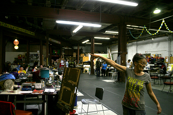
Ohio has a high concentration of quality progressive art studios compared to other states - 12 in 11 different cities across the state. During our research trip, we were able to visit both Visionaries and Voices (V+V) studio locations in Cincinnati. V+V embodies all of the essential qualities of a progressive art studio, providing two fine art open studio spaces that are utilized by more than 140 Cincinnati-based artists experiencing developmental disabilities. The studios are staffed by trained artists who provide non-intrusive guidance and facilitation, and the Northside location includes a professional exhibition space.
We spoke with Tri-County Studio Coordinator, Megan Miller and the Northside Studio Coordinator Theo Bogen during our visits; both are dedicated to and passionate about the mission of V+V and committed to facilitating the studio process based on what each artist is compelled to make.
an artist's work space in the studio
V+V stands out because of its professional, egalitarian culture. The relationship of the staff to the artists in progressive art studios is often simplified in terms of teaching or facilitating. In practice, the latter is defined by hands-off assistance, allowing the artist to create freely, and the former is a more codependent or antiquated approach defined by teaching or instructing in a didactic sense. V+V not only demonstrates the more progressive approach, but also in a deeper way, shows that this bifurcation is just a piece of a more complex continuum. Artists at V+V work with not only a sense of ownership of their own practice and work, but also with ownership of the entire enterprise, the studio itself. They move freely throughout it, develop personalized workspaces with ongoing projects and materials, and enjoy a peer relationship with the assisting staff.
This culture may be explained by their unique history. The studio began as a work space for the late Raymond Thundersky (now a local legend), and slowly transitioned into a non-profit program over the years. The workspace was organized by a couple of social workers for Thundersky and a few other artists. The identity of the studio as a workspace provided wholey to a group of artists, as opposed to an art program functioning as a service provider, persists in the culture today, much to their benefit. Most prospective artists hear about the V+V by word of mouth and have an informal artist interview to determine if they’re a good fit for the studio. Ultimately, their admission is dependent primarily on whether they’re interested in working productively as an artist. To be productive, though, is not considered to be synonymous with being prolific, as many artists may be productively and creatively engaged without necessarily producing commercially viable or permanent works.
V+V's exhibition space
The V+V gallery usually hosts five exhibitions a year, and organizes exceptional group shows. They typically curate thoughtful exhibitions featuring 2 or 3 of their artists in a manner driven by those artists’ ideas. Sometimes artists function as curators as well. Furthermore, exhibition opportunities for artists’ work are sought out at galleries, museums, universities, and other venues on both a local and national level. In addition, a Teaching Artist Program (TAP) is offered as an option for artists that instead have an interest in pursuing visual art careers in teaching, speaking, and other leadership roles. TAP “supports those goals, while offering the community the opportunity to learn about art from a unique perspective. V+V artists who complete TAP courses bring lesson plans to classrooms, community centers, and partnering organizations all over greater Cincinnati. Each artist develops their own lesson plans customized to benefit students of all ages and abilities.”
a portion of the inventory stored at the Northside Studio.
Marlon Mullen
Untitled, acrylic on canvas, 14" x 14", 2015
Untitled, acrylic on canvas, 30" x 30", 2015
Untitled, acrylic on canvas, 24" x 36", 2015
Nancy Graves, acrylic on canvas, 36" x 24", 2014
Marlon Mullen, who is represented exclusively by JTT in New York City, lives in Richmond California, where he maintains a studio practice at NIAD Art Center. Mullen’s abstractions reduce found imagery, often in the form of art magazines, to a point well beyond recognition. Mullen’s work, characterized by flat, simple abstraction, is achieved with an unprecedented sense of honesty, devoid of stylistic embellishment and without reverting to geometric or other systematic deconstructions (calling to mind the work of Gary Hume and Monique Prieto). Each elegant, lushly painted composition feels like an original and unequivocal interpretation of its source (often maintaining only fragments of the initial image), but ultimately asserting a new sense of resolution with power and charm. (See More)
Mullen currently has a solo exhibition on view until November 7, 2015 at Atlanta Contemporary in Georgia. Recent selected exhibitions include the Parking Lot Art Fair, San Francisco (2015), Marlon Mullen at JTT in NYC (2015), NADA Art Fair White Columns Booth in Miami (2014), Under Another Name, organized by Thomas J. Lax at the Studio Museum of Harlem (2014), Undercover Geniuses organized by Jan Moore at the Petaluma Arts Center (2013), Color and Form at Jack Fischer Gallery in San Francisco (2013), and Marlon Mullen at White Columns in NYC (2012). Mullen is a 2015 recipient of the Wynn Newhouse Award.
Mullen and his works at NIAD
Dan Michiels
Return of the Aliens, Mixed Media, 19" x 23" 2009
HG Wells in a Different Time Barrier, Mixed Media, 20" x 30" 2010
Return of the Worms, Mixed Media, 2009
all images copyright Creativity Explored
Michiels' works are difficult to categorize; they're not exactly images or patterns, and not merely symbols or clearly narrative in nature. They are collections of information - setting up and exploring systems to create intensely detailed works comprised of spaces and passages, each asserting a strong sense of significance and purpose without explanation. Their intricacy demands close viewing, but careful examination becomes a mind-bending exercise that's overwhelming and fascinating. Dan Michiels has been making art at Creativity Explored in San Francisco since 2008. From Creativity Explored:
“Michiels' painstakingly creates meticulous renderings of the mind’s action only in reference to a ruler, paper, pencil, and an array of color, and how these elements organize themselves in two dimensions. This can be a liberally amorphous registration of shape and color, or a pulsating, rigorous grid structure carefully filled-in to create a tessellated all-over composition. “(more)
FLASH tv

Below is the latest episode of Full Life’s television program FLASH tv, which includes a lot of great information about Uplife, a new inclusive community art space in Portland, Oregon. Full Life is a singular and wonderful program also located in Portland (see our overview here).
FLASH tv, produced by the Full Life Allstars and Rob Grey, is the most successful outlet for creative performance we’ve discovered at a progressive art studio. The charming, low budget production has an open-ended concept (including sketches, interviews, and absolutely anything else that they come up with), creating a context for new ways of thinking about and engaging in performance, as well as documenting real life experiences. Like many Full Life projects, FLASH tv doesn't produce a marketable art product, but instead demonstrates something more profound about the ideals of the progressive art studio through a pure and focused commitment to tapping into the rich, creative minds of the artists.
all 36 episodes of FLASH tv are available right here: http://www.flashtvpdx.com/
Kenya Hanley
Untitled, mixed media on paper, 9.5" x 9", 2014
A Lunch, mixed media on paper, 14" x 9", 2015
Kenya Hanley's works on paper have the feeling of both aspiration and interpretation. Bold, decisive drawings describe a world of abundance, encoded in color and imagined connections between realms of fiction and reality. Hanley works at LAND Gallery, a progressive art studio in the heart of DUMBO, Brooklyn, one of the premiere art neighborhoods in New York. From Land:
"Kenya’s work has been the subject of an exhibition at the flagship J Crew store on Madison Avenue, and the work has since become part of J Crew’s corporate collection. Kenya’s work also figures prominently in the collection of The Museum of Everything in London as well many private collections throughout the United States." (See More)
The Arts of Life
Established 2000, Chicago Illinois
The second Chicago program we visited was The Arts of Life - a young, principled, and community-oriented program. They’re an independent studio, without a larger support organization, that was founded by artist Veronica Cucilich in 2000. It began as solely a visual arts studio with 12 individuals, but now has two locations in Chicago offering various kinds of support for their artists. Both locations focus primarily on Visual Art, but also offer Music; the North Shore Studio (in Glenview) has mainly part-time attendance and includes Performing Art, a “project-by-project collaboration between The Arts of Life artists and Chicago-based performance makers.”
One of our tour guides, Frances Roberts.
During our visit to the Chicago Studio we were given an in-depth tour of the space by two of the program’s artists, Mike Marino and Frances Roberts. The building includes a small gallery space at the entrance, and large converted warehouse studio that includes workspace for painting and drawing, a printmaking press, storage space, and a kitchen break area. The space felt quite open; the artists moved freely throughout and engaged with each others’ work, conveying a real sense of ownership of the studio. Despite the bustling atmosphere, each workspace felt personal - artists surrounded by their ongoing projects didn’t seem to have trouble maintaining focus and developing a distinct creative practice in their respective sections of table space.
We spoke with then Studio Manager Caitlin Law and Development Coordinator Sara Bemer, two of only four paid staff (Studio Manager, Studio Coordinator, Arts Coordinator, and Volunteer Coordinator) working with 30 artists each day at this relatively large program location. There are also 3 full-time and 1 part-time office staff (Executive Director, Development Manager, Development Coordinator, and Executive Coordinator) that split their time between the Chicago Studio and North Shore Studio in Glenview. The program uses a substantial, constantly fluctuating team of interns and volunteers who provide support in all aspects of the program. This structure is the consequence of the program’s strong activist philosophy, or vise versa; in either case, their example provides important insight about the nature of utilizing volunteers in a progressive art studio.
Our conversation with Law and Bemer focused largely on philosophy; they expressed a passionate commitment to their artists receiving respect as professional fine artists and resist working with anyone who describes the artwork using sympathetic or inauthentic language, even if it means turning down opportunities or support.
Arts of Life artist Guy Conners
The Arts of Life’s dedication to their philosophical ideas is integral to the program, because its structure demands constantly teaching new members of their community (volunteers, interns, artists, etc). There are generally 5-10 volunteers at a time, including vocational rehabilitation workers. Volunteers sometimes help with artist facilitation (aided by written instructions regarding materials and intended progression for each piece). Office staff are also required to work one day a week on the studio floor in order to stay informed and maintain communication. For them, perpetually building and maintaining this culture in the studio is a means to raise awareness and educate the outside community. In further support of these ideas, the daily operations of the studio are managed by an egalitarian “system of collective decision-making” in which all aspects, from structure, events, exhibitions, and studio maintenance, to choices regarding language are discussed and voted on in large group meetings in which all of the artists, volunteers, interns, and staff are given a voice.
Arts Of Life colaborations at Terrain, Noël Morical and Jean Wilson above, Mike Paro and Tim Stone below
In addition to hosting exhibitions in the Arts of Life gallery space, they strive to participate in the local scene frequently. Artist often participate in gallery visits, especially since the studio is located right near the West Loop Gallery District. Notably, work from artists at The Arts of Life has been included in shows at respected Chicago galleries such as Threewalls and Terrain Exhibitions, as well as various retail venues. Vincent Uribe, the Chicago Studio’s Arts Coordinator, has organized The Arts of Life Collaboration Program in which Chicago-based artists pair up with Arts of Life studio artists for a minimum of six months. Most recently, Tim Stone and Jean Wilson collaborated with Mike Paro and Noël Morical for the exhibition Four Corners, creating two site-specific installations for an alternative space, Terrain Exhibitions, from February 8 - March 3, 2015. Terrain was founded in 2011 by artist Sabina Ott and writer John Paulett.
One of The Arts of Life’s important ambitions for the future is to increase their fundraising revenue in order to be less dependent on government funding, which is particularly sparse in Chicago. It’s clear that fundraising with a genuine commitment to more progressive ideas is a greater challenge than organizations serving this population have faced in the past. Other programs we visited using regressive ideas to interest sympathetic donors raise incredible amounts of money at the expense of alienating the individuals they serve from the community. From a pragmatic point of view, this only has short-term value. It provides immediate funding for great programming and services, but in the long-term it only maintains the divide between this population and the community, while creating a patronizing culture within the organization. This will eventually undermine the programming and ultimately render no actual benefit. Encouraging donors to give in support of the potential and greatness of others proves to be a harder sell than appealing to the desire to enable a group portrayed as helpless. Programs we visited after the Arts of Life have demonstrated that it’s not impossible, so we hope to see this studio continue to promote progressive ideas with growing success.

The Arts of Life Band
This Friday, March 13th, the Arts of Life Band and DHF Express (affiliated with Project Onward) will be playing head to head for the Fifth Annual Battle of the Bands. That same evening, The Arts of Life will be hosting the 4th Annual Square Foot Show at the North Shore Studio.