Mapping Fictions: Daniel Green

Daniel Green, Fifteen People, 2009, Mixed media on wood, 14.25 x 22.5 x 1.75 inches

Daniel Green, Little Mac vs Soda Poponski, 2015, mixed media on wood, 11.5 x 15 inches

Daniel Green, The Sun, 2015, mixed media on wood, 6 x 16.5 x 1 inch

Daniel Green, Business Delivery, 2011, Mixed media on wood, 13 x 29 x 1 inches

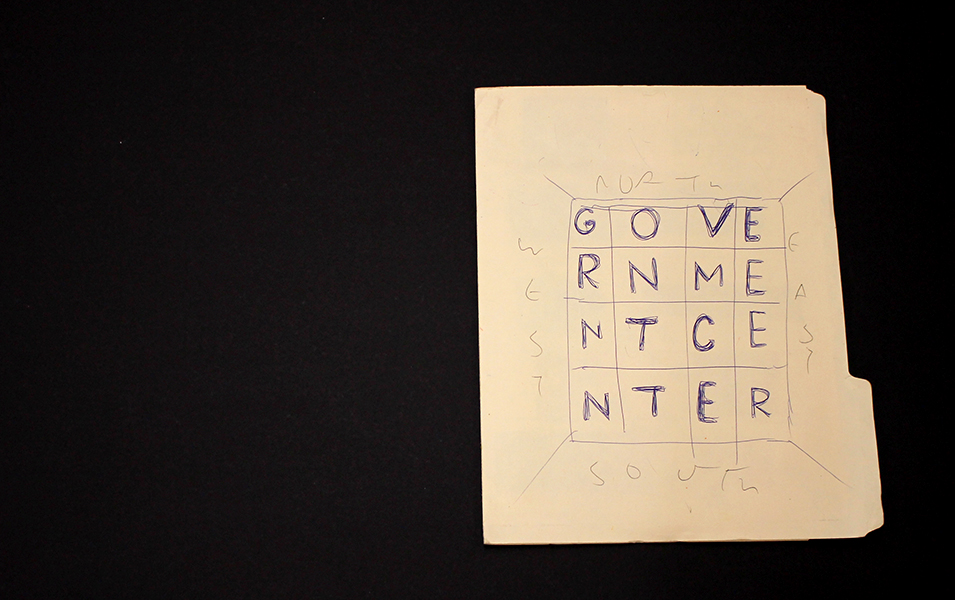
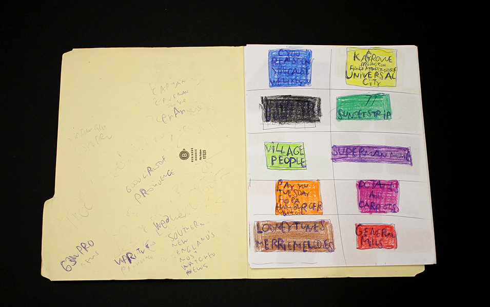
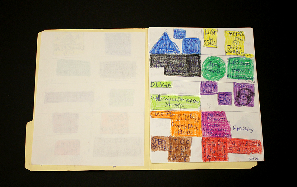
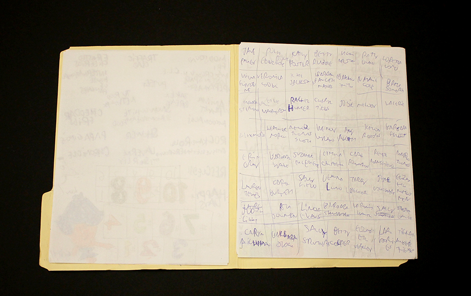
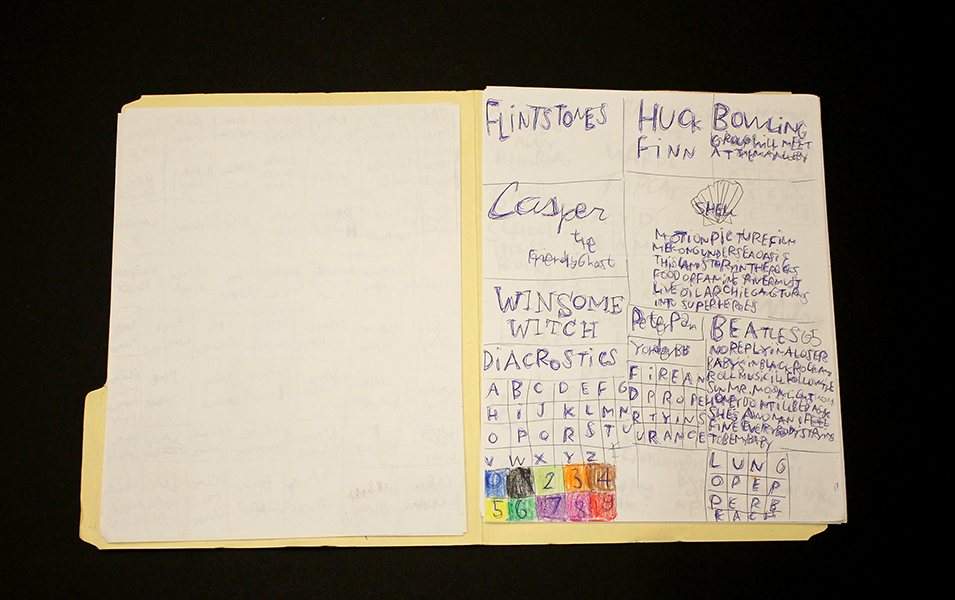
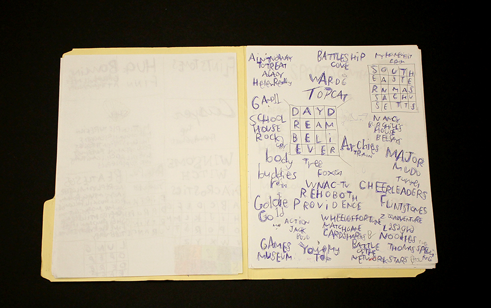
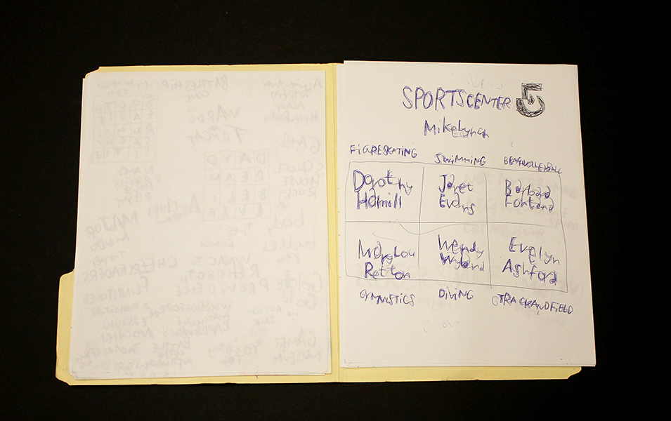
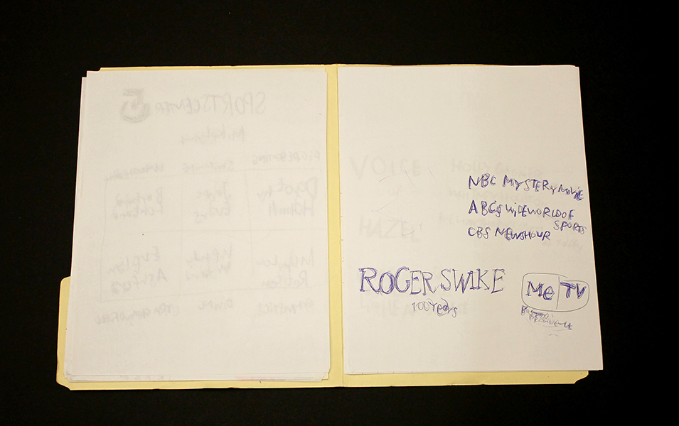
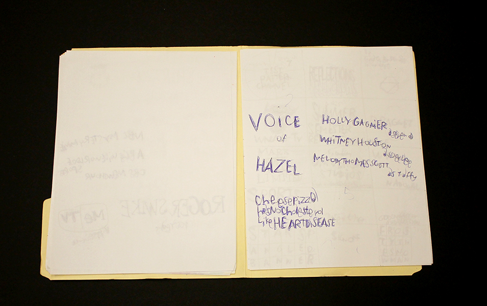
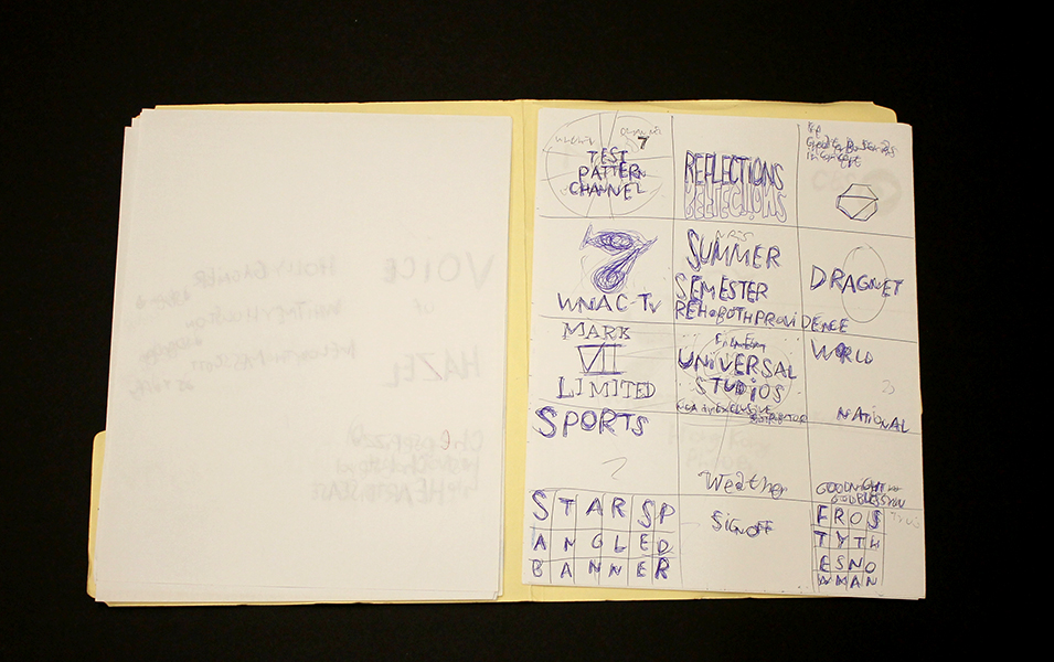
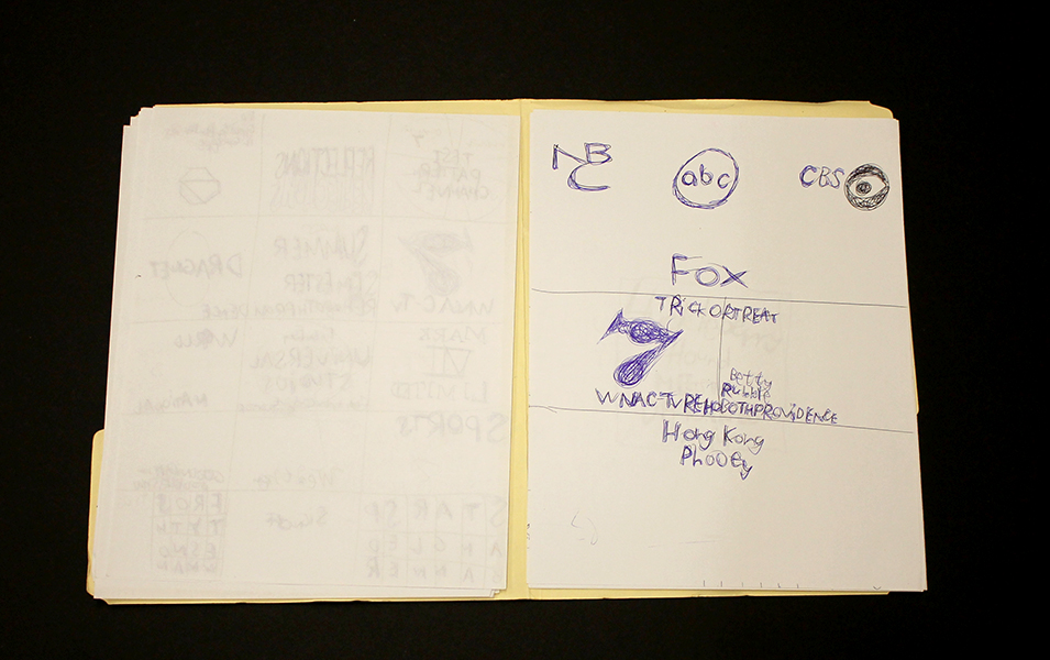
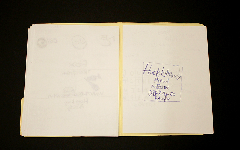
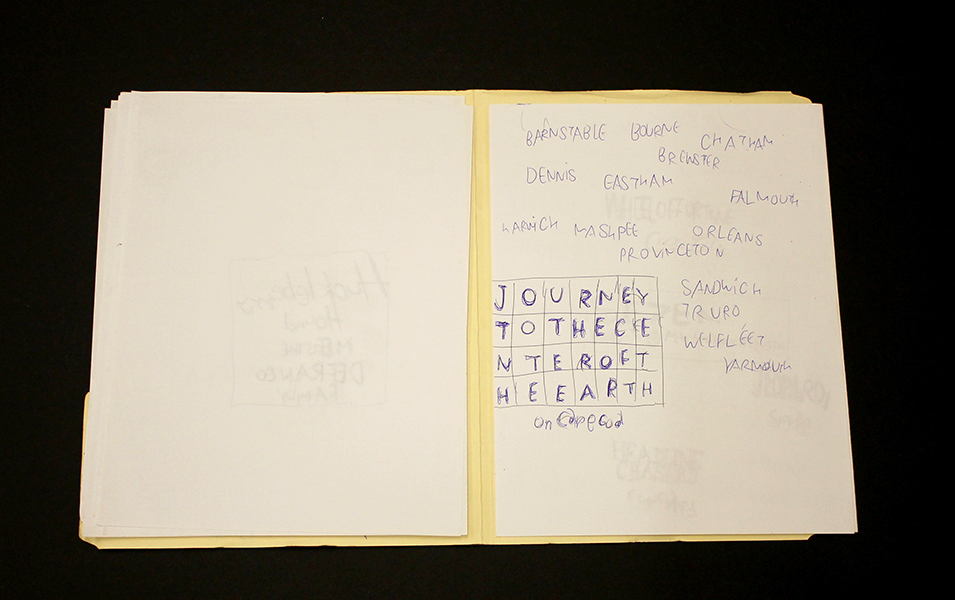
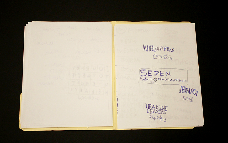
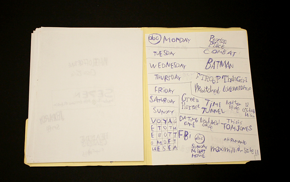
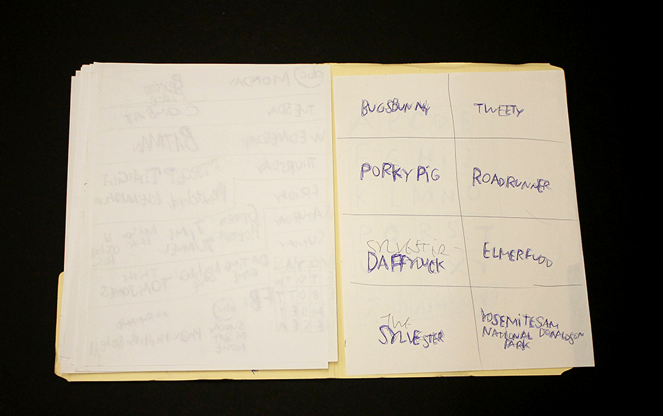
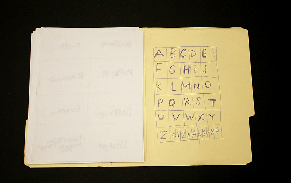
Daniel Green's process is slow and intimate; quietly hunched over his works in the bustling studio, he draws and writes at a measured pace. These detailed works are an uninhibited visual index of Green’s hand; when read carefully, they become jarring and curious, slowly leading the viewer to meaning amid the initial incoherence. Green’s text is poetic and complex - language and thought translated densely from memory in ink, sharpie, and colored pencil on robust panels of wood. Figures and their embellishments are drawn without a hierarchy in terms of space occupied on the surface; they are at times elaborate and at other times profoundly simple. The iconic figures’ facial expressions (Jesus, Abraham Lincoln, Tina Turner, video game characters, etc.) are generally flat with proportions stretching and distorting subject to Green’s intention.

Ultimately, these drawings compel the viewer to internalize and decipher Green’s ongoing, non-linear narrative. His drawings call to mind Deb Sokolow’s humorous, text-driven work, but are less diagrammatic and concerned with the viewer. In an interview with Bad at Sports’ Richard Holland, Sokolow elaborates on her process: 

I’ve been reading Thomas Pynchon and Joseph Heller lately and thinking about how in their narratives, certain characters and organizations and locations are continuously mentioned in at least the full first half of the book (in Pynchon’s case, it’s hundreds of pages) without there being a full understanding or context given to these elements until much later in the story. And by that later point, everything seems to fall into place and with a feeling of epic-ness. It’s like that television drama everyone you know has watched, and they tell you snippets about it but you don’t really understand what it is they’re talking about, but by the time you finally watch it, everything about it feels familiar but also epic.  (Bad At Sports)

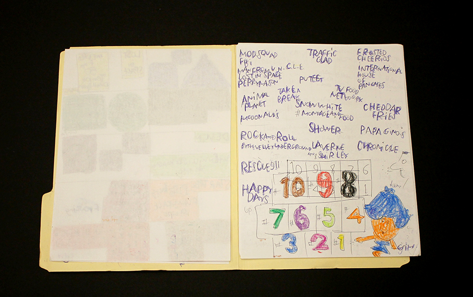
Much like Sokolow, Green engages in making work that begins with the rigorous practice of archiving information culled from his surroundings and interests, which then develops into intriguing, fictitious digressions. Dates and times, tv schedules, athletes, historical figures, and various pop culture references flow through networks of association - “KURT RUSSEL GRAHAM RUSSEL RUSSEL CROWE RUSSEL HITCHCOCK AIR SUPPLY ALL OUT OF LOVE…” Although the listing within his work sometimes gives the impression of being intuitive streams of consciousness, most of it proves to be very structured and complex within Green’s system. Rather than expression or even communication, the priority seems to be the collection of information or organization of ideas; the physical encoding of incorporeal information as marks on a surface is a method for making it tangible, possessable, and manageable. 

Daniel Green, Pure Russia, 2011, Mixed media on wood, 9 x 23 x 3.5 inches

Pure Russia (detail)

From the perspective that Green invents, there’s an endless number of time sequences that haven’t been considered before. A grid of days and times (as in Pure Russia) imagines time passing in increments of one day and several minutes, then returns to the beginning of the series, stepping forward one hour, and proceeding again just as before. It could be cryptic if you choose to imagine these times having a relationship to one another, or it could instead be an original rhythm whose tempo spans days, so that it can only be understood conceptually as an ordered structure mapped through time - the significance of the pattern superseding that of specific moments. 

By blurring the distinction between the articulation of ideas through text and the development of mark-making, Green’s highly original objects become unexpectedly minimal and material, yet simultaneously personal and expressive.

Daniel Green’s work will be included in Mapping Fictions, an upcoming group exhibition opening July 9th at The Good Luck Gallery in LA, curated by Disparate Minds writers Andreana Donahue and Tim Ortiz. Green has exhibited previously in Days of Our Lives at Creativity Explored (2015), Create, a traveling exhibition curated by Lawrence Rinder and Matthew Higgs that originated at University of California Berkeley Art Museum and Pacific Film Archive (2013), Exhibition #4 at The Museum of Everything in London (2011), This Will Never Work at Southern Exposure in San Francisco, and Faces at Jack Fischer Gallery in San Francisco.

Mapping Fictions: Roger Swike

Untitled, ballpoint pen on paper, 12 x 9 inches

Untitled, ballpoint pen and crayon on paper, 12 x 9 inches

Untitled, ballpoint pen and crayon on paper, circa 2013 12 x 9 inches

Roger Swike's ten crayons

Roger Swike is an exceptionally prolific artist who works rapidly on many pieces simultaneously; much like Melvin Way, his drawing process channels an immediate and intuitive stream of information, yet is also executed with deliberation and great intention. Swike will often revisit drawings created at different times and deliberately organize them into various color-coded folders; the resulting works are an assertive, endearing proposition about what an art object can be. Within content that initially appears chaotic or arbitrary, familiar text referring to pop culture and the exterior world is pervasive. Black and blue ballpoint pens and ten crayons are utilized as though each tool has a symbolic role. Some ideas are organized neatly into grids, others are written in less regimented clusters or lists, primarily in multiple layers of ballpoint pen. Over time, curious relationships and subtle patterns emerge, such as references to the number 7 or numbers listed on their own counting down from ten (but when listed alongside the alphabet they ascend from 0 to 9).

Because Swike’s work is disciplined and systematic, the viewer is tempted to decipher the rigid system that defines it, but the true nature of the work seems to reside in the plasticity of its rules. A grid listing Loony Toons characters deviates from the pattern to include "YOSEMITE NATIONAL PARK SAM DONALDSON", numbers are written in black ballpoint pen without an overlapping of blue pen, words or phrases are redacted, yet the sequence and grid are still drawn using the ten selected colors…often it feels as though Swike isn't creating the system, but instead exploring it as a poet does language, both fluent and curious. Each time Swike's lexicon is revisited, it presents an opportunity to rethink its mysterious nature - possibly an archive, message, map, poem, or something else entirely.

Roger Swike’s work will be included in Mapping Fictions, a group exhibition curated by Disparate Minds writers Tim Ortiz and Andreana Donahue at the Good Luck Gallery in LA, July 9 - August 27. Swike (born in Boston, 1962) has shown previously at the Berenberg Gallery in Boston, Fuller Craft Museum, the Outsider Art Fair, Margaret Bodell Gallery, and Phoenix Gallery in New York. He has also been awarded a MENCAP award in London, England.

We first encountered Roger Swike’s work many years ago, as studio co-managers and facilitators in a progressive art studio in Nevada; we began visiting other studios while traveling (before the inception of Disparate Minds). Swike has maintained a studio practice at Gateway in Brookline, Massachusetts (the oldest progressive art studio in the US) since 1995. Despite this, his extensive body of work remains relatively unknown outside of the Boston area, possibly because the art world hasn’t quite been ready for work as contemporary and singular coming from a living, so-called outsider artist.

Mapping Fictions: Joe Zaldivar

West Club Entrance at NRG Stadium, graphite, micron, and marker on paper, 18" x 24", 2016

Street Map of City of Industry, California, graphite, micron, and marker on paper, 18" x 24", 

Gates 5-8 of Sports Authority Field at Mile High, graphite, micron, and marker on paper, 18" x 24", 2016

Joe Zaldivar’s work documents and reimagines disposable or forgotten media with permanence and idealism; his vast and varied oeuvre includes massive, detailed hand-drawn maps, intricate interiors and landscapes drawn from Google Street View imagery, and drawings referencing local business mailers, logos, advertisements, and tv stills. He has also compiled an enormous, ever-expanding archive of home-recorded video ephemera which is uploaded to a YouTube channel (including cold opens, sign-ons/sign-offs, and advertisement segments from obscure tv broadcasts dating back many years), all citing sources, dates, and times.

To parse the intent or underlying conceptual framework of Zaldivar’s intensely elaborate creative endeavor, his Street View landscapes and interiors provide an important entry point. As a whole, they feel like the collected documents of a digital explorer searching for and preserving scenes from around the world, often capturing iconic landmarks: sports stadiums, restaurants, famous storefronts, etc. Aesthetically, each of these drawings isolates a moment (a necessary quality of any still image), a tendency that’s especially engaged in his drawings, as in Cindy Sherman’s film stills. This sense of candid immediacy and stillness could be attributed to the automated eye of the google maps camera car; Joe's interpretations of these moments, however, are more nuanced and often altered.

The Coffee Roaster, 13567 Ventura Boulevard, Sherman Oaks, California, graphite, micron, and marker on paper, 18” x 24", 2016

The Coffee Roaster, for example, remains faithful to its source material except for a few deviations; the billboard has been replaced with one lifted from another image, and one of the patrons (whose face is blurred in the street view image), is replaced with a man loosely resembling Homer Simpson, both of which are references to a 1995 episode of the Simpsons (Treehouse of Horror VI). In this episode, Homer Simpson ends up at “Erotic Cakes”, a bakery in the real world via interdimensional travel, the actual filming location being the storefront of The Coffee Roasters. This drawing exemplifies the manner in which Zaldivar’s work traverses multiple layers of meaning - navigating the world, drawing connections between reality and fiction, and isolating or describing fully a specific moment.

Recorded during the USA Christmas movie special, a 1973 20th Century Fox Television remake of the movie "Miracle on 34th Street" starring Jane Alexander, David Hartman and Sebastian Cabot on Tuesday, December 19, 1989 on USA Network.

In this context, recording moments digitally and creating intuitive, thought-provoking connections across various media, Zaldivar’s YouTube channel is a compelling enigma. Zaldivar's channel isn’t the only one of its kind, this curious practice has a surprising cult following. He’s among the most popular, however, with almost 2000 subscribers and nearly 4 million total views of well over 1000 videos. Sometimes he records directly from recent broadcast television, while other segments are culled from VHS tapes found at yard sales. Whereas other channels featuring this kind of content are direct digital transfers from other media, Joe records his television screen by hand with a tablet computer - the filter of his gaze is always present. Much like his Street View drawings, these recordings are slightly unsteady, but intensely diligent. As extensive as his archive is though, the moments he chooses to document are just a few waypoints into the realm of ephemeral television media. There’s a distinct ambition across all of his works to address and highlight moments not originally intended to be the focus of the media that they reference (as evidenced particularly in this early work).

Zaldivar with a work in progress, from a recent studio visit at First Street Gallery Art Center

Chicago Area Vicinity Map, graphite, micron, and marker on paper, 90" x 48" 

Given the map-like quality of Zaldivar’s process, it’s intuitive that his body of work would include actual maps. Zaldivar creates large-scale maps in 18” x 24” sections (usually divided into a grid of 8 or 10); he diligently works on one section at a time while referring to an iPad, with the completed sections stacked neatly beneath the one in progress. These hand-drawn cities reclaim selections from that endless modern world of digital maps, generated by swarms of satellites and computer systems, as a personal and human experience. Through this lens, his smaller drawings that incorporate both road maps and disposable ad imagery (logos, slogans, place names) can be understood as signifiers for a specific time and place.

Joe Zaldivar (b. 1990) attends First Street Gallery Art Center in Claremont, California (the same studio that supports the great Helen Rae). He has shown previously in Wunderkammer, an invitational group exhibition at Pitzer College's Nichols Gallery and Street Views, a solo exhibition at First Street Gallery Art Center. Zaldivar was the initial inspiration for the upcoming group exhibition Mapping Fictions: Daniel Green, William Scott, Roger Swike, and Joe Zaldivar at The Good Luck Gallery in LA, curated by Disparate Minds writers Tim Ortiz and Andreana Donahue, which will be on view July 9 - August 27, 2016.

Knicoma Frederick


Knicoma Frederick, Untitled (Candle Army Eyes) from the Series 80 Bit, 2006, Acrylic on canvas, 24” x 18”

Knicoma Frederick, Glory News Article from the Series Information 1600, 2012, marker and pen on paper, 8 ½” x 11”

Knicoma Frederick, Untitled (Elaborately Painted Pedicure) from the Series 80 Bit, 2008, colored pencil on paper, 8 ½” x 11”

Knicoma Frederick, from the series Die Evil 82, 2013

Knicoma Frederick, Unitled (Couple Painting/Interior) from the Series 80 Bit, 2010, Acrylic on canvas, 36 x 24 inches

“The painting is not on a surface, but on a plane which is imagined. It moves in a mind. It is not there physically at all. It is an illusion, a piece of magic, so what you see is not what you see … I think that the idea of the pleasure of the eye is not merely limited, it isn’t even possible. Everything means something. Anything in love or in art, any mark you make has meaning and the only question is ‘what kind of meaning?”       - Philip Guston

Prolific visionary Knicoma “Intent” Frederick has lived the intensely dedicated life of an artist for whom painting is more than painting - it’s a way to access something deeper than merely tangible or social ends. Frederick’s work engages the practice of image design and creation with a mystical or prophetic intent, relying on and striving to access and utilize the magic inherent in the process of painting.

Sometimes remarkably akin to the work of William Scott, Frederick’s work possesses an abundance of idealism, realized as utopian visions of the future - proclamations from Glory News, superhero first responders defeating armies of demons, or a “love and justice” rocket ship flying overhead. Where Scott has a steadfast tone of praise and celebration, however, Frederick’s narrative works also include darker, stranger, sometimes ominous themes that afford them a sense of gravity, conflict, and romance. 

Knicoma Frederick, Untitled (Couple Painting/Beach Scene) from the Series 80 Bit, 2010, Acrylic on canvas, 36" x 24"

Works such as Untitled (Couple Painting/Beach Scene) live in a space characterized by a more cryptic sort of mysticism, in which painting becomes not only the method that Frederick employs, but also becomes incorporated into the content of the image - overtly, when paintings are included in the image, and less explicitly when “painting” as an archetype is present in the work via the presence of painting tropes (such as a dramatic seascape or elements of  traditional still life). These tendencies also present themselves in the work of Los Angeles based painter John Seal

In response to our inquiry about Frederick and the concept of paintings of paintings Seal remarked:

"The magic, really, is in the disconnect/misconnect. It is in the way the subject and its material delivery interface/intermesh with the viewer's life experiences--it is the surprise of finding anything in common, the surprise of seeing one's self, altered and new, reflected in the painting which in turn becomes new in the viewer's eyes. The magic is in this dual rebirth of viewer (subject) and painting (object). The magic is the painting's ability to make this dual rebirth visible. Painting paintings of paintings is, to me, a way to lead people into the mechanics of image, and to invite the viewer to examine their own relationship to looking: if a picture can be captured by a picture via the means (language) of painting, what can it do to the rest of the world?"

Knicoma Frederick harnesses these mechanics to not only compel the viewer to reflect on the capacity of painting, but to also assert the presence of his message in the world he envisions. The "dual rebirth" that painting facilitates is, for Frederick, a pathway into this realm that his work manifests, and painting is explicitly the magic by which this manifestation takes place. 

In the course of discussing his WPIZ series of artist books, and a fictional video game called ArtFighter (which exists within WPIZ) Frederick articulates his manipulation of this mystical function of painting:

"People have heard of games like ‘Street Fighter’ and ‘Mortal Combat’ and ‘Tekken’ for PlayStation and XBox and all of those different types of game systems…But ‘Art Fighter…is fighting with artwork. You’re taking artwork and you’re fighting the situation with it. You’re taking a picture that represents what you want to have happen, done by the storyline in each book. You’re taking a picture, and you’re destroying the negative with it…I have an obligation to make the WPIZ so that the books are used for overcoming the evil that’s in the people’s way." (source)

Shortly before the establishment of the Creative Vision Factory (where Frederick maintains his studio practice), Director Michael Kalmbach encountered Frederick attempting to get permission at a drop-in mental health center to use the copy machine (unsuccessfully), presumably for the distribution of a handwritten series of newspapers (in the neighborhood of six hundred pages). Kalmbach cites this event as instrumental in the development of CVF (informing its goals, design, and function), not only due to the magnitude of this endeavor, demonstrating the need for and potential value of a studio of this kind, but also that the content of these newspapers provided important insight about both Frederick's personal experience and the mental health system in general.

Frederick’s works are conceptualized as series of books for which each work represents a specific page. Over the four years that he has been with CVF, he has published more than 25 artist books, each comprised of 125 - 150 works; prior to the publishing a book, the works can not be sold individually. Frederick has an extremely productive creative practice; Kalmbach estimates that he creates roughly 1000 works per year.  

Knicoma Frederick is originally from Brooklyn, New York, but is currently based in Wilmington, Delaware. Recent exhibitions include All Different Colors and Outsiderism at Fleisher/Ollman in Philadelphia and previously at numerous venues in Wilmington, Delaware. He has work in the permanent collection of the Delaware Art Museum and is the recipient of an Emerging Individual Artist Fellowship from the Delaware Division of the Arts.

Courttney Cooper


Cincinnati Map, 2010, ballpoint pen on collaged paper, 64" x 88"

Untitled, 2015, ballpoint pen on collaged paper, 52" x 80"

Cincinnati Map, 2009, ballpoint pen on collaged paper, 51" x 85"

Cincinnati Map, 2009 (detail)

Cincinnati Map, 2009 (detail)

images courtesy Western Exhibitions and Visionaries + Voices

Cooper’s oeuvre is a ongoing narrative featuring Cincinnati, imparted with adoration and idealism. Drawings that are tenaciously committed to archiving the city’s developing reality in bic ballpoint pen, Cooper documents the destruction of old buildings and construction of new ones, while modifying details to reflect the time of year (often after they've been hung in an exhibition space). But they are also richly populated with celebratory, idealistic imagery - flags flying on rooftops, hot air balloons traversing the sky above the river, “Do not be afraid, be a precious friend! Zmile, you’re in Zinzinnati Ohio USA 2011”.

Cooper’s works are often characterized as maps, which isn’t an entirely accurate categorization. Visionaries + Voices’ Krista Gregory points out:

I've come to learn that Courttney has been drawing "aerial views" of Cincinnati since he was a small child, first using an etch-a-sketch. His mark-making certainly reflects having this type of information/tool...I see the work that Courttney creates more in the vein of landscape, or townscape; as they are romantic in their visceral love for this place...I think that this work being categorized as ‘maps’ is misleading and couches them in something that is more related to Courttney's disability rather than to what it is that he is actually expressing and creating. They are not accurate. They are not drawn completely from memory. I've witnessed people hold on to wanting to think these things because it makes the work accessible or novel in some way. I sort of think that it is a reductive way to see them

The desire to see Cooper’s works as maps may be the consequence of trying to categorize autistic thinking - relegating autistic artists as spectacles of savant-ism. Courttney Cooper, however, is not comparable to Stephen Wiltshire, for example; his drawings are not an accurate configuration of streets as a road map indicates, nor are they a repetitious anonymous depiction of a city in an illustrative way. They're indeed informed by an intimate experience with his city - an astounding wealth of information accumulating across increasingly massive surfaces (created by gluing together scrap paper that Cooper gathers while working at Kroger). But this isn't the subject of the work, it's only the formal foundation that serves as a vehicle for Cooper’s voice. Cooper’s drawings are a complex and authentic network of specific places and structures; his streets are composed of details from memory or observation, cataloging expressions of particular perceptions in particular moments. The relationship of these moments to each other in space is approximated, as in memory - all of which culminates in a dizzying realm of overlapping information that becomes a living record, adorned generously with nostalgic, commemorative expressions of community and identity.

Zinzinnati Ohio USA: The Maps of Courttney Cooper curated by Matt Arient, is a selection of Cooper's drawings from 2005 - 2015, currently on view at Intuit through May 29th. Cooper is represented by Western Exhibitions in Chicago, where he has an upcoming solo exhibition November 12 - December 31, 2016. Cooper has maintained a studio practice at Visionaries + Voices in Cincinnati since 2004;  he has exhibited extensively in the greater Cincinnati area and has work in the Cincinnati Art Museum collection. Selected exhibitions include the Wynn Newhouse Exhibition at Palitz Gallery, Syracuse University (as a 2015 Wynn Newhouse Award recipient), Cincinnati Everyday at the Cincinnati Art Museum, Maps + Legends: The Art of Robert Bolubasz and Courttney Cooper at Visonaries + VoicesStudio Visions at the Kentucky Museum of Art, Cincinnati USA: Before Meets After at PAC Gallery, and Indirect Observation at Western Exhibitions.

Sylvia Fragoso

Untitled, glazed ceramic 

Untitled, glazed ceramic, 14" x 7" x 7", 2013

Untitled, glazed ceramic, 17" x 11" x 11", 2015

Untitled, glazed ceramic, 15" x 8" x 5", 2014all images courtesy NIAD

Untitled, glazed ceramic, 15" x 8" x 5", 2014

all images courtesy NIAD

Sylvia Fragoso’s methodically hand-built sculptures are crafted with a deceptive indelicacy and thick layering of glazes - small monuments in which form is defined by seeking rather than devising. Much like the ceramic work of Sterling Ruby or Julia Haft Candell, Fragoso reaches a compromise between concept and process. Where opportunities arise, she inserts symbolism that declares an identity for the work; subjects common in her drawings such as church and family are translated into physical form in a manner analogous to the way that her method of building with clusters of shapes on paper translates to her process of building with clay. References to function or representation are ultimately denied in favor of material manipulation and aesthetic - a revelation of the joy of making.

In a recent Art In America article The Happy Medium, Leah Ollman discusses the re-emergence of ceramics in the contemporary art discourse (especially in L.A.):

A new shift, roughly a decade old, has been catalyzed not by a single or even a few strong personalities, but by a broader redefinition and realignment of creative practice. Increasingly post-disciplinary, artists roam freely among mediums, unencumbered by traditional boundaries and hierarchical divisions. Many show a renewed interest in work of the hand, which they see as an antidote to theory- and concept-driven art. A messy physicality is often their (defiant) answer to the disembodied digital; theirs is a rising constituency for authenticity which advocates the material over the virtual.

This shift has extended to progressive art studios as well; in addition to Fragoso, other self-taught artists creating exceptional ceramic work are Mirov Menefee of The Canvas in Juneau, Alan Constable and Chris Mason of Arts Project Australia in Victoria, Cameron Morgan of Project Ability in Glasgow, Tanisha Warren at Creative Growth in Oakland, and Billy White, also of NIAD.  

Fragoso (b. 1962) has exhibited recently in Hold Onto Your Structure : The Ceramics of Sylvia Fragoso at NIAD Art Center (2016), Telling It Slant organized by Courtney Eldridge at the Richmond Art Center (2015), Visions et Créations Dissidents at Musée de la Création Franche in Bégles, France (2014), ArtPad SF at the Phoenix Hotel in San Francisco (2013), and extensively in group exhibitions at NIAD, where she has maintained studio practice for many years.

Untitled, graphite on paper, 24" x 18"

Untitled, graphite on paper, 24" x 18"

Insights from Ari Ne'eman

Ari Ne'eman

Recently Disparate Minds had the opportunity to have an encouraging and insightful conversation with Ari Ne’eman about progressive art studios, the incredible work they do, their future, and their relationship to the disability rights movement. Ari is a hero of the movement, particularly as a champion of autism rights and autistic self advocacy; he’s the co-founder and current president of the Autism Self Advocacy Network (ASAN) and was appointed by President Barack Obama to chair the National Council on Disability’s Policy & Program Evaluation Committee in 2009 (Ne’eman is the first autistic person to ever serve on the council).

As we’ve traveled around the country speaking with directors of progressive art studios, a common concern, almost everywhere, has been how these programs can continue as regulations regarding medicaid services change - that phasing out the practice of providing medicaid funded services in a “congregated” or “sheltered” setting could threaten their existence. Strangely, progressive art studios seem to find themselves at odds with the broader disability rights movement as a direct result of this. As we’ve researched to understand this issue, we’ve found that representatives of the disability rights movement generally just aren't aware that progressive art studios exist or familiar with their impact or importance. Other than a general awareness of the VSA (a network of providers affiliated with the Kennedy Center offering some art related services to children with disabilities), Ari also had no prior knowledge of progressive art studios, had never heard of Creative Growth or Judith Scott, and didn’t know that at the center of our culture, the art world, there’s an incredible shift occurring in the way that developmental disability is currently understood.

During our visit with Creativity Explored director Amy Taub, responding to a question about developing practices to accommodate future regulations (such as an integrated or community based model that works) said “this is what works”. Studios like Creativity Explored have, for decades, provided day programs supporting artists to have independence, agency, and place in our culture to a degree beyond the the most idealistic dreams of any other form of service provider. Championing the voices and ideas of people with disabilities in national and international forums, in public works and large-scale commercial endeavors. And yet, Taub also conceded poignantly that progressive art studios are an incredibly small fraction of medicaid providers for day or employment services.

Through exhibitions, artists like Marlon Mullen achieve a profound connection to a broader community. 

Furthermore, it’s not only studios that aren’t well known or understood among disability service providers, but art itself. The achievements of artists like Judith scott, Dan Miller, Courttney Cooper, Marlon Mullen, Julian Martin, and Helen Rae feel monumental; it’s easy to forget how small and obscure the art world really is to the majority of the population. The reality is that most people wouldn't know who Larry Gagosian or Jeff Koons are, nevermind Matthew Higgs or Andrew Edlin, even as their influence touches so many aspects of our culture. The social impact of contemporary art isn’t married to public knowledge of its agents; the average IKEA customer has likely never heard the name Donald Judd. The impact that progressive art studios have made and can make, is enormous and unprecedented in history for people with disabilities, even as the most successful examples of artists from progressive art studios remain mostly unknown.

We believe that even though progressive art studios are currently a relatively small fraction of services provided, the work they pursue is essential. We decided to reach out to Ari Ne’eman and discuss this specifically in response to his own comments on the relationship of the disability rights movement to social and cultural change. In this video Ari responds to a question about the lack of social and cultural victories made by the disability rights movement, conceding that the movement has focused on making valuable legal and policy advancements by “soft selling” the cultural and social impact that’s aspired for. He states, “We haven’t excelled at turning out large numbers of people, we haven’t excelled at winning social and cultural victories” and that the movement is “not well-geared towards winning hearts and minds”; as a result of this and the movement being insular in nature, Ne’eman says, “We don't see the broader cultural conversations about disabilities that we see in the context of other identities.”


Winning hearts and minds while creating broad cultural conversation is exactly what progressive art studios are doing, better than any other model for support. We conveyed to Ari the feeling expressed to us by many progressive art studios that “congregating” or “facility-based” programs are unfairly regarded to be necessarily less progressive than integrated community-based supports, arguing that although progressive art studios aren’t integrated spaces in a traditional sense, they affect integration and inclusion in their respective communities and cultures through exhibitions, which ultimately provide a categorically more authentic presence for the voices and ideas of artists with disabilities than simply being physically present does.  

We also argue that even though integration is possible and is being pursued by several studios, it may not be without a cost to the studio’s effective functioning, as well as their social impact.  Currently, we argued, these studios are emerging in the contemporary art conversation as a new model for artists’ careers and development, and it’s important that this movement belongs to artists with disabilities and their respective studios. Even ignoring the practical disadvantages of transitioning to a system in which artists with disabilities rent studio space to work alongside neurotypical artists (with facilitators visiting to work with them as job coaches), this is a change that would undermine these artists’ ability to make a case for their place in history not only as artists who are successful despite disability and receiving services, but as artists for whom being disabled and receiving services is an integral part of their identity, their lives, and their creative practice. These artists’ disability and dispositions as recipients of services should be understood as a legitimate cause to congregate as artists, because it should be understood as a legitimate way of being.

The studio at the Center For Creative Works in Philadelphia PA is a rich creative community

Ari’s response to this was encouraging and compelling. He expressed that integrating progressive art studios wouldn't have to mean eliminating the studio itself, or even depriving it of its identity as a space for artists with disabilities, it just needs to also be open to artists without disabilities who aren’t paid supports. Ari explained that this isn’t just about the social impact of integration, but also how integration affects the delivery of services. This is something easy to forget, as our focus has been on the handful of studios who are the most progressive and successful in the world, where delivery of services isn’t a concern.  Looking more broadly, that there are a great many programs who provide art, even in an open studio setting that aren’t as effective as they should be - who are not as organized, progressive, or person-directed as they should be. It’s undeniable that the quality of services provided by staff would, as a whole, be better if staff were also working with neurotypical artists. In this sense, it’s impossible to deny that if all service providers providing day programs were required to be open and appealing to neurotypical artists using their space alongside artists with disabilities, they would be forced to use more progressive practices. It’s significant that this idea only makes any sense for art studio programs - they’re the only kind of day program that would be appealing to neurotypical artists if they become open to them.

Ari explained that there has been a focus on integrating and improving residential and employment services more than day services, and he committed to us that he’ll keep progressive art studios in mind as attention shifts to day services. In response to our description of the progressive art studio model, Ne’eman emphasized a few key points that will be important going forward:

  • Focus on benefit to the individual served

Although the social and cultural impact of progressive art studios and their artists is important, it should never be prioritized over benefit to the individual. This means facilitating and supporting career management in a way that always prioritizes the artist’s wants and needs above all other concerns, including social impact, or benefit to the program or its staff. This means not exhibiting or selling an artist's work if they don't want it exhibited or sold, even if that exhibition would provide valuable exposure for the program as a whole. This also means being very careful about collaborative projects, which are often regarded as a good way to connect with the community, but which could also present a high risk for exploitation.

  • Severability of services

The relationship of the program to the artist needs to be such that the artist is able to continue their life and career even if they chose to use another provider. This is a concern that stems from problems identified in residential services in which service providers are also landlords, so ending or changing services means moving out of their home.  

For progressive art studios this has important implications in two dynamics of the model. One is ownership of the artists’ works - both physical inventory and as intellectual property.  Agreements have to be very clear from the start about how this is managed in the event that an artist chooses to stop being a part of the studio or move to a different studio. The other dynamic is the marriage of habilitation/care services and art facilitation/career management services. Having artists work with artists in the studio is essential, so the dual role of artist staff as facilitators and direct care or habilitation staff is an ideal arrangement. The principle of severability of services would seem to  also require that the artist should be able to continue to use the studio even if they prefer to use a different provider for rehabilitation services, or if they chose to discontinue their habilitation or care services. The latter is arguably more essential, and certainly more feasible, as it would simply require that the artist pay for their use of the studio by some other means, as neurotypical artists using the studio would in an integrated arrangement.

  • Eliminating scheduling of regular hours

One of the essential aspects of a progressive art studio described by Lawrence Rinder in discussion of the Create exhibition was that the artists work in the studio during “hours which reflect the common work hours, five days a week 9-5”.  However, artists shouldn’t be in agreement with the studio to attend at certain times as they would attend work or school, but may set goals to invest a particular amount of time and devise plans that use a schedule to meet that goal. In practice, this seems to boil down to a mere matter of language, but it’s based on an important principle; artists in progressive art studios aren’t paid an hourly rate, so they can’t obliged to attend particular hours. Attendance policies or schedules that have a compulsory feeling are left over from less progressive models - an artist's use of the studio should be understood as self-motivated.

The most encouraging insight from this conversation was that the future of progressive art studios may be not only to sustain as regulations change, but to broaden scope and expand as a new definition of what day programming is. If studios are understood not as part of an outmoded form of service, but as the examples of the ideal model for a still relevant and important one, then day programs in general can be redefined, no longer as places where people with disabilities are accommodated, but as spaces for creativity, in which a truly neurologically diverse group of creative people congregate to utilize tools, materials, and work space with guidance and support as needed - spaces that are for expression, entrepreneurship, and all manner of making, whose existence is a statement about the essential relationship of diversity to productivity as paragons of the most extreme expression of those principles.

Deveron Richard

Sectra Shower, watercolor on paper, 18" x 24”, 2014

The Milkets, watercolor on paper, 26" x 32”, 2015

The Planets, watercolor on paper,  17.25" x 23.5”, 2009

A Border Between Unicorns, watercolor on paper, 19" x 25.5”, 1996

Deveron Richard maintains a creative practice at one of many ECF art centers in the LA area (previously discussed by Disparate Minds in terms of their relationship to DAC Gallery). His inaugural solo show is currently on view in LA at the Good Luck Gallery through May 21st. From the Good Luck Gallery:

“An idiosyncratic iconography of visionary space travel and anthropomorphic sexuality arrives via the South Bay of Los Angeles through the singularly fertile imagination of Deveron Richard. Winged horses in brassieres and high heels glide peacefully around the cloud-enshrouded towers of a futuristic city, polar bears in lipstick and slit dresses prance through a fluorescent arctic landscape, and provocatively-attired unicorns face off on a hallucinatory geometric color grid. These hybrid creatures of exaggerated femininity exude a quirky eroticism. Rendered in watercolor with a distinctively saturated palette, inventive draftsmanship and hypnotic backdrops of complex rhythmic patterning. Other works depict interplanetary battles with rockets hurtling through galaxies and deadly beams shooting into space.”

Full Life

full life

Full Life in Portland, Oregon (founded by Rachel Bloom in 2004) is a unique and dynamic program whose methods are informed by client choice with more depth and ambition than most service providers of any kind that we have encountered. Full Life is funded as a day program and receives no private donations; they’re technically for-profit, although profits tend to go only into the development of more programming. 

Full Life began as an open art studio and is still centered around this format, but now offers a wide range of daily recreational and vocational programs including work in their own “Happy Cup” Coffee Shop, janitorial assignments, employment in a greenhouse and chicken farm, and a wide range of creative arts classes and projects, among many other options. The Full Life staff, a team of 20+ creative people, are all given agency to develop and introduce new programming and opportunities to offer. The schedule is incredibly diverse (and in constant flux), initiating and retiring activities organically. Because staff working directly with individuals are also involved in developing the programming, what is offered (and when) can be constantly tracked based on demand and interest. The art studio portion of the facility is always open for clients to come to between projects or when they lose interest in a project they’re signed up for. 

The program serves around 160 individuals who attend five days per week, split fairly evenly into two 5 hour shifts (morning and afternoon) with a one hour overlap. Their most impressive achievement is that they offer this wide range of opportunity to their large community of clients with incredible flexibility. Each person chooses his or her daily activities at Full Life (not only with a team in an annual or quarterly planning meeting, but independently every day).

This scheduling board hangs in the reception area; the programming offered is updated daily and each person comes to the reception desk in the morning to plan their day - their name is written under the activities that they wish to attend and then staff use this schedule to understand their own schedules for the day. Opportunities on the board include everything from paid employment in the community to foosball tournaments and karaoke.

Steve the Program Director states “everyone has the right to work, if they want to”, elaborating that an individual granted a subsidy to live on due to unique social, physical, and intellectual struggles should be offered opportunities, but not forced to be employed if they’re satisfied with an unemployed life. Full Life is committed to offering individuals the opportunity to excel in whatever manner suits them, rather than attempting to encourage them to be excellent in some consensus paradigm of what it means to be productive or employed. An individual decides whether or not to work each morning and everybody is encouraged to do well in whatever they choose to do. Ultimately, in spite of this unconventional approach to considering employment, Full Life offers about as much traditional employment as any program of its size serving a comparable population. 

The question of whether art is understood as recreation or career isn’t answered by Full Life, but is instead determined by the ambition of each artist. Full Life sells some artwork, but customers are almost exclusively Full Life staff. Artists are permitted to take works home and to make artwork as gifts for friends.

An important lesson to take away from Full Life is the depth of meaning that some of the projects achieve as a result of the cultivation of a community driven by individual choice. Although they don’t tend to produce cohesive bodies of work for exhibition, they do complete works that have deeply understood meaning within the context of the Full Life community.  A large, collaborative, and ever-changing window display is a voice of the community, that is for many a more intuitive way to speak to the outside than a delicately presented gallery exhibition.

These championship belts also play an important role in foosball tournaments that staff person Rob Gray describes as “a very big deal around here.”  Works like these can be viewed as art objects, somewhat like aboriginal masks in a museum case, where the intensity and adoration with which they are crafted could be well understood and respected. But within the realm of Full Life, they have a greater and clearer meaning than they could really achieve elsewhere. Because work is allowed to be entirely personal, many works are kept by the artists or created for a particular person; one could likely collect from the staff offices a very endearing collection of works.

This philosophy grants the freedom for the facility to become an art studio in a more natural sense. It’s a place that not only creates projects, but also explores ideas. Staff are empowered to develop programming at any time and are therefore able to devise projects that respond to the concerns and interests of the artists in the moment. Some projects are intended to develop skills and introduce concepts that empower, others resemble something more like a collaboration between staff and artist (truly between artist and artist). The result is a committed team of staff, an empowered and satisfied group of clients, and an exceptionally strong culture of mutual respect. There are truly beautiful examples of artists enabled to achieve excellence,  such as the poetic works of Marvin Asino, who is supported by Full life to participate in readings and access local creative writing communities. The culture cultivated by Full Life’s deeply person-directed methodology is described by the various creative projects they produce collaboratively, whose sole function seems to be expression of their community, such as this video, “when you least expect it”

Marvin Asino

From the Disparate Minds collection: “For all of my friends and one basketball player” is a zine containing 21 poems interpreted from the text works of Marvin Viloria Ariza Asino. It’s sensibility can be described using Marvin’s own words “rhythm; kind, beautiful, friendly.”  Asino writes in a matter-of-fact manner (siding in a space where humor and simple, profound truths meet), so the force of its beauty comes entirely by surprise with a wonderful sense of mystery. 

This anthology was given in the course of a conversation with one of Marvin’s many friends, Robert Grey, at Full Life, in Portland Oregon last year. An updated overview of Full Life, a very different kind of program, will be posted soon.

Billy White

My Body, mixed media on canvas, 18" x 24", 2015

Jed Clampett, glazed ceramic, 10" x 7" x 4"

Untitled, acrylic, 18" x 24", 2015

Untitled, graphite on paper, 12" x 17"

Untitled, mixed media on canvas, 24" x 18"

The process of evaluating any artwork includes some interpretation of how it functions - mechanisms such as the way gestural brushstrokes communicate movement by indexing the physical action of their application, or the way that arrangements of representational imagery can imply relationships between elements that generate narrative.

The mechanism by which Billy White’s paintings elicit emotion is sharply specific, yet escapes analysis, remaining a wonderful mystery. A loose, fearless application of paint renders forms with a striking physicality and sense of humor. There’s an uncanny affinity with the work of figurative painters Todd Bienvenu and Katherine Bradford (who both have an aesthetic undoubtedly informed by the work of self-taught artists). The impact of White’s work cuts through a vivid alternate world that operates on White’s terms - a highly original set of priorities, passing over image and rendering to achieve an expression of mood and vitality, as though excavating the underlying stories that were already present; impatient mark-making and barely legible imagery find time and space for redolent storytelling and detail. While he typically focuses on painting and drawing, White occasionally creates small ceramic sculptures that are rich in character and evocative of Allison Schulnik’s warped clay figures - slumped postures, elongated, rubbery appendages, intermingling glazes, and sunken, cartoonish expressions.

White’s work is largely influenced by his avid interest in pop culture, often depicting actual and imagined events in the lives of various celebrities or fictional characters, from Dr Dre to Hulk Hogan to Superman. NIAD provides some insight into White’s process: “He might start off painting Bill Cosby, but quickly change his mind by lunch. When that happens, he simply works right on top and doesn’t erase what came before. The new work becomes an extension of the old. By the end of the day this could happen several times and what’s often left is a latticework of figures and stories with interchangeable meanings.”


Billy White (b. 1962) has exhibited previously in Rollergate at the Seattle Art Fair, Telling It Slant organized by Courtney Eldridge at the Richmond Art Center, Undercover Geniuses organized by Jan Moore at the Petaluma Art Center, ArtPad San Francisco at the Phoenix Hotel, and extensively at NIAD Art Center, where he has maintained a studio practice since 1994. He has an upcoming solo exhibition at San Francisco’s Jack Fischer Gallery later this year.


Progressive Practices: Materials, Archives, and Inventory

“I am glad that I had the guts to make these things, and that people like them, because I want them to live for a long time after I am gone.” - Patrick Hackleman 

A remarkable aspect of the progressive art studio history is their independent emergence across the world. Creative Growth in Oakland, California is widely regarded to be the first; they were among the first to be established (Gateway Arts in Brookline, MA was founded shortly before) and they were, by far, the first to break into the art market and support artists that are recognized nationally and internationally. However, the relationship of this first program to subsequent programs elsewhere doesn't strictly follow the typical narrative of a pioneering idea. Their legacy is significant; Franz and Elias Katz went on to establish Creativity Explored and NIAD, and many programs have looked to the bay area as they developed (utilizing the example of Creative Growth as a proof of what's possible with this model). However, versions  comparable to the progressive art studio are widespread and usually come into being without any knowledge of Creative Growth or any other studio. It has been and continues to be a naturally occurring phenomenon. 


Art-making is an intuitive and fantastically effective solution to many of the issues that various service providers for adults with developmental disabilities strive to resolve. As those of us who work within the field understand, the endeavor to provide the least restrictive environment isn’t a merely passive endeavor, It requires a proactive, thoughtful, and ambitious effort to provide not just a safe space, but also  independence, validation, and opportunities to make valued contributions in the community. In a setting based on these aspirations, art-making is a perfect answer, and in some form it tends to be introduced at some point, but in most cases with woefully insufficient ambition or perspective. 


Once art is introduced in settings comparable to day programs, a door opens and an important opportunity emerges. From that point on, the success of the program is dependent on how much the staff believe in the potential of the works created to be great, meaningful, and valuable - and how they express that belief. The degree of belief spans a vast spectrum, at one end the artist’s potential is overlooked entirely as they’re encouraged to waste time by following step-by-step instructions to create mediocre craft objects, and at the other end their potential is hindered only by the limitations that the art itself has to be great - a limit that has not yet been discovered by anyone ever. How a progressive art studio demonstrates respect for their artists and belief in their potential is first expressed in tangible terms - how the work is handled and presented (in not only exhibitions, but at all times). The standard of these practices sets the tone for every aspect of the studio’s functioning, permeating the culture of the organization and influencing how the artists perceive their own work and potential.

Because progressive art studios don’t necessarily emerge with the intention of becoming fine art organizations, and often exist within larger organizations for which fine art has not been a part of their history or culture, they tend to reside within a system that isn’t prepared to understand the process of maintaining an art practice. As a result, many basic concepts such as the nuanced quality of materials or the concept that a great piece can be ruined very easily, aren’t broadly understood. Advocating for respecting the work and believing in its potential must be a constant effort, on every level, from the working culture within the studio, to the relationship between the studio and both its parent organization and the community; every choice has to adhere to clear principles with great conviction.  

The Canvas' Jeff Larabee working with a selection of archival markers and surfaces 

The Canvas' Jeff Larabee working with a selection of archival markers and surfaces 

High Quality Materials      
The first expression of belief in and respect for our artists’ endeavors is the investment we make in the materials provided. High quality art materials are expensive and great art can be made using very inexpensive materials; Henry Darger and Joseph Yoakum created amazing bodies of work in this manner. However, their work has yellowed and faded over time, with restoration efforts already being utilized to preserve their original integrity. The principle that a studio should follow is to use the highest quality archival and lightfast materials feasible for each artist; this must be a highly individualized facilitation process. New, very prolific artists, or artists who haven’t yet matured in their practice may work with student grade materials, but it’s not unreasonable to provide a very expensive sheet of handmade paper to someone who routinely spends months dedicated to completing a single drawing. 

A program should strive to develop a budget capable of maintaining a baseline for quality of materials that, at a minimum, accounts for archival integrity while also allowing room for larger investments in artists who demonstrate promise. As often as possible, these investments and the precious nature of materials should be communicated to the artists. Learning to be attentive to the distinctions in quality and craftsmanship of tools and materials is an important aspect of being a visual artist; developing reverence for a beautiful surface or rich pigments can be an important step in an artist's development. 

Great Photo Documentation and an Archival System
For a progressive art studio to create a clear and complete archive of works is an ongoing  difficult and time consuming task; even medium or small sized programs easily produce hundreds of individual works each month. No other kind of art organization has such a labor-intensive professional archiving process as the progressive art studio; art schools produce a lot of work without storing or documenting it and galleries, museums, and private collections preserve and document large quantities of works, but they aren't created in house. Therefore, developing a great system to achieve this inevitably requires a bit of thought and innovation. Much like great materials, an archival system can be a huge investment (including proper lighting and camera equipment), but the benefits are equally huge.  

The best and most thorough studio archive project we’ve encountered is NIAD’s inventory, which is available to view online in the form of a Tumblr blog - a great resource for what an inventory should ultimately look like. At first glance, it gives you an impression of the program overall, listing works by all artists, with the most recent work at the top. What makes it really powerful, though, is its searchability. You can search a specific artist's name to access their complete body of work, as well as search by medium or year. 

Marlon Mullen's work in NIAD's online archive 

Marlon Mullen's work in NIAD's online archive 

There are many ways to achieve a similar system offline. The key is that each work have a distinct identity - a unique accession number that’s included in the filename of the digital image and physically written inconspicuously on the back of the work. These numbers can then be used to store Information about the work, including artist name, title, medium, size, framed or unframed, and whether it’s currently part of the inventory or sold previously in a simple searchable document (database or spreadsheet) separate from the images. This can be great resource for the program to track its own progress, to be aware of and critical about its trends. 

An archive such as this makes the difference between being perceived and dismissed as a space for recreation or therapy, and being recognized and revered as a powerful and productive cultural institution. It’s also an extremely beneficial resource for gallerists, collectors, curators, and the press, providing convenient access to an impressive collection of incredible bodies of work.  

As important as these pragmatic benefits are, though, is the statement and attitude implicit in developing an impressive archive is more important; the work is either treated as if it’s worth documenting, or as though it is not.

A Clean, Ordered Storage Space and Clean, Careful Handling Practices

Many years ago I worked with a young woman who was caught up in a network of behavior modification obsessed service providers carefully executing “proven” methods to move arbitrary behavioral metrics incrementally. Regretfully, I was never able to fully support her to escape this pseudo scientific culture she was immersed in, but I was able to have her attend our studio for a few days a week, where she was provided with beautiful sheets of pristine drawing paper, on which she made fantastic drawings that were subsequently stored away carefully. During this period of time I visited her home, a state owned “intensive care facility.”  Standing in her living room, I was struck by what the the physical nature of the space asserted about the relationships existing within. There were small thrift store artworks hung weirdly high on the wall out of reach, thick glass brick windows, and a tv bolted to a quaint, wooden piece of furniture that was also bolted to the floor with a simple, but sturdy iron armature holding a sheet of 1.5” thick plexiglass in front of the screen, to protect it.

The contrast between the sensibility of this environment and the practice of giving her that valuable, delicate sheet of drawing paper, not only without protecting it from her, but with the presumption that when she was finished, it would be greatly more delicate and valuable than before, could not be more stark (and for home staff accompanying her to the studio, this notion was downright counterintuitive). This example is extreme, but defines a stigma that proves to be a significant barrier to any progressive art studio, especially those that exist as a part of a larger service provider. Day hab programs tend to be spaces defined by a preoccupation with safety, filled with reinforced or disposable versions of ordinary objects. Assembly workshop programs avoid jobs that entail the creation of delicate products or handling of delicate parts. In a setting that fashions itself to be a productive environment, the stereotype that those with disabilities are clumsy and careless is insidiously destructive. Progressive art studios’ designs and intentions aren’t just divergent from traditional programs for people with disabilities, but are actually opposed to and incompatible them; as much as they resemble day programs in form, they are, in almost every dynamic, the exact opposite. 

The inventory at Grace Studio in Hardwick, Vermont. In addition to providing access to art to people with disabilities in their community, Grace owns the estate of the late Gayleen Aiken, who previously worked there. Grace received a grant specifica…

The inventory at Grace Studio in Hardwick, Vermont. In addition to providing access to art to people with disabilities in their community, Grace owns the estate of the late Gayleen Aiken, who previously worked there. Grace received a grant specifically to provide their staff with professional training in handling and maintaining their collection.

A well-maintained and professionally handled inventory of works makes an important statement against this stigma. Progressive art studios need to learn how to handle, package, and store work with the utmost care, not only for obvious practical purposes, but for the sake of the principles that these practices stand for. The understanding that people with developmental disabilities can also create precious art objects worth treating with the highest standards of care is essential to the vision and message.

Like a great archival system, a robust, dependable inventory opens doors for progressive art studios and their artists. A well cared for body of work is an infinitely more compelling proposition to a gallerist than a handful of works carelessly piled onto shelves, stuffed into flat files, or hung arbitrarily on the studio walls. One of the most prevalent, troubling, and confusing phenomenons we discovered during studio visits across the country was artists who were invested in art-making for years having almost no inventory or documentation of work to show for it. 

Julian Martin


Untitled (motorbike), pastel on paper, 15" x 11", 2014

Untitled (White on Cream), pastel on paper, 15" x 11 1/4", 2010

Untitled (Orange Shape and Khaki), pastel on paper, 15" x 11 1/4", 2010

Untitled (parrot), pastel on paper, 15" x 11", 2014

Like other progressive art studio artists at the Outsider Art Fair, Julian Martin works from found imagery culled from magazines (often art publications). Whereas Helen Rae pushes found imagery to greater levels of complexity and reality, and Marlon Mullen and Andrew Hostick retell images in their own vocabularies, Martin pares the image down to a series of perfectly resolved moments in which a series of forms (each powerful and resolved in their own right), is described with an abundance of velvety pastel marks applied deliberately and seamlessly with a deft touch. Martin achieves a ubiquitous softness - soft colors, shapes, surfaces, and materials, yet always precise and controlled in application, saturating the surface while maintaining the boundaries of each form with conviction.

Initially, Martin’s work seems aesthetically akin to the work of many young artists currently revisiting concepts of early abstraction with suggestions of the figure, such as Brooklyn-based painters Austin Eddy and Tatiana Berg. However, where these artists revisit and re-imagine the ideas of artists like Picasso and Dubuffet, who were themselves appropriating the aesthetics of outsiders, Martin is the real thing. Not in that he is a “real outsider” (at this point Martin is quite well established professionally, certainly as much an insider as any artist living and working in Melbourne), but rather that his works, in sum, lack any tone of irony or nostalgia; the strength of resolution that each of Julian Martin’s drawings finds is achieved through a minimalist’s sensibility, preoccupied with the absolute rather than a historical context, more comparable to Malevich, Gottlieb, or Mondrian than Cubism or Art Brut.

The proposition underlying Martin's work seems to be that a found image may, inevitably or inherently, possess a more perfect resolution that can be exposed through a measured and thoughtful process of reduction. Unlike Mondrian, the absolute is not found in total abandonment of the original, but in the poetic and specific distillation of the identity and expression of the image.

Martin has attended Arts Project Australia in Melbourne since 1988 and has exhibited extensively at various venues in Melbourne since 1990. He has also shown previously at Fleisher/Ollman (Philadelphia), several Outsider Art Fairs (NYC), Museum of Everything (London), MADMusée (Belgium), Phyllis Kind Gallery (NYC), Jack Fischer Gallery (San Francisco), among others. Martin is represented by Fleisher/Ollman and Arts Project Australia.


The Effortless Humor of Michael Pellew

Michael Pellew, Untitled, 2016, Mixed Media on Paper, 11"x17"

Michael Pellew, Michael and Latoya Texting on the Beach, 2015, Acrylic on Canvas, 12"x9"

Michael Pellew, British Platter, 2015, Mixed Media on Paper, 14"x17"

One of the fantastic surprises at the Outsider Art Fair this year was our experience with the work of Michael Pellew. Pellew’s work is unassuming, and in the context of the fair particularly blends in - a style defined by repetition, drawing within a simple system, and the use of unconventional materials (markers). We were more familiar with his series of small original drawings marketed as greeting cards, which typically feature a grouping of four or five figures (available at Opening Ceremony in Manhattan and LA). In a larger scale, the voice only available in snippets in smaller works unfolds to become an astonishing comedic performance.

The repetition and economy of visual language in his work is necessary to the humor - each figure articulated in an identical manner, with just a few distinctive features describing its specific identity. The supreme ease with which each character enters the scene via this agile visual vernacular accounts for the works’ pace and timing. There's an exciting cleverness in the way the simple archetype of the figure takes on the identity of countless celebrities, analogous to a skilled impressionist mimicking pop culture icons in rapid succession. Pellew seems to be compiling an ongoing, shifting catalog of celebrities; those with apparent relationships or categorizations are sporadically interrupted with unexpected pairings (Princess Diana and Lemmy Kilmister) or fictional personas (Lauryn Hill M.D. from Long Island College Hospital, The Phanton Lord). Viewers with an extensive knowledge of pop culture are highly rewarded by the ability to recognize the abundance and subtlety of his references.

Michael Pellew, Untitled, 2015, Mixed Media on Paper, 22"x30"

Humor is an important element in many works that don't necessarily make us laugh, but truly funny art like Pellew’s (beyond the occasional clever moment or inside joke), is very uncommon. Crystallizing the elusive and ephemeral quality of comedy into a permanent art object is extremely difficult to achieve. Usually the most overtly funny approach is to employ an explicit punchline that rests on an impressive technical or procedural spectacle; artists that exemplify this approach are those like Wayne White or Eric Yahnker. 

Eric Yahnker, Beegeesus, 2005, 13 x 10 x 10 in."Bible whited-out except that which sequentially spells Bee Gees" image via www.ericyahnker.com

Eric Yahnker, Beegeesus, 2005, 13 x 10 x 10 in.

"Bible whited-out except that which sequentially spells Bee Gees" image via www.ericyahnker.com

Pellew’s humor, however, is more nuanced, so in the absence of a punchline, his approach relies on absolute fluency rather than overt technical prowess. The quintessential example of this brand of humor is Raymond Pettibon; works that appear effortless afford the artist a more casual voice, equipped to cultivate a more dynamic interaction between the work and viewer. When it's less obvious that there's a joke present, the viewer tunes into a more acute examination of tone and timing in search of the artist's intention. 
 

Raymond Pettibon, image via www.raypettibon.com

Raymond Pettibon, image via www.raypettibon.com

Whereas Pettibon uses this approach to insert sardonic or satirical moments of levity into his generally grim oeuvre, Pellew instead engages this sort of humor with a lighter and even silly sensibility; he creates an abundantly bright and positive space that is captivating. The conceptual foundation of his work becomes about treading the line between earnestly identifying as an artist, or slyly engaging in play-acting the role of an artist. Walton Ford has described using play-acting (as a scientific illustrator) in a similar way as an entry point into comedy. In Pellew’s case, the performance is broader, and in its execution more engrossing - guiding you through his alternate world, you're always uncertain if he’s serious, even as he crosses well over into the realm of absurdity.

Michael Pellew, Michael Jackson and Bubbles, 2014, Acrylic on Canvas, 14"x11"

In the affable universe he realizes, there’s virtuosity in the way moments of comedic surprise cut sharply through. The lingering experience of these pieces isn’t static, but a dreamlike memory of an event unfolding; line-ups of celebrities…everyone had a pepsi…they were all hanging out around a limousine eating McDonalds…and then Marilyn Manson is offering his famous burger and fries. It’s an alternate reality composed of familiar characters and Pellew is leading us along, introducing each of them, all in his voice - but really it's the viewer’s voice. You are left walking away amused, incredibly satisfied, but not entirely sure what has just happened. 

Pellew has been working at LAND Gallery’s studio for over ten years and participated in numerous exhibitions in New York, including group shows at Christian Berst Art Brut and the MOMA. His work has been acquired by many reputable collectors, including Spike Lee, Sufjan Stevens, Citi Bank, JCrew and PAPER Magazine.

Michael Pellew, Making a Band (detail)

Masters and Emerging Artists at the Outsider Art Fair

Art Project Australia’s Julian Martin at Fleisher/Ollman

At the 24th annual Outsider Art Fair in New York, it was clear that there has been a profound shift. Superficially, the aesthetics are far from the folk art antique shop feel of the past, having assimilated to a presentation more typical of the mainstream - a change generally attributed to one of field’s most successful champions and current fair organizer, Andrew Edlin. On a deeper level, the definition of “outsider” is flexed to a degree that's able to contain a broad spectrum of idiosyncratic works - from the visionary scarecrows of the late Memphis-based artist Hawkins Bolden, to Marlon Mullen’s lush abstractions, to an installation of 3D printed sculptures designed by 65 unconnected collaborators (presented as the work of a manufacturing company, Babel curated by Leah Gordon). Abandoning category without losing identity, the context of this forum has evolved rapidly over the past few years.

In a review of the fair for Design Observer, John Foster recalls that at the inception of the genre, early outsider art dealer Sidney Janis introduced the concept that “serious art could be made by everyday people”, a notion that's difficult to sympathize with today (if artists aren't “everyday people” then what are they?). This train of thought still seems to have some novelty for some 74 years later, as illustrated by Barbara Hoffman’s odd New York Post headline “The artists at this amazing fair are prisoners, janitors, and mental patients”. Ultimately, Edlin has allowed the fair to begin to merge seamlessly with the mainstream by expanding to include a flexible set of principles rather than depending on this particular kind of romantic narrative structure. It’s no longer necessary that the artists work in isolation or live obscure, misunderstood lives.

Rather, it’s a space for excellent creative endeavors that are genuine and created for their own sake, or for a context not ordinarily included in the art world. The most essential principle underlying this movement is that the institution of the market isn’t what engenders great work. In a climate where Laura Poitras (a filmmaker and journalist with no prior fine art experience) has a significant exhibition opening today at the Whitney, the particular terms and intent with which the OAF brings divergent, highly original perspectives to the art world maintains a distinct and important purpose. 

The beauty of this more elastic definition is its efficacy both presently and retroactively, indicating that this isn’t so much a shift in paradigm as a greater understanding of why these works have been so compelling all along.

Hawkins Bolden at Shrine

As usual, titans of the self-taught canon were featured extensively throughout the fair: Henry Darger, Joseph Yoakum, Adolf Wolfli, Jesse Howard, Bill Traylor, Thornton Dial, Minnie Evans, Martin Ramirez, Gayleen Aiken, Frank Jones, Royal Robertson, and James Castle, etc. These masters (the ones who have inspired so many to work in this field) continue to be represented by fantastic works, not due to a traditional romantic narrative, but because of genuine, sophisticated, and highly original visions, as evidenced by their conceptual harmony with work by contemporary “outsiders”.

The fair's strongest and most relevant exhibitions, however, were contemporary works by artists who maintain studio practices at progressive art studios - a dynamic collection of installations that were, in sum, a tour de force eliminating any question about their importance to this emerging sub-market, and potential to sustain, develop, and gain momentum.

Marlon Mullen at JTT/Adams and Ollman

Marlon Mullen, NEWS (P0329), acrylic on canvas, 24" x 36"

The fair’s most important moment, and starkest example of the flexed "outsider" categorization, was the joint exhibition of NIAD’s Marlon Mullen by New York’s JTT Gallery and Portland’s Adams and Ollman - a solo exhibition of reductive acrylic paintings, with content explicitly referencing the contemporary mainstream. The narrative justification for its inclusion would be the assumption that these abstractions are defined by an unusual way of thinking and seeing, as opposed to a neurotypical artist’s contrived deconstruction of found imagery. Whether Mullen is engaging in abstraction in the traditional sense, creating representationally from his own perspective, or whether there is no meaningful difference between representation and abstraction in his experience is impossible to determine. Ultimately, their genesis becomes irrelevant because the elusive power of the imagery is an amalgamation of the inherently expressive nature of the work's formal elements, which isn’t dependent on a mutually understood way of seeing. The real triumph and importance of Mullen’s work lies in the revelation that their mysterious conceptual origin only causes their success to be more fascinating, and that they’re pushed to a degree of technical sophistication that’s unmistakably impactful. His paintings are paradoxically thoughtful and casual, as awkward as they are bold, as messy as they are delicate. These pieces embody a deeply genuine and intuitive quality that coexists with a strength defined by specificity and fine tuning.

Helen Rae at The Good Luck Gallery

Helen Rae, July 1, 2015, colored pencil and graphite on paper, 24" x 18"

The fair’s most generous moment was The Good Luck Gallery’s installation of stunning Helen Rae drawings - surfaces saturated with vigorous mark-making culminate in robust, stylized worlds rendered in graphite and colored pencil. Rae’s counter-intuitive re-imagining of the boundaries between abstraction and representation are thrillingly confounding. Strong graphic or patterned passages have an inexplicable sense of depth and form, which transition into fields scattered with spare details, achieving an almost photographic quality - all of which emerges from a surface that (when examined closely) possesses a roughly inscribed physicality. The continuous stream of excellent new drawings replacing sold work served as a testament to the promise of this prolific septuagenarian as an emerging phenomenon to watch. 

Andrew Hostick at Morgan Lehman

Photos do little to capture the true nature of Andrew Hostick's drawings at Morgan Lehman Gallery. Not evident above is the experience of approaching this simple red, blue, and brown figure eight to discover that it’s surrounded by an opaque, shimmering field of marks in white colored pencil, worked hard into the mat board surface. The mystery of choosing to color a white surface white, is in its own way explained and not compounded by its eventual effect: fantastic moments of wonder in a distinct and familiar space. The curious effect of this subtlety achieved in such a laborious manner lays a foundation for the elusive mood that runs throughout all of Hostick’s works. He seems to search for, and with great success, achieve abstractions that aren’t just poignant in a general sense, but evoke a beautifully bleak, arid quality that seems to romantically belong to Ohio. 

Andrew Hostick, Leon Polk Smith: A Constellation with Works on Paper, graphite/colored pencil on mat board,


Kenya Hanley, Family Matters, 2015, Mixed Media on Paper, 17" x 14", image courtesy Land Gallery

Other highlights included the velvety pastel abstractions of Art Project Australia’s Julian Martin at Philadelphia’s Fleisher/Ollman, humorous, pop-culture driven drawings by Kenya Hanley and Michael Pellew at LAND Gallery, Harald Stoffers at Cavin Morris Gallery, Joe Minter and Lonnie Holley at James Fuentes, Evelyn Reyes, Daniel Green, and Camille Halvoet at Creativity Explored, Terri Bowden, Susan Janow, and William Scott at Creative Growth, Walter Mika and Victor Critescu at Pure Vision, and an impressive quantity of work by artists at Japanese studios. Although only 4 progressive art studios exhibited independently at this year’s fair, their respective artists were prominently featured in a quarter of the exhibitions, including those of the most prominent dealers.

Henry Darger and Judith Scott at Andrew Edlin

Susan Janow, Untitled, colored pencil and micron on paper

Harald Stoffers, Brief 164, March 10th, 2012, ink on paper, 39.25" x 27.5", image courtesy Cavin Morris Gallery

Lonnie Holley at James Fuentes, NY

One of the most important insights from this year's Outsider Art Fair is that the progressive art studio can no longer strive to position itself as a neutral, invisible player between self-taught artists and an outsider art gallery. Undeniably, progressive art studios are poised to be a truly important movement, but, reflecting on this changing landscape it’s important that they critically evaluate their role in presenting work to the market. Despite their prevalence at the fair, gallerists had no reservations about expressing that they’ve been forced to stop representing artists they believe in due to studios' failures, ranging from unethical behavior (such as gifting works to program board members) to providing intrusive facilitation to simply being disorganized. The process of translation from outsider to the mainstream fine art market is delicate, and is something outsider art dealers are just now learning to do effectively; they’ve been an asset to studios because of their willingness to represent unique artists without ties to the broader art community. As the distinction continues to break down between outsider and insider, however, studios can only continue to be relevant if they’re able to proactively take on the responsibilities of translation and promotion typically provided by gallerists (including handling and documenting artwork properly). 

The future of this process is pioneered right now by career paths that resemble the ones profiled above: NIAD, JTT, Adams and Ollman, and Marlon Mullen; Visionaries + Voices, Andrew Hostick, and Morgan Lehman; First Street, Helen Rae, and Good Luck Gallery; and Creative Growth, William Scott, and White Columns.  Progressive art studios must believe in and champion each of their great artists with respect for their individual vision, with a focus on developing careers that extend beyond their program of origin.  

Mark Hogencamp, Untitled (IMG_2616), Digital C-print, 27" x 36", 2014

In the traditional narrative of outsider art, the career of an artist such as Mark Hogencamp would have ended with the initial discovery of Marwencol. Ideally in the past, he would have been deceased before the work was found and his fixed oeuvre would be intrinsically associated with the story of a strange man working in isolation and obscurity (much like Darger and Ramirez). Mark Hogancamp, however, is no longer obscure or working in isolation. His new work at this year's fair, scenes created using full-sized mannequins, are a clear and exciting new development in his creative process. Hogancamp’s work is not at all diminished by the open involvement of his facilitator and gallery director Eddie Mullins, who we spoke with at One Mile Gallery’s booth. In our conversation with Mullins, his relationship with Hogencamp was remarkably familiar. Marwencol is a project absolutely devised and driven by Hogencamp, but Mullins has no inhibitions about explaining that the use of mannequins began after he provided some for Mark. Mullins plays an instrumental role in how Hogencamp’s vision is ultimately seen as art, but his assistance isn’t mistaken for collaboration (much like the relationships sound engineers and producers have with musicians). In this way, the transparency of this relationship sets an important example for studios to follow.  

Recognizing the true nature of the facilitated creative process, including that provided by artist staff in the studio, must be fully open to criticism in order to progress; it’s simply too personal, dynamic, and delicate to be left out of the discussion. The next wave of great artists will come out of progressive art studios that are not only assisting artists to initiate a creative practice, but also provide innovative and ambitious new facilitation methods to further develop dynamic bodies of work.

Discussing Biography

Judith Scott in the studio, image via Creative Growth

Over the past several years, as work created by artists working in progressive art studios (as well as those historically categorized as outsider or visionary) has entered the mainstream, questions have emerged about how to appreciate and discuss these artists. What does it mean to contextualize this work as fine art? What really defines this categorization? What role should the artist's disability or dispositional narrative play in understanding the work? Responding to these questions often seems to result in skirting or avoiding the consideration of an artist's biography.  

Fear of overstating biography is rooted in a fair desire to understand these artists on a level playing field with their contemporaries, trying to avoid both an especially generous consideration and a disparaging framing of “other” (necessarily lesser) - seemingly opposite ideas that are in effect the same, a phenomenon which we refer to as the “sympathetic eye”.  This dismissive perspective suggests that this work is compelling and valuable only relative to biography; “this is a great achievement...for a person with a disability” is the most destructive and unfortunate possible understanding. This problem emerges in two distinct and passive ways: as an expression of a commonly held, inherent bias or an escape from the pressure of formulating a critical, thoughtful response. There tends to be a discomfort (even fear) that disability or mental illness elicits because the true nature of their difference is unknown - it remains a great and beautiful mystery. This mystery provides an unsure footing for the viewer, unable to feel (with either praise or criticism), if they understand and are receiving what's being communicated or that they’ll be exposed with their response.  And so, the sympathetic eye is easily provoked and often may occur without provocation, or despite active attempts to dispel it in the nature of presentation.

installation view of Jessie Dunahoo's work at Andrew Edlin Gallery, image via Andrew Edlin Gallery. Dunahoo's installations are vehicles for relating his personal history and fictional narratives, while also recalling their genesis as a tool he devised as a child to navigate his family's farm in Kentucky.  

In Nathaniel Rich’s recent piece about Creative Growth in The New York Times (A Training Ground for Untrained Artists), he quotes a 1993 article by Rosemary Dinnage in order to describe the appeal of outsider art:  “The fantasy that over there, on the other side of the insanity barrier, is a freedom and passion and color that were renounced in childhood … the longing for a return to something direct and strong and primitive.” Dinnage, and Rich by reference, articulate a sympathetic bifurcation that is false; it’s implicated that mainstream contemporary art (we’ll refer to it as insider art) is inherently more structured and sophisticated (less primitive, less free). If this is understood in terms of biography, the real misconception becomes clear. It’s presumed that biography is important in outsider art and not insider art because the latter has a sophisticated, conceptual structure devised by the artist in the course of intentionally creating works of art (intended to be presented and marketed in the contemporary mainstream), a structure that references western art history and culture. In outsider art, a sympathetic viewer assumes that this sophistication is absent, so biography or a captivating narrative is necessary to take the place of a conceptual structure that provides its context. Thus, the perception is that an artist isn’t being intentional, but instead their disposition is what causes the work to be interesting.

In the presentation of Judith Scott’s Bound and Unbound at the Brooklyn Art Museum,  curator Catherine Morris sought to avoid this characterization stating:

We have tried to resist viewing Scott’s lack of speech as a void in need of filling and instead have chosen to focus on what Scott does communicate through her work. Readings that draw on biography to construct narrative interpretations for artists who do not communicate through traditional means have historically taken precedence over other ways of understanding. This exhibition is, in part, an attempt to forefront readings of the work that ask questions without expecting definitive answers or metaphorical readings.
https://www.brooklynmuseum.org/exhibitions/judith_scott/

Despite this earnest attempt to challenge the viewer to accept mystery, Cynthia Cruz, writing for Hyperallergic, responded “I question the importance of biography as it is emphasized in the wall texts. This results in silencing the work, turning it into the strange artifacts of a strange, not-understood person,” (Words Fall Away) suggesting that the mere presence of the artist's biography in the exhibition is sufficient to “silence” the artist's voice. Cruz makes a comparison to A Cosmos, at the New Museum, where Scott's work was exhibited without biographical information among insiders of similar sensibility. Certainly integrating works by artists with disabilities covertly into group shows with mainstream artists will effectively evade the sympathetic eye, but possibly at the cost of putting a ceiling on their careers and ultimately perpetuating the stigma that disability should remain hidden. 

Daniel Green, Billy Ocean & Little Richard & Tina Turner, colored pencil/micron on paper, courtesy Creativity Explored

Beyond the problematic implications of both relying on biography too much or avoiding it altogether, often, actively excluding biography is a disservice to the work. David Pagel, in an excellent review of Helen Rae’s exhibition at The Good Luck Gallery (Exhibition Review: Helen Rae), creates an ideal balance of formal, conceptual, and biographical discussion. His criticism focuses primarily on the experience of viewing the work, with keen observations of her routine, artistic process, and unique way of seeing as they are relevant to her drawings, which ultimately assist in recognizing and appreciating their power.

Rejecting the presumption that outsider or visionary art is to be filtered solely through a biographical understanding, whereas contemporary art always speaks for itself, means accepting the fact that some elements of biography are important to all works of art. A heavy focus on biography is, of course, common in outsider art writing. Discussing his recent book about Martín Ramírez with Edward Gómez for Hyperallergic, Víctor M. Espinosa makes an important distinction between a sociological perspective and a formal one:

It is written from the point of view of someone who is practicing the sociology of art, not from that of a conventional art historian … Sociologists believe that no work of art stands alone like that. It’s not that simple. Various factors play roles in how a work of art is produced and, ultimately, in what it might mean at any given time — social, cultural, historical, economic and other factors.
HYPERALLERGIC

Traditionally, a sociological perspective (or even anthropological one) is permissible in the discussion of outsider art, but it’s not only to fill a void where the artist's own explanation is absent. Espinosa points out that absent any “sociological perspective” (ie. biography) the evaluation is incomplete. These factors are an unavoidable element of any work; certainly our knowledge of Kara Walker’s race or Jeff Koons’ marriage to Cicciolina, for example, informs our understanding of their work. As Matthew Higgs points out:

I think that that question of the artist’s biography is something that a lot of people have issue with in relation to outsider art. I was wondering why we don’t know more about the lives of contemporary artists, why it’s only when they suddenly get a 10-page profile in the New Yorker that we find out what their parents do. Unless an artist gets to a certain level of visibility, we know nothing really about a contemporary artist’s life. We don’t know about their home life, about their kids, what their kids do, what their parents did, or what their partner does. All of this is regarded as extraneous to the work, which of course it isn’t. It’s central to the work.
Artspace

Joe Zaldivar, Street Map of Claremont, California, marker on paper, courtesy of First Street Gallery

This begs the question, though, of what’s really occurring and why it's happening now, if outsiders and insiders are so similar in this regard. The real concern is not the presence of these ideas, but who controls them. Andrew Edlin Gallery’s Phillip March Jones explains the additional roles of an outsider art gallery director with Karen Rosenberg for Artspace:

Someone like Judith Scott …  there’s a lot of reasons she wouldn’t be able to [market herself]. And other people are just so involved in the works they’re creating that it’s not really part of their reflective process. A lot of the art we show is created for very personal reasons, usually in private. Often, the artists create worlds they wish to inhabit. Maybe sometimes they don’t know that they aren’t inhabiting them—maybe they live within that work, or maybe the relationship to the work is more important, or real, than the relationships they have in our real world. I think someone like Henry Darger very clearly lived more in his work, his drawings, than in Chicago.
…As dealers in this field we have a greater responsibility to the artist, because frequently you are the one who is making a lot of the decisions that the artist would make. When I work with a contemporary artist, they’re present for the installation—they’re doing all these things that for the most part the outsider artist is not engaged in
.
Artspace

What Jones is describing, in effect, is a process of translation. The trajectory of American art history over the past 100-150 years has been driven by a search for new concepts and divergent ways of thinking. This has always been most notably achieved by including ideas previously considered to reside in the margins - Picasso’s appropriation of the ideas and aesthetics of African art, the inclusion of women in the 60s and 70s, the appropriation of commercial and design aesthetics by Pop artists, current artists investigating race and LGBTQ issues, etc. This process has lead to a situation in which the boundaries of the creative culture are so thoroughly broken down that contemporary artists are expected to invent art for themselves and, in effect, become new outsiders. What remains of our consensus culture is only in the periphery - pristine white spaces, white cotton gloves, and expensive crates.  Insider artists create for this context, but it’s social power has become equally available to objects like the quilts of Gees Bend, which once had a context and purpose of their own, if a curator such as Phillip March Jones is able to provide it.

Tom Sachs Space Program, image via tomsachs.org

Tom Sachs’ 2007 Space Program took place in the blue chip heart of the contemporary mainstream, Gagosian in Chelsea, but it’s only this context that makes it an insider work. Had he created the same body of work, but instead performed the landing in a midwestern backyard then he would be an outsider - and we may give greater credence to his stated goal of creating as a means of attaining the unattainable in a mystical sense, yet his social commentary most likely be dismissed and pathologized as an expression of some strange paranoid thought process. Those distinctions, however, are less important than the fact that it would still be a remarkable and highly sophisticated work. It is an important revelation that the difference between outsiders and insiders is actually just a few delicate details of circumstance. It’s not a desire to escape the superior sophistication of the mainstream that has lead to the inclusion of outsider work, but that the line between the two is increasingly blurred. From our perspective, these designattions have become obsolete and are more appropriately used in only a historical context. 

Unfortunately, the sympathetic eye is almost inevitable and shouldn’t be the responsibility of galleries, curators, or art writers to actively target and discourage this tendency. It is their responsibility, however, to confidently lead by example in a full and fair engagement with the work of these artists as they would with any other, including uninhibited discussion of biography, disability, and the various relevant aspects of lifestyle and disposition that inform the work - a respectful practice of appreciating these works by approaching the unknown with wonder instead of fear. This may mean being comfortable experiencing a work as fiction when it was intended as non-fiction or recognizing that compelling, conceptual contrivances of a neurotypical artist may be just as compelling (or more compelling) as intuitive expressions from an artist with an intellectual disability. Because, by definition, neurodiversity will require communication across profound intellectual differences, including vast disparity in the fundamental nature of our experience - the work must become a point of connection without having to result in a consensus.


NEW VOICES

Throughout 2015, Disparate Minds writers Tim Ortiz and Andreana Donahue worked directly with The Canvas, a progressive art studio in Juneau, Alaska as Artists-In-Residence, guest facilitators, and curators of the group exhibition NEW VOICES.  

Mike Godkin, Transportation: boat, plane, car, chalk pastel on vellum, 12" x 12", 2015

Jeff Larabee, Untitled, sharpie and marker on clayboard, 16" x 20", 2015

Mirov Menefee, Untitled, ceramic, dimensions variable, 2015

Mirov Menefee, Untitled, colored pencil, graphite, and micron on paper, 18" x 24", 2015

The Canvas is a relatively young studio and when we initially joined them was beginning to transition from a didactic approach to art-making to one of professional development. We were given the opportunity work directly with artists in the studio alongside facilitators to share ideas and knowledge about further developing the emerging creative culture and cultivating an environment conducive to the independent discovery of art-making - guiding artists to invent and maintain studio practices of their own devising. We focused on post hoc guidance through the introduction of criticism in one-on-one discussion and group critique, challenging artists to explore the potential investment of time and care available in each of their processes.

The result of this paradigm shift has been a wealth of inspired new ideas and creative voices. NEW VOICES represents a selection of current work in various media by this studio’s most promising and successful artists, including many that we’ve discussed in essays for Disparate Minds over the past year: the nuanced minimalism of Grace Coenraad, Luis Hernandez’s intuitive yet complex abstractions, the enigmatic text-based drawings of Jeff Larabee, and Susy Martin’s bold, layered symbolism. This exhibition establishes a dialogue between artists and artwork, accentuating similar investigations of visual language and innate tendencies - repetitive processes or subject matter choices, surface manipulation, emblematic mark-making, or heightened attention to detail.

Other highlights from the exhibition include: 

Mark Davis, Untitled, colored pencil on paper, 19" x 24", 2015

Mark Davis’ first major work on paper - a complex, pattern-based drawing in colored pencil, created using an intuitive set of rules, built methodically from bottom to top; it’s a spectacle of fluorescent color and rich detail, paradoxically both a simple, flat pattern and organic rendering of form reminiscent of a woven textile. 

Terral Kahklen, Untitled, graphite, micron, and marker on paper, 9" x 12", 2015

Exhibited alongside Jeff Larabee is his good friend and fellow explorer of text aesthetics, Terral Kahklen (TK). TK began coming to the studio late in the year, but immediately began making compelling work. He’s an example of an experience with profound intellectual disability that’s persistently misunderstood and unseen, a person whose way of being demonstrates that being disparate from the neurotypical (far from being a mere impairment in any linear sense), can become a disposition in which making connections between his inner and exterior world (social engagement in a fundamental sense) is a series of creative problems. In effect, his entire engagement with the neurotypical world becomes a creative and aesthetically thoughtful endeavor. Throughout his life, he has elected to be silent and communicate almost exclusively through minimal sign language, allowing himself to be understood on his own terms. For TK, creating elegant, minimalist drawings couldn’t be more natural. His process is exceptionally thoughtful, carefully considering each mark for long periods of time despite consistently choosing to repeat the forms T and K in an exclusively grayscale palette; each of his early works was a singular exploration, but quickly accumulated as a dynamic body of work reflecting a clear perspective. 

Melanie Olsen, Twin Lakes, graphite on paper, 10" x 19", 2015

Melanie Olsen, Untitled, graphite on paper, 2015

Melanie Olsen is an eccentric artist who has spent her life surrounded by the majestic, monumental terrains of California and Alaska. In temperament, Melanie is a classic landscape painter, inspired by the beauty and romance of the sublime landscape, and strives to respond to it faithfully in her work. Her drawing process is a collection of brief, intensely focused moments in which she traces long, complicated contour lines, gritting her teeth and drawing almost blindly as her eyes intently follow the jagged mountain edges in her source imagery. In the interest of objectivity, she relies methodically on a range of different grades of graphite to control value in her shading, evaluating tones against a set of graphite swatches. Her works are a highly critical endeavor, not intended to be expressive or personal, but idealistic and true. 

In addition to being a fantastic exhibition, NEW VOICES is an achievement of one of the most revolutionary and exciting aspects of progressive art studios: their power to support contemporary, genuine work for the benefit of both local and global art communities.  In Juneau, Alaska, the local art community (with a few exceptions) produces and exhibits safe. accessible works - neo-impressionist landscapes typical of rural communities and kitschy illustrative works reflecting a narrow set of themes highly driven by the tastes of tourists, while the beautiful traditional arts of Native Alaskans often remain marginalized. In this cultural landscape, this exhibition is an unprecedented emergence of relevant and compelling contemporary concepts and studio processes.  

Karen Wiley, Untitled, graphite and erasure marks on vellum, 12" x 12", 2015

Mary Ann James

Heaven, graphite and watercolor on paper, 2015

Train, graphite, micron, and watercolor on paper, 2015

Camping, graphite, micron, and watercolor on paper, 2015

Untitled,  graphite and watercolor on paper, 2015

Mary Ann refers to all of her works as her “creations”. Like a story teller, she’s inspired by a combination of personal experiences in her daily life and concepts that she values, such as motherhood and heaven. Consequently, her works have a narrative feel - depictions of people and places that may be part of a story.

Mary Ann’s process, however, is not guided by narrative, but rather by an ambition to create. As a result of this, her subjects aren’t rendered as two-dimensional images, but intended to exist in their own right, in a two-dimensional world. In effect, her imaginative nature inevitably imbues the world she creates with a narrative life, but this distinction in her creative practice is important. Because she's creating rather than depicting, a figure, for example, is drawn in its entirety before clothing is drawn onto it - often a layer of flesh tones is painted before a subsequent layer of paint is added for the color of their clothing. If she includes shoes or gloves for a figure, she draws them around the foot or around the hand, rather than over it. Figures standing in front of a train are placed below the train, rather than in front of it, because both the train and people are created separately. Mary Ann has a highly original way of translating her perception of reference images onto paper, often distorting the scale of objects and editing out details that don’t fit her vision. 

In the world she creates, scale is an expressive choice; each form is given whatever space it needs to exist and relate to the world it occupies. Ultimately in her work, she creates people and things to stage a still, timeless moment that’s simple, complete, and good.

Mary Ann James maintains a studio practice at The Canvas, a progressive art studio in Juneau, Alaska.

Marlon Mullen Update

Marlon Mullen, Untitled (P2403), acrylic on canvas, 36" x 36"

Marlon Mullen, Untitled, acrylic on canvas, 24" x 30"

Marlon Mullen, Untitled, acrylic on canvas, 30" x 30"

Marlon Mullen in the studio, images courtesy NIAD

Marlon Mullen (b. 1963 Rodeo, CA), who is now represented exclusively by JTT Gallery and Adams and Ollman, lives in Richmond California, where he maintains a studio practice at NIAD Art Center. Mullen’s process entails reducing found imagery, often in the form of art publications, to a point well beyond recognition. Mullen’s flat, simple abstractions are achieved with utter sincerity, devoid of stylistic embellishment, and without reverting to geometric or systematic deconstructions (calling to mind the work of Gary Hume or Monique Prieto). Each elegant, lushly painted composition feels like an original, unequivocal interpretation of its source (while maintaining mere fragments of the initial image), but ultimately asserting a new sense of resolution with power and charm.  

Mullen has been exhibiting work for several years, but there has been a recent increase of interest in his oeuvre; after his inaugural show with JTT in New York, he went on to have a solo exhibition at Atlanta Contemporary; upcoming solo exhibitions are slated with Adams and Ollman in Portland, Oregon and Jack Fischer Gallery in San Francisco. JTT and Adams and Ollman will also be co-presenting a solo show of Mullen's work at the Outsider Art Fair in January. 

In a March Artspace interview, on Finding Space in the Market for Underdogs, curator and White Columns Director Matthew Higgs asserted that Marlon Mullen is "an amazingly interesting painter...we did a solo with Mullen a few years ago...JTT saw his work with us and is doing a solo show with him now. I think that's a really amazing development, that Mullen's work, which was largely only seen in the context of the center where he worked, is now finding multiple audiences. Certainly, from our perspective at White Columns, the goal is to create an audience for these ideas - we're less concerned, or ultimately less interested, in creating a market for these ideas. But I accept entirely that sometimes a market will come."

Mullen's work was discussed more recently in a compelling article written by Brendan Greaves for Artnews, The Error of Margins: Vernacular Artists and the Mainstream Art World. Greaves investigates the current role of Mullen and comparable artists in the contemporary art market:

Though the art world may not yet have a satisfactory way of referring to artists like Mullen, who are variously described by such leaky terms as self-taught, outsider, and vernacular, it has, over the past few years, shown more interest in them and is gradually growing the existing market for their work. When this issue of ARTnews went to press, Christie’s was preparing a September sale of what it deems “outsider and folk art,” including work by such acknowledged masters as Chicago narrative artist Henry Darger, Tennessee stone carver William Edmondson, Swiss Art Brut exemplar Adolf Wölfli, and rural Idahoan James Castle, who made paper constructions and delicate drawings with soot and spit.


The anticipated sales prices of the vernacular works at the auction—ranging from $2,000 to $4,000 for small pieces by Clementine Hunter, a painter of life on the Louisiana plantation on which she lived, to $400,000 to $600,000 for a large double-sided Darger drawing—illustrate the highly variable nature of this still-developing market. As Cara Zimmerman, Christie’s newly hired specialist in the field, told me over the summer, “While some well-known artists like Darger and Edmondson have already achieved auction prices commensurate with post-war and contemporary artists, this is still a new venture for us.

Previous exhibitions include the Parking Lot Art Fair in San Francisco (2015), Welcome To My World at NIAD (2015), NADA Art Fair White Columns Booth in Miami (2014), Under Another Name, organized by Thomas J. Lax at the Studio Museum of Harlem (2014), Undercover Geniuses organized by Jan Moore at the Petaluma Arts Center (2013), Color and Form at Jack Fischer Gallery in San Francisco (2013), Marlon Mullen at White Columns in NYC (2012), After Shelley Duvall '72 at Maccarone in NYC (2011), and Create, curated by Matthew Higgs and Lawrence Rinder at the Berkeley Art Musueum (2011). Mullen is a 2015 recipient of the Wynn Newhouse Award and has work in the collections of The Studio Museum in Harlem, the Berkeley Art Museum, and MADMusée (Belgium). See more of Mullen's work here

Joe Zaldivar selected by High Desert Test Sites

A Joe Zaldivar drawing was selected for the High Desert Test Sites 2015-2016 Limited Edition Postcard Series. Zaldivar, a prolific artist who maintains a studio practice at First Street Gallery Art Center in Claremont, California, has created an extensive body of work using Google Maps Street View images as reference material; this particular piece depicts the Sky Village Swap Meet in Joshua Tree, where the HDTS headquarters is located. Proceeds from postcard sales support future HDTS programming, projects, and events. A few highlights of their compelling and diverse programming include Andrea Zittel's A-Z West, Noah Purifoy's Outdoor Desert Art Museum, and the Sky Village Swap Meet. Notable contemporary artists who have exhibited with HDTS include Allan McCollum, Lisi Raskin, Cayetano Ferrer, and Siebren Versteeg, among many others. 

You can purchase one of Zaldivar's postcards here.

From High Desert Test Sites:

High Desert Test Sites is a non-profit organization that supports intimate and immersive experiences and exchanges between artists, critical thinkers, and general audiences – challenging all to expand their definition of art to take on new areas of relevancy.   
As a conceptual entity we are dedicated to "learning from what we are not."  We believe there are many ways to live, and that learning from others can offer new insight and perspectives on ourselves, and the everyday environments we may think we already know well.  Our mission is inspired by those visionary individuals who have made their work their life practice – who create intellectually rigorous and culturally relevant work regardless of the market or other outside factors.
HDTS programs include guides to the high desert’s cultural test sites, immersive excursions, solo projects, workshops, publications, and residencies.